
“Vitroflex” ad by Pilkington Brothers Ltd. (1937)
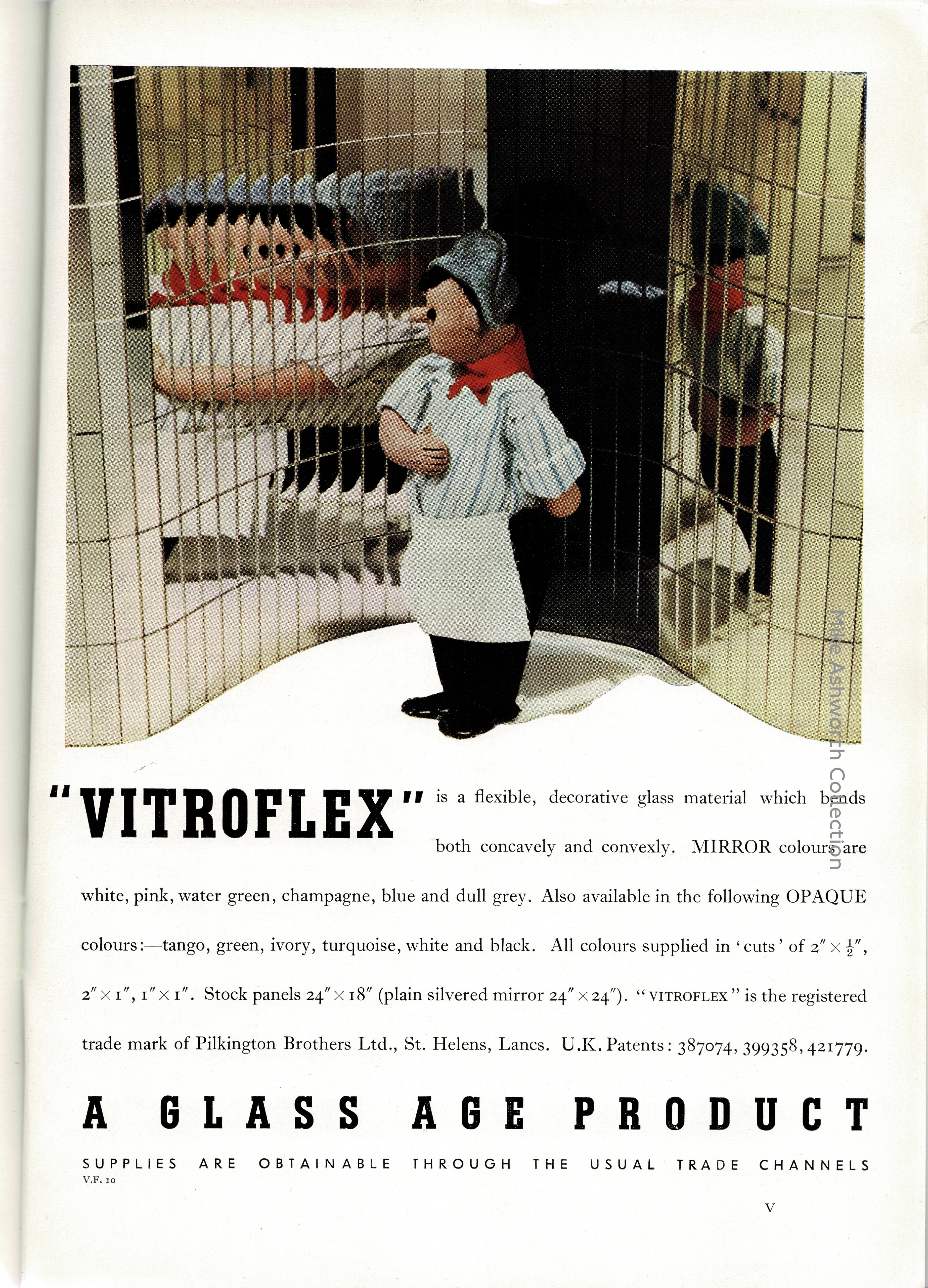
A fine contemporary advert for the Pilkington’s Glass Works product “Vitroflex” issued in 1937. This, thanks to the flexible backing sheet, allowed coloured and mirrored finishes to be fitted to curved surfaces and this rather accorded to the contemporary architectural vogue. It shares a similar tradename to Vitrolite, the coloured glass sheets developed in the US and that Pilkington’s had acquired rights to in 1932.
At the time of the advert Pilkington’s were highly successful not just because of their willingness to adapt to new glass making technologies but also their marketing techniques. Glass, as a decorative and semi-structural material, was very much in fashion as the 1930s progressed and modern architecture that made much of ‘light’ and techniques such as curtain walling were a growing market for the company.
The slab-serif caps are from Ludwig & Mayer’s Tempo. Designed by Walter Höhnisch and first cast in 1930, it was marketed as bold condensed companion to Hans Wagner’s Welt-Antiqua. For markets abroad, Tempo was named Luxor Bold Condensed (and Welt-Antiqua was known as Luxor). Tempo also went under the names Nilo (Nebiolo) and Ultra schmal halbfett (Schriftguss).
The body copy is set in Imprint (Monotype, 1913), with loose linespacing, non-lining numerals, and fractions. The bottom line features Erbar-Grotesk (Ludwig & Mayer, 1926) in tracked out caps.
")


