Willumsens Museum
Jens Ferdinand Willumsen (1863–1958) was a Danish artist who excelled in an enormously wide range of disciplines: etching, painting, sculpture, architecture, graphic as well as ceramic art were among his subjects. Initially trained as architect at Copenhagen’s Technical College he failed three times at earning a second degree from the Royal Academy of Fine Arts – and characteristically for his fin-de-siècle generation turned his back on academia. Instead he sought connection to the European avant-garde, then concentrated in and around Paris. Willumsen achieved national and international recognition, but never was granted unanimous applause.
While living half his life in southern France, from 1916 on, he still strived for securing his place in his home country’s memory. Starting in the 1920s Willumsen campaigned for his own museum in Denmark, an effort that led, in 1947, to a deed of gift by which he donated his works and his own art collection to the Danish state. The museum was slow to materialize, though: it opened just one year before Willumsen’s death and all he ever saw of it were photographs.
Willumsens Museum is located in and operated by Frederiksund, a small town of 16,000 inhabitants, one hour northwest of Copenhagen. The museum is in fact the city’s main attraction.
Being a single artist museum and far from Copenhagen’s bustling center posed severe challenges. In 2018, this made the museum board reach out to IDna Group, an agency focussing on brand strategy and visual identity. The graphic fruit of the collaborative development of a new strategy can be seen in this post.
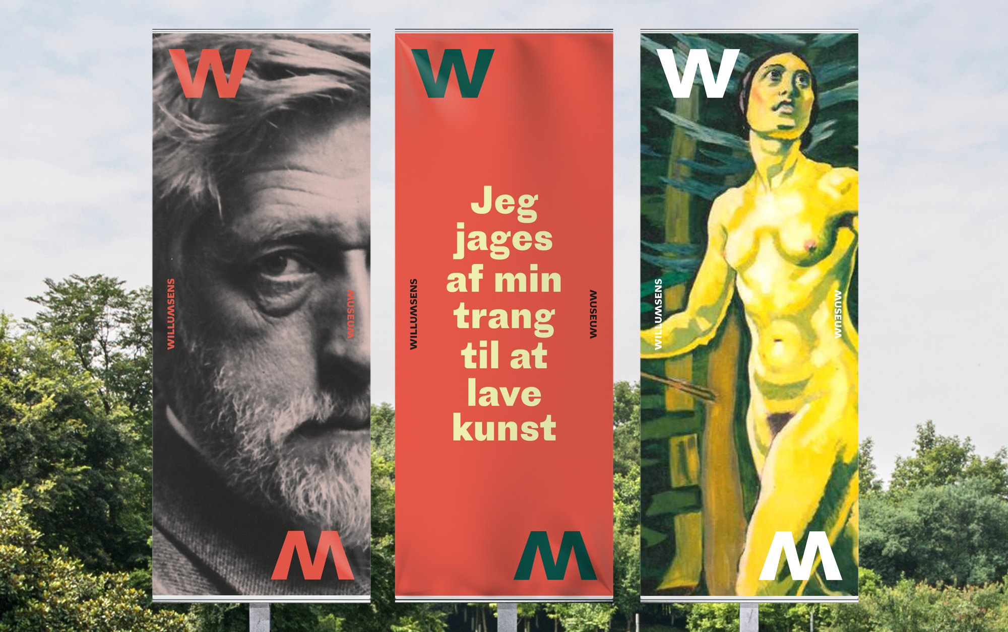
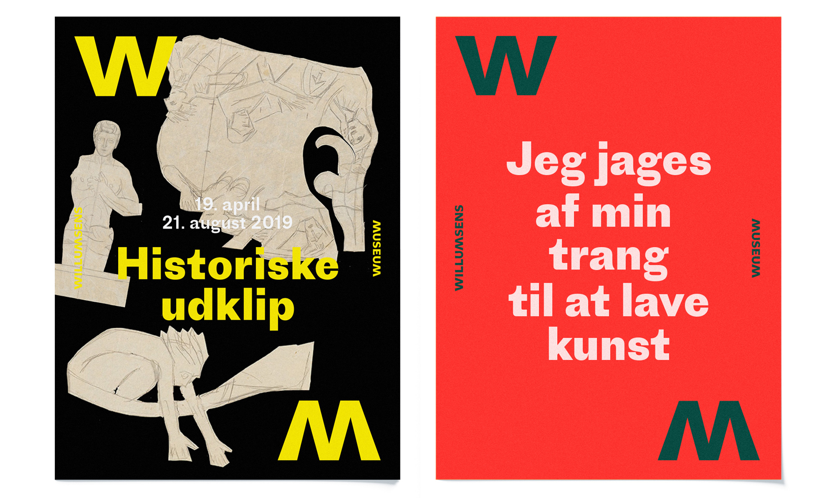
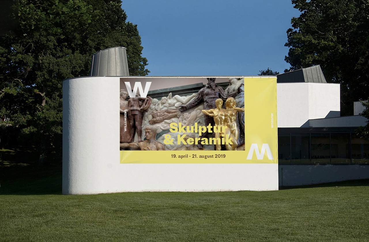
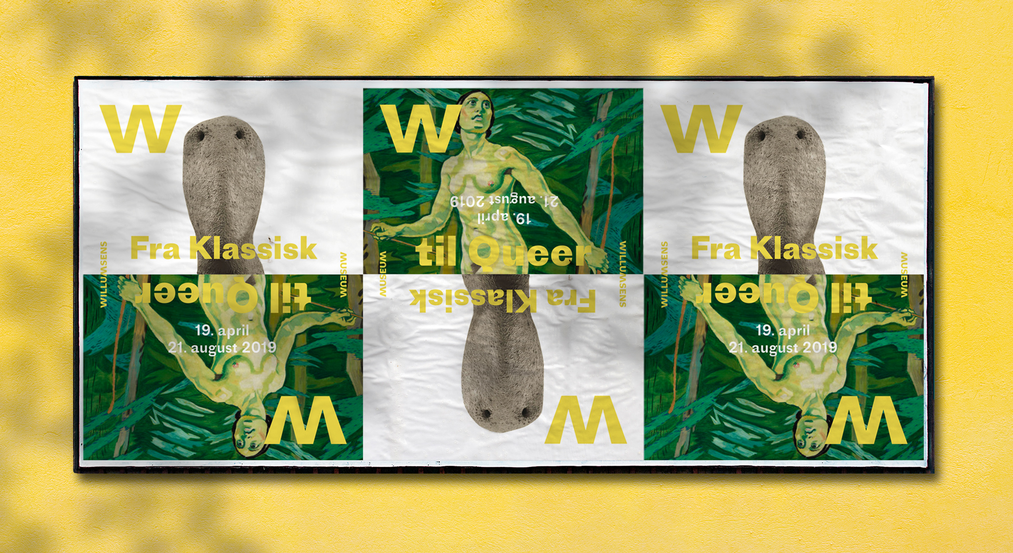
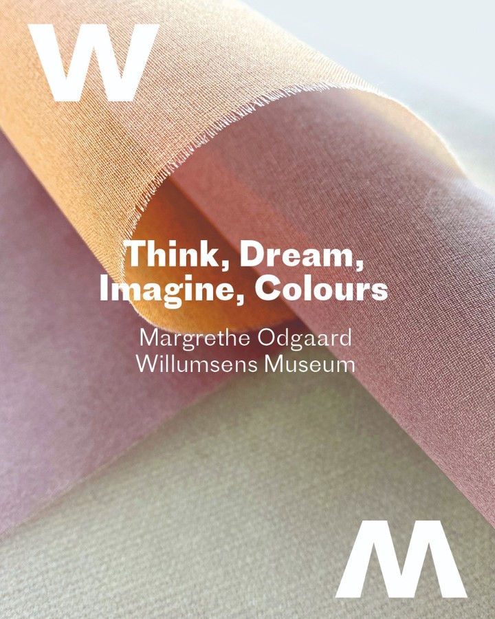
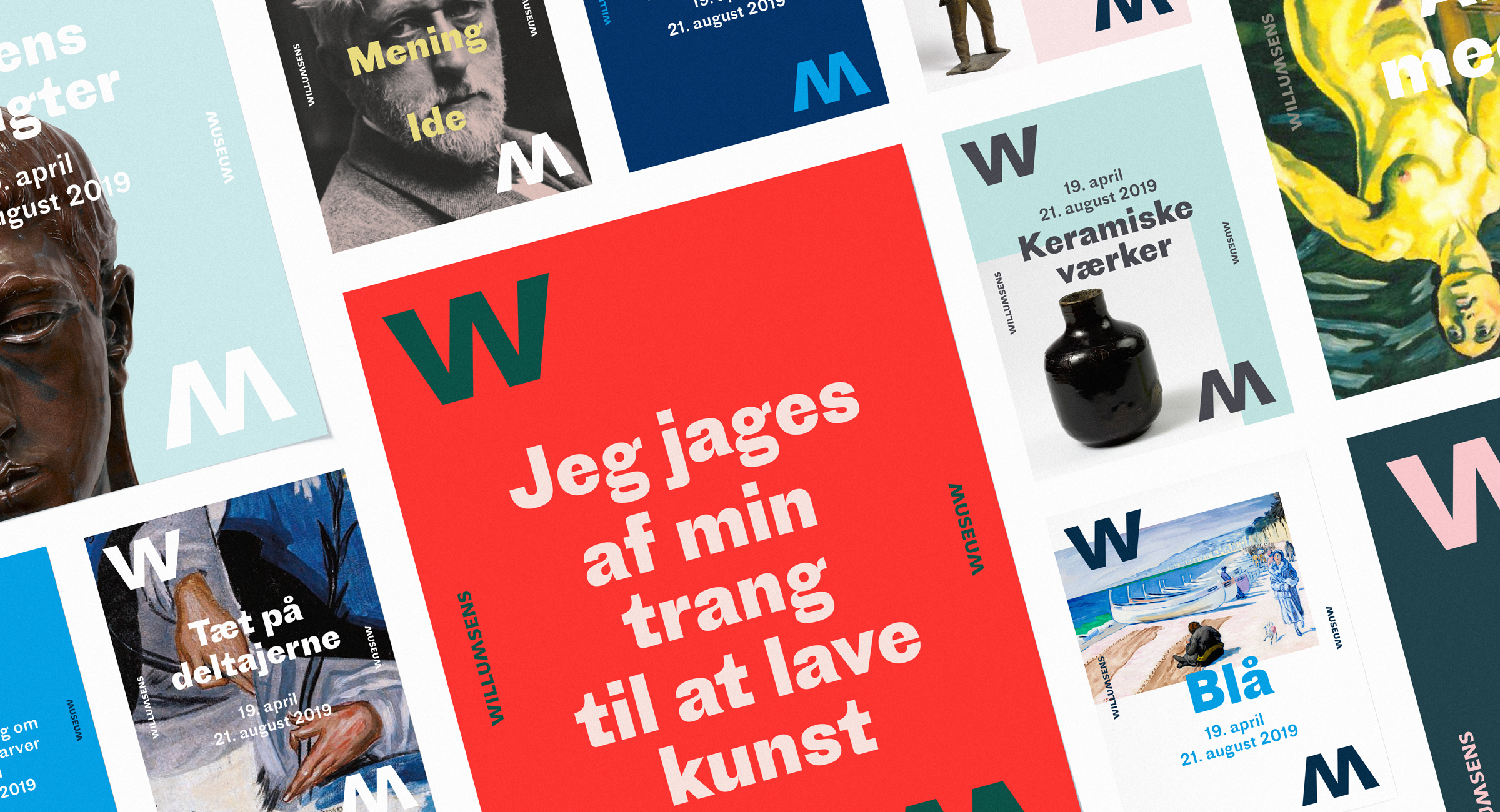
Reflection, mirroring and dialogue are at the core of the new concept. While the curators aim at mounting thematic exhibitions that bring Willumsen’s legacy into dialogue with other artists, the logotype itself embodies this idea by mirroring the W and the M. There is a calm logo lettering displaying the full name, but for the use on posters, brochures and other promotional media it is split into two big initials placed diagonally on the format, with the words “Willumsens” and “Museum” placed at the left and right margings. This way a sort of frame is created in which the content may shine.
Apart from the logo, the redesign puts all on one card, typographically: Proto Grotesk in different sizes and cuts, mainly bold and regular. Proto Grotesk was designed by Jean-Baptiste Levée, head of Paris-based foundry Production Type. Inspired by somewhat quirky early German sans serifs from the 19th century, Proto Grotesk picks up on contradiction as a topic in typeface design and achieves poignant contemporary appeal.