
Deutsche Bahn ads (1974/1975)
In 1974 and 1975, Deutsche Bahn used Wordsworth as the display type in their ads. Made by Phil Martin for his Alphabet Innovations in 1973, this face appears to be based directly on Les Usherwood’s Graphis (Typsettra, 1971). Usherwood later expanded his Graphis to a four-style family named Barnard & Barnyard, which was digitized by Red Rooster/ITF as Beckenham. Wordsworth was digitized by URW.

Wordsworth (URW’s digitization, top) compared to Beckenham RR ExtraBold (Red Rooster, bottom). The latter is equivalent to Barnyard Extra Bold, formerly known as Graphis. The spacing isn’t great in either of the digital versions.
The comparison above shows how Wordsworth is a tad smoother and less explicitly calligraphic than Graphis/Barnyard/Beckenham. This quality is most notable in the round dots, but also in e or g. In a comment to Phil Martin’s obituary on Typographica, Mark Simonson – who had conducted an interview with Martin in 2004 – comments on the lack of originality in some his work:
Things were different back then. A lot of the stuff he did was perfectly acceptable at the time, but you would never get away with it nowadays if you want to be respected as a type designer. Phil was not a great type designer, but he was a great remixer.
The ad copy seems to be set in a tightly spaced phototype version of Century Expanded.

“Ihr Beitrag zum Umweltschutz.” (1974)

“Reisen bildet.” (1974)

“Ich hab’ mein Herz vor Heidelberg verloren.” (1974)
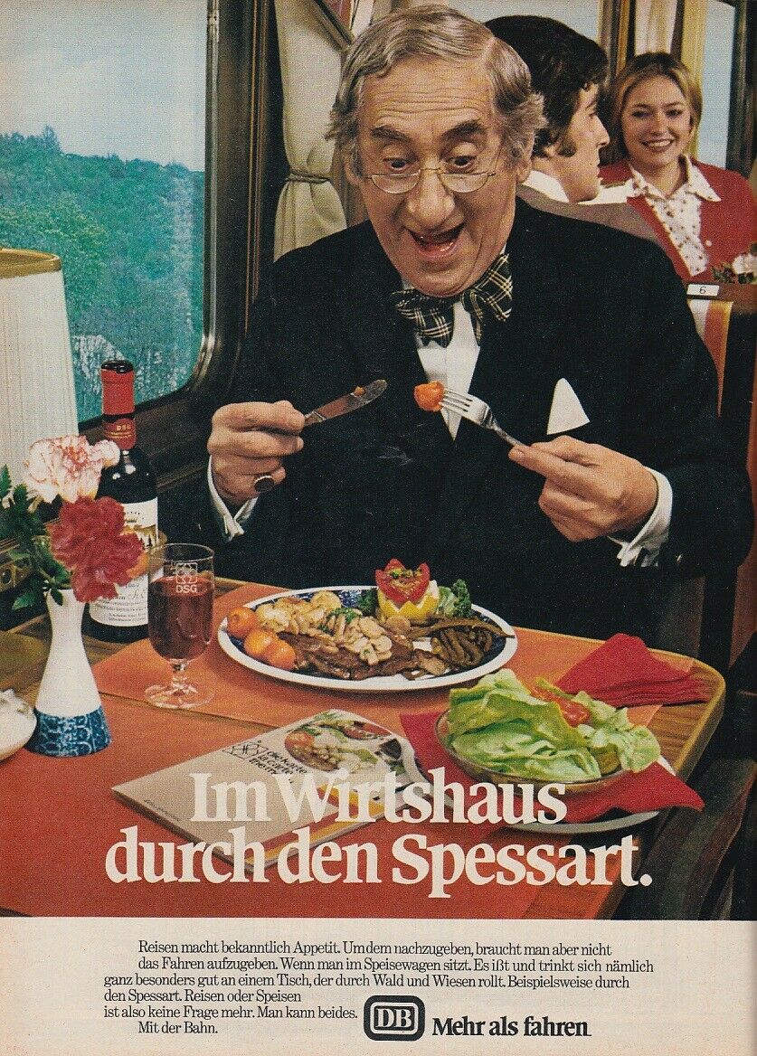
“Im Wirtshaus durch den Spessart.” (1974)

“Traumreise.” (1974)

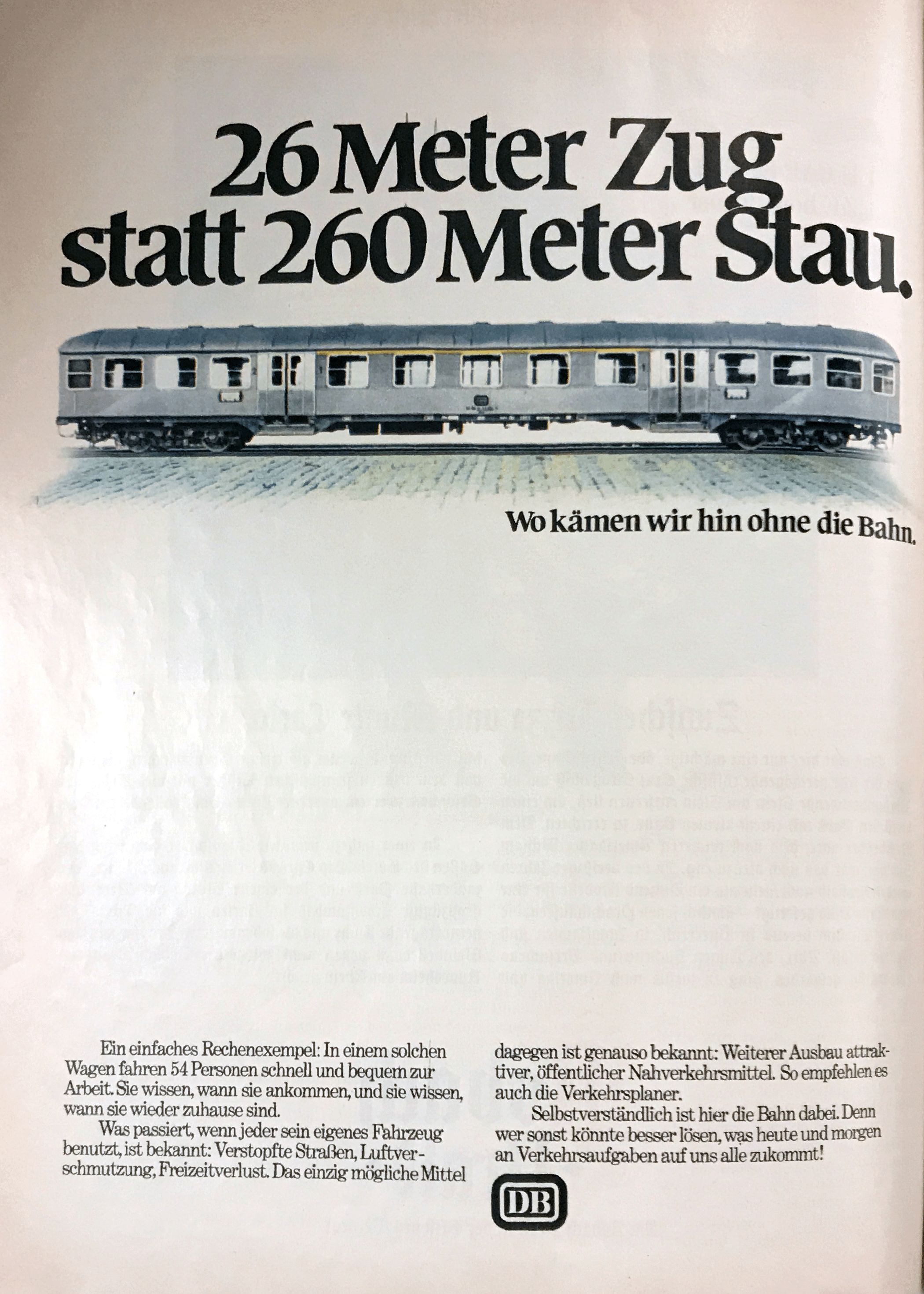
“Die erholsamste Kolonnenfahrt in Ihrem Urlaub.” (1974)

“Auf dem besten Wege zur Erholung.” (1975)


")


