
Manet and Modern Beauty

The unconventional arrangement of the title typography on the book jacket nicely integrates with the chosen detail of one of Manet’s paintings – and adds a contemporary touch along the way.
Manet and Modern Beauty: The Artist’s Last Years is a book on the French painter Édouard Manet (1832–1883), featuring his work and correspondence as well as a chronology of his life. It uses the Halyard Text typeface family extensively from the cover to the smallest text inside.
The publication goes with an exhibition given at the Getty Center in Los Angeles from October 8, 2019 to January 12, 2020. It was edited by Scott Allan, Emily A. Beeny, and Gloria Groom, and published by J. Paul Getty Museum.
400 pages
, 9⅝×11⅜ inches, 206 color and 97 b/w illustrations, 1 table.
ISBN 978–1–60606–604–1

The title is repeated on the inner flap, shown reversed in a light weight from Halyard Text.
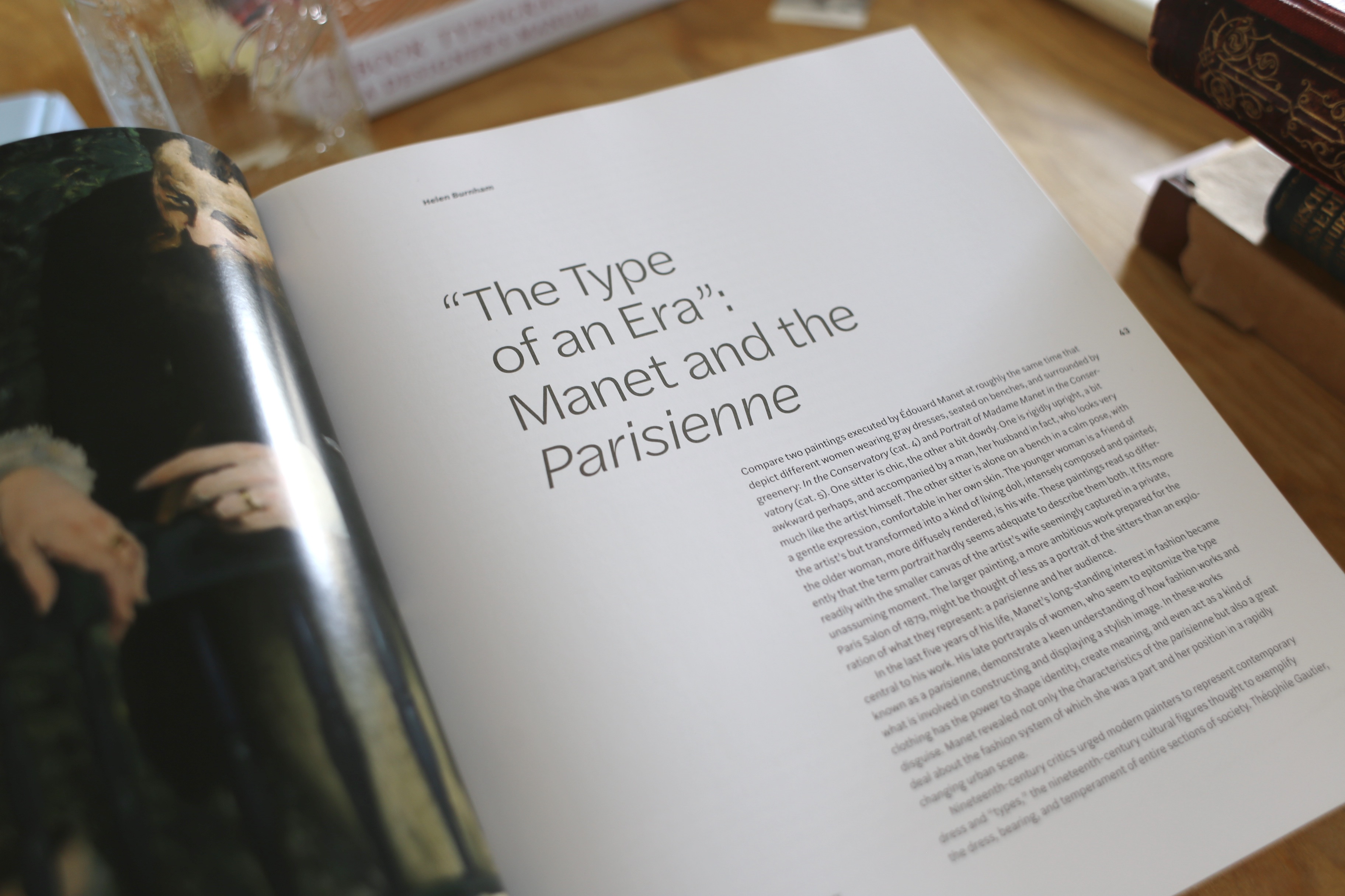
The Halyard superfamily comprises three optical sizes. Book designer Jeffrey Cohen decided to go exclusively with Halyard Text and its more open shapes. Halyard Text also appears for titles, skillfully set with reduced tracking and hanging punctuation.
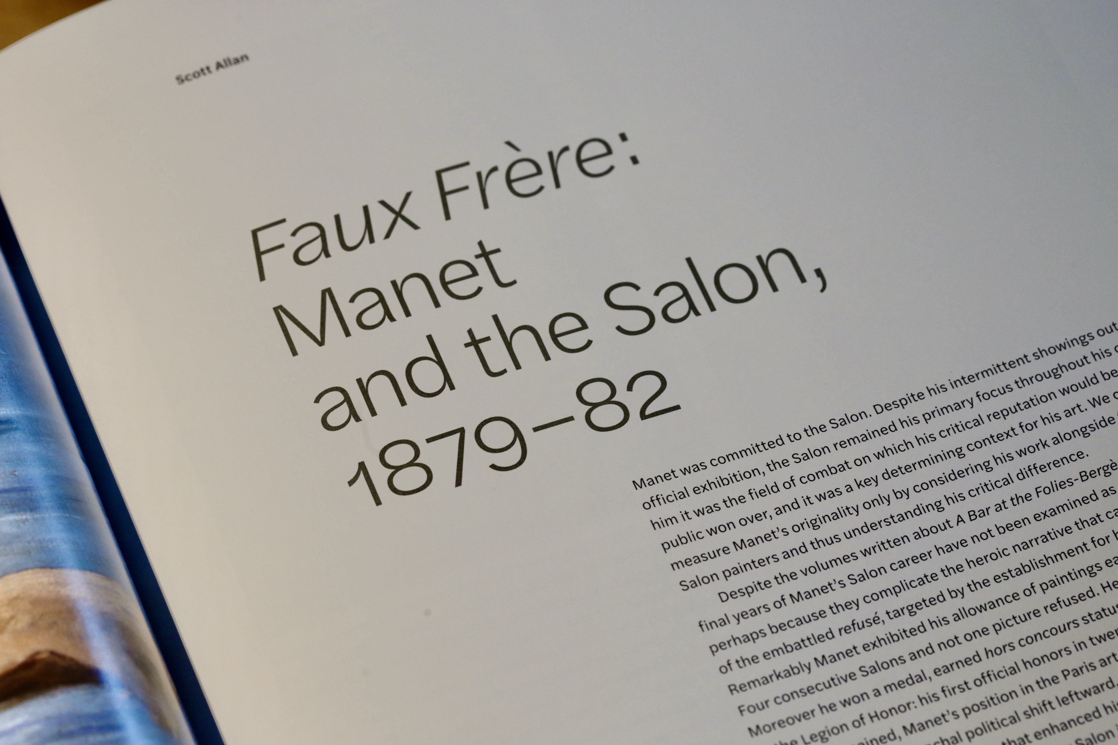
The headings are set with a short line measure, leaving opening pages with a generous amount of white space. Halyard Text is specified in roman and italic styles, with non-ligning numerals.
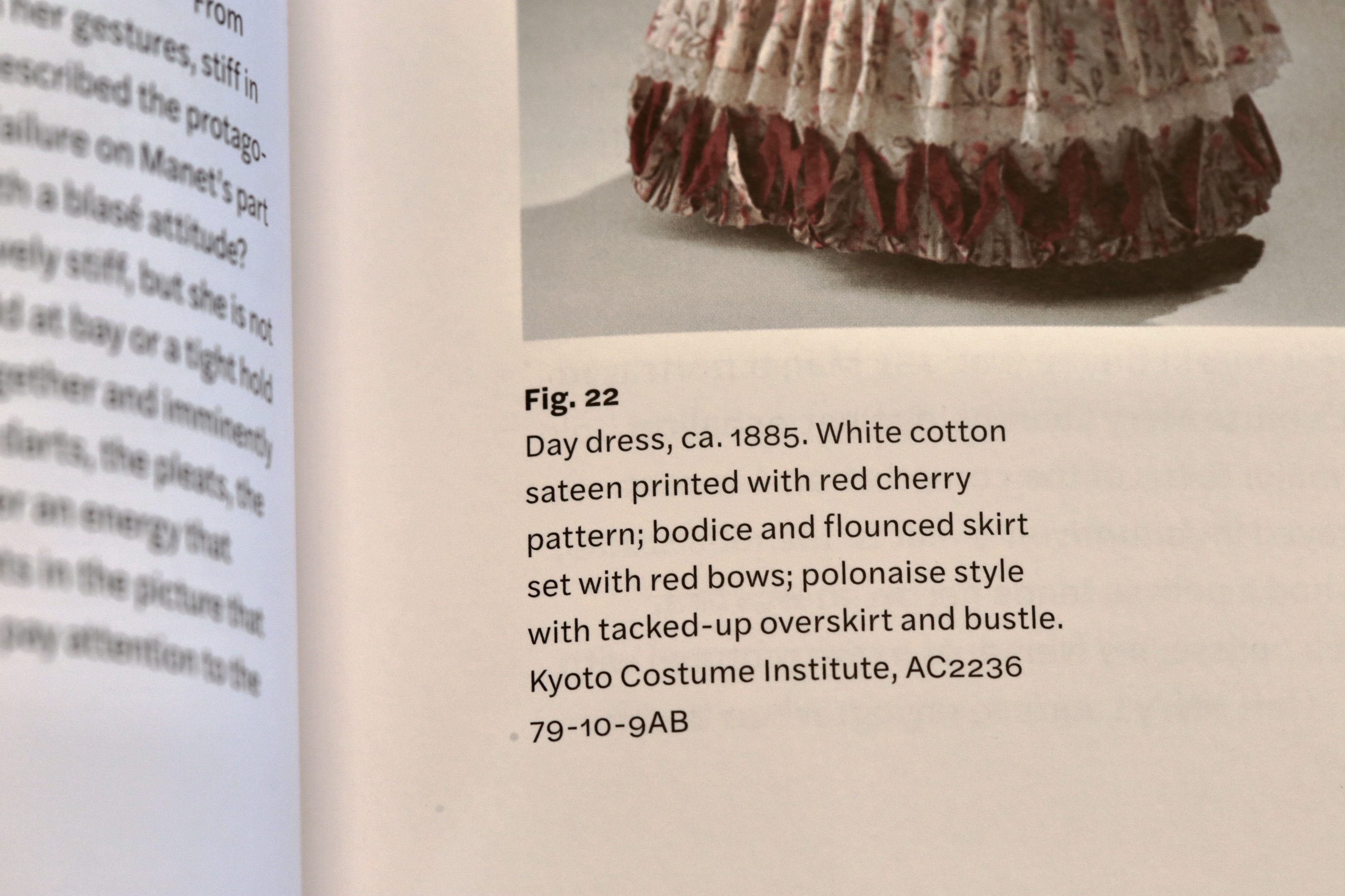
Image captions are enlivened by the use of two contrasting weights.

Running titles are set vertically in the outer margins, echoing the rotated “Manet” on the book jacket. The inline headings are highlighted by the use of bold small caps.
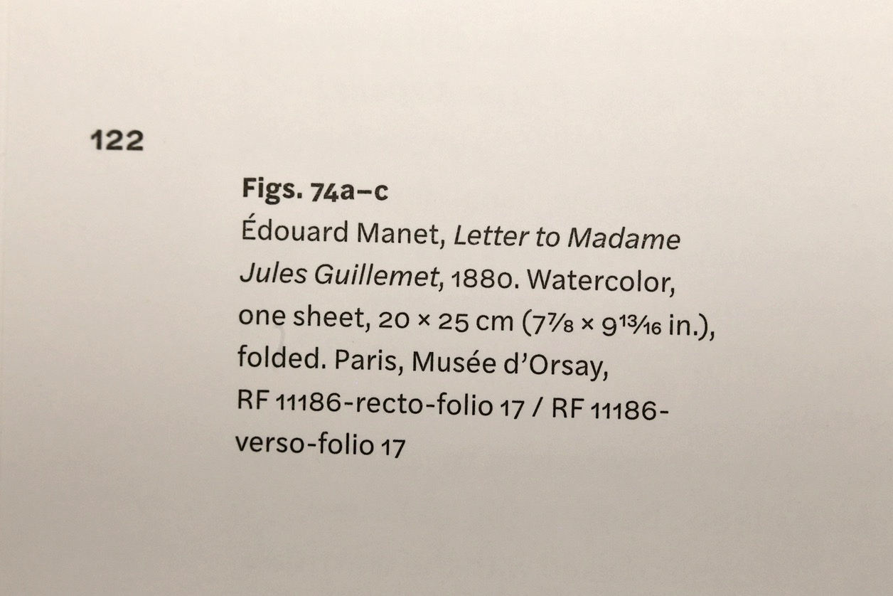
The nominator and denominator glyphs included in Halyard Text come in handy for setting arbitrary fractions.

By working with various distinctive styles, clarity is achieved even on dense pages. By keeping everything within one family, the page looks calm and harmonious.


