The Price is Right (1972–)

The Price Is Right is a game show franchise created by Bob Stewart. The franchise centers on television game shows, but also includes merchandise such as board and video games. The original TV show ran from 1956 to 1965 and was hosted by Bill Cullen. Four contestants compete to win cash and prizes by guessing the price of merchandise.
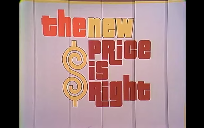
The logo as featured in one of the first episodes after the relaunch, aired on September 6, 1972
In 1972, the TV show was revamped. For the first year, it went under the name The New Price Is Right. The show got new hosts – Bob Barker for the daytime edition, and Dennis James for a weekly version for the syndicated markets. It also got a new visual identity. The logo used a typeface that had been released shortly before: Pinto Flare. This extrabold design with hairline counters was shown by Franklin Photolettering in 1974, featuring biform alternates and a number of glyphs with hyper-extended descenders that allow for interlocking combinations. Pinto Flare might have been one of the few originals by the NYC-based company. Its designer is unknown. Don Roberts was the TV show’s art director in 1972. I don’t know if he takes credit for the logo.

The host enters the stage.
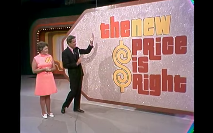
Bob Barker with a contestant
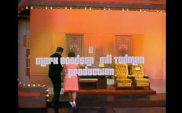
The end credits were set in Pinto Flare, too.
When Bob Barker (b. 1923) retired in 2007 after a remarkable thirty-five years as the show’s host, passing the mic to Drew Carey, this change was marked by a new logo variant: the curly dollar sign and the title were now framed by two shapes that resemble the sliding doors, or maybe also a rotated shopping basket.
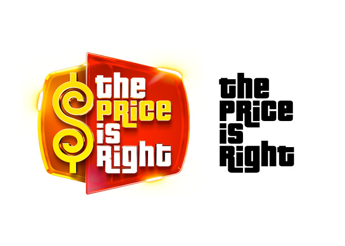
Left: The current logo for The Price Is Right, in use on the website since September 19, 2022.
Right: a resetting in the Pricedown font. Differences include the height of T, the waistline of P R and C, as well as the size of the counters and apertures.
Over the years, the logotype was adjusted and redrawn numerous times, for various applications (for more images, see the dedicated wiki). The letterforms underwent slight (and sometimes not so slight) changes.
In or before January 1998, Ray Larabie of Larabie Fonts (now Typodermic) released a digital font based on the show logo, and named it Pricedown. The marquee text that accompanied the release made it clear where he got the inspiration from:
Come on down, you’re the next contestant on the Price is Right (tm). I’m sorry, you have all overbid. It’s time for Plinko! Let’s play Squeeze Play. Spin that wheel. A new car!
If you can’t figure out where this font is from I suggest you put those books away and catch up on some daytime television.
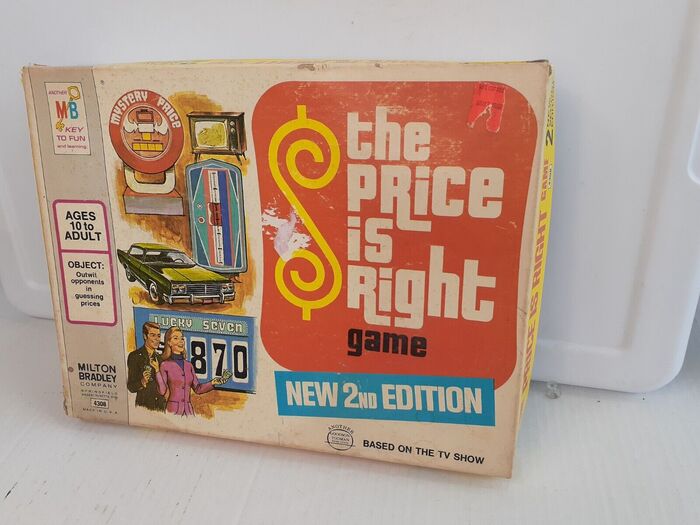
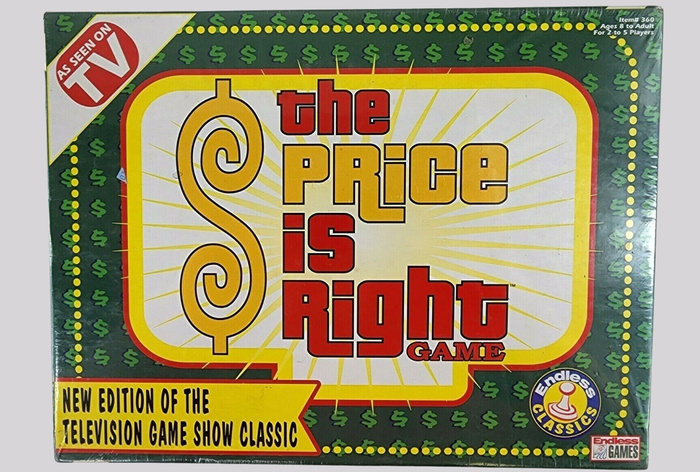
In an early version (v2 from 1999), the ampersand in the font is still the curly one from the TV show logo. Larabie’s interpretation isn’t faithful to Pinto Flare. Most notably, the counters and apertures in Pricedown are larger, and letters like g or q don’t have a notch at the top. These details actually match some (redrawn) versions of the logo, including those seen on the board game boxes.
A board game from 1998 appears to make use of Larabie’s font, see below – if that’s indeed the case, Pricedown came full circle right after its release. The authors of the Price is Right wiki claim that, “starting in 2007, the font for the Carey logo is, and still is, a custom version of Pricedown.” I can’t confirm this claim, but the comparison shown above suggests that it’s imaginable.
In 2013, Larabie released a rebuilt and improved version of Pricedown, expanding the design to nine weights from Ultralight to (the original) Black, with numerous alternates and ligatures, and a character set that covers Latin (incl. Vietnamese), Greek, and Cyrillic.
In 2005, Patrick Griffin of Canada Type issued another digitization. His interpretation named Jazz Gothic is based directly on Pinto Flare and hence stays closer to the original than Pricedown. As far as I can tell, this font was never used by The Price is Right. It’s a handy option if you want to recreate the original 1972 logo, though.
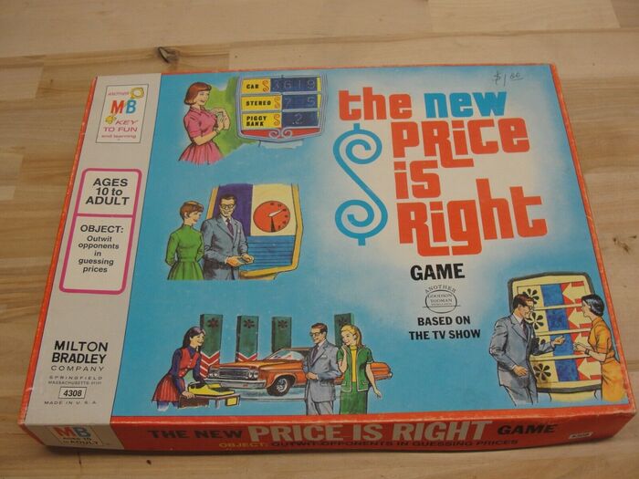
The New Price is Right board game, Milton Bradley, 1973. Note that the lettering is only loosely based on Pinto Flare. The size of the counters as well as details like the top of g are closer to Larabie’s later digital interpretation, Pricedown.
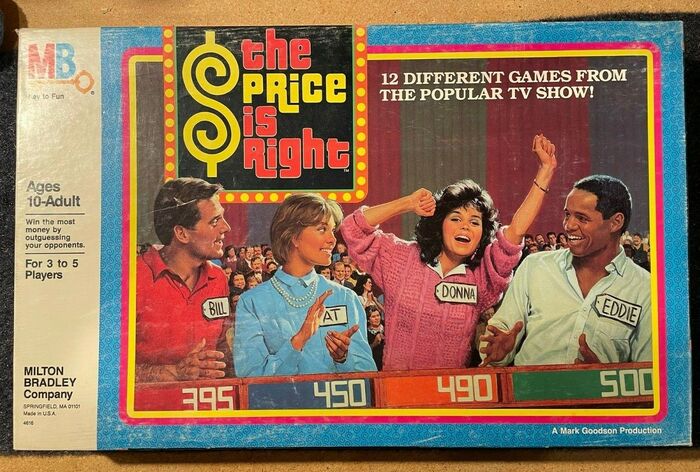
The Price is Right board game, Milton Bradley, 1986. “12 different games …” is set in caps from ITC Bookman.
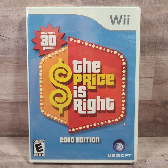
The Price is Right video game for Nintendo Wii by Ubisoft, 2010. The numerals 1 and 3 and the letter T don’t match the glyphs in Pricedown.
Shout out to Bryson Stohr who suggested a post about this logo and its iterations, and provided some pointers.
Formats
- Packaging (1982)
- Branding/Identity (6664)
- Film/Video (867)
Topics
- Entertainment (1295)
- Film/TV (1664)
Designers/Agencies
- Don Roberts (1)
- unknown (3281)
Tagged with
- CBS (28)
- TV show logos (139)
- game shows (11)
- logos (3874)
- logo evolution (60)
- dollar sign ($) (19)
- stage graphics (104)
- biform/unicase (223)
- hyper-extended glyphs (290)
- interlocking letterforms (73)
- contoured type (361)
- long-time use (118)
- doors/gates (39)
- end credits (111)
- board games (47)
- boxes (409)
- various editions (77)
- Milton Bradley (7)
- Endless Games (1)
- lettering derived from typeface (630)
- video games (168)
- Ubisoft (4)
- Nintendo (24)
- 1970s (1355)
- high profile (582)
- iconic uses (104)
- early uses (1730)
Artwork location
- United States (8300)
















1 Comment on “The Price is Right (1972–)”
Here’s a glyph set of Pinto Flare, as shown in Modern Display Alphabets, a book presenting “100 complete fonts selected and arranged by Paul E. Kennedy from the Franklin Photolettering catalogue” and published in 1974 by Dover Publications in their Dover pictorial archive series. Unlike many other of their alphabet books, this issue appears to be no longer in print. Art. Lebedev Studio has a digitization.
Pinto Flare was available at least in 1972, as evidenced by the use for The Price is Right. It came with various swash and biform alternates. The design was copied by Facsimile Fonts as Maverick before May 1973. Lettergraphics showed it as Mustang Flair in 1976, and Castcraft as Pinto Flair [sic!] in 1978.