
Le livre des erreurs by Gianni Rodari (Ypsilon Éditeur)

Book cover.
To celebrate the 100th birthday of Gianni Rodari (1920–1980), Ypsilon Éditeur published a new edition of his “Book of Mistakes” (Il libro degli errori, 1964), translated from Italian to French by Jean-Paul Manganaro, with the original illustrations by Bruno Munari (1907–1998).
Designer Pauline Nuñez wanted to use a Cairoli-like font for this book, as a nod to the adorable vintage cover designs by Italian publisher Einaudi where Rodari’s children books were first published. Cairoli is the name used by Italian foundry Nebiolo for a sans serif of German origin which is also known as Neue moderne Grotesk, or Aurora-Grotesk.
Among the contemporary revivals of this 1910s design, it’s the version by Forgotten Shapes named Neue Moderne Grotesk FSL that Nuñez found the most interesting, “because it exactly matched how I was picturing the book in my head.” Released in summer 2020, the faithful digital reconstruction by Stephan Müller came just in time to be used in the book. Neue moderne Grotesk is used on the cover and for headings. It’s paired with Egizio, a text Clarendon designed by Aldo Novarese for Nebiolo in the 1950s.
In addition to the printed book, there’s an audio book version. Co-produced by the Institut Culturel Italien de Paris, it comprises seven episodes read by Denis Lavant. They are available on Soundcloud until March 31, 2021. The graphics for the audio version were designed by Nuñez, too, pairing Neue moderne Grotesk FSL Black with numerals from Egizio Bold.
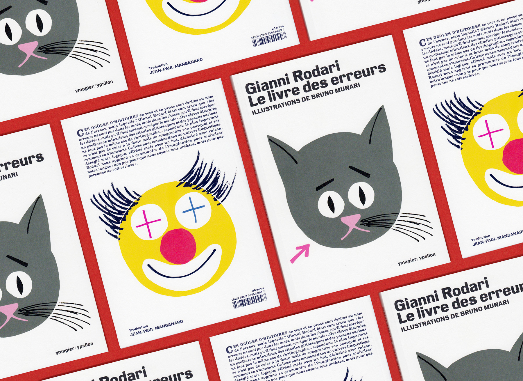
Book covers (front and back).

Spread ft. “La musée des erreurs” and “En Sardaigne”.
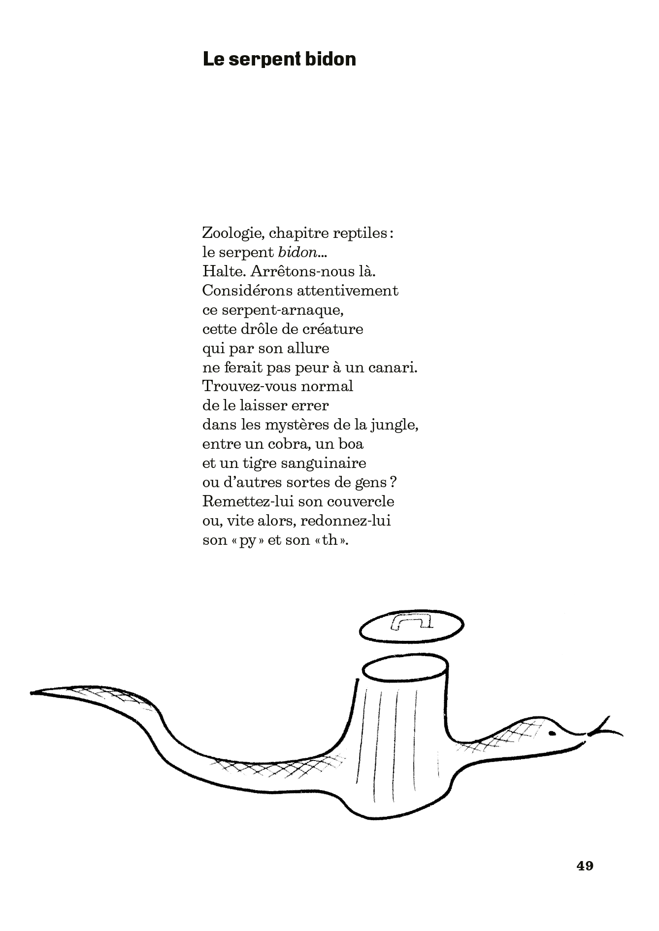
Page ft. “Le serpent bidon”.

Spread ft. “Ma vache” and “Le monument”.

The audio book read by Denis Lavant, as presented on SoundCloud.

Cover images for the various episodes of the audio book.


Announcement for the release of the third episode of the audio book.


")


3 Comments on “Le livre des erreurs by Gianni Rodari (Ypsilon Éditeur)”
I have to say that this shows how Stephan’s Neue Moderne Grotesk FSL, which I expected and was very curious about, for me does not capture the subtleties of Cairoli. It might be that versions from the different foundries were slightly different, even Cairoli could be slightly different from Aurora? I do not know. I have two Weber Aurora specimens, probably from the 1930s-1940s, and Cairoli always seems “warmer”.
At any rate Stephan’s digital version looks more “rigid” to me. It might be also because it does not offer optical sizes.
I have a number of these Rodari books in early italian editions, and (going by memory) these recreated cover designs for the French edition, while beautiful, lack some of the charm given by Cairoli’s “vernacularity”.
Edit: I recalled wrongly, as the original italian editions do not use Cairoli, but my consideration still stands, as period uses of Cairoli in its lead version in my opinion evoke a different atmosphere.

On a second thought, it might be also the spacing. Cairoli, when used on Covers, was usually quite generously spaced, even the Nera version.
See these two Urania covers as an example (I might do an entry of the Van Vogt one as it’s very nice):