
Whitelab Genomics
Contributed by Brand Brothers on Jan 13th, 2021. Artwork published in
November 2020
.
Source: www.brandbrothers.fr License: All Rights Reserved.
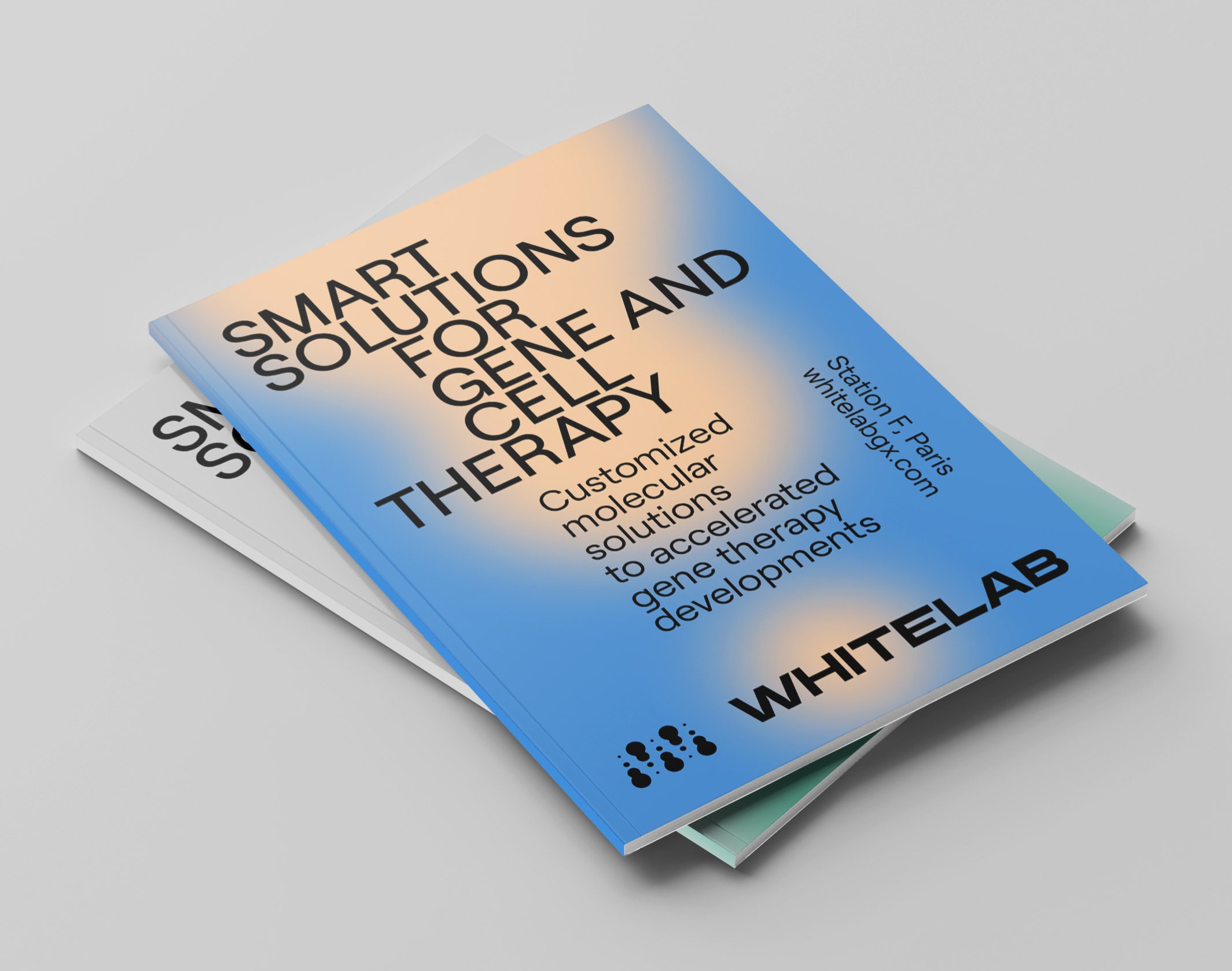
The studio was approached by Whitelab Genomics to redefine a visual identity and a graphic language for the company.
The new logo is composed of a monogram and a wordmark. The stable, thick and structured typographic design includes graphic accidents that add a certain singularity to it. The monogram W, playing on the counterform, positions Whitelab in the life sciences sector, in a sensitive and subtle way. The visual territory is based on blurred textures, a limited color palette and the use of a single typeface, Roobert (Displaay).
Source: www.brandbrothers.fr License: All Rights Reserved.

Source: www.brandbrothers.fr License: All Rights Reserved.

Source: www.brandbrothers.fr License: All Rights Reserved.

Source: www.brandbrothers.fr License: All Rights Reserved.

Source: www.brandbrothers.fr License: All Rights Reserved.

")

")


")


")


