
Musée du quai Branly – Jacques Chirac

Web poster for the Anting-Anting exhibition featuring Gothic Lab Croco.
The Musée du quai Branly – Jacques Chirac is an arts and ethnology museum in Paris. In 2019, it changed its identity, and chose Guénola Six as new artistic director.
The identity designed by Guénola Six relies upon the idea of the exhibition as an experience for the visitor: in order to render this aspect, the identity emphasizes objects of the collections, putting them into a narration by the way these objects interact with their background and with the text. In this perspective, titles set in Production Type’s Gothic Lab play a huge part in defining the imaginary of the exhibition. Indeed, the diversity of patterns that compose the typeface family, inspired by shapes found in nature and, more specifically, in animals, brings us back to the organic textures of objects created by primitive or tribal societies. Gothic Lab is available in various styles named Croco, Elephant, Gecko, Mantis, Snake, and Tigre. Each letter becomes an object in itself, as the pattern follows and adapts to the shape of it: the heavy programming work that permitted the design of the font, supported by Ivan Murit’s thesis work on Alan Turing and stochastic rasters, is the key behind the fine adequacy of the pattern.
Even though the cultural influence of this museum calls for a stable corporate identity, Guénola Six managed to add a special touch through the daring use of Gothic Lab, telling us stories from other times and other societies.
Gothic Lab is combined with Parisine. The museum’s logo is based on FF DIN.

Poster for the Océanie exhibition featuring Gothic Tigre SD.
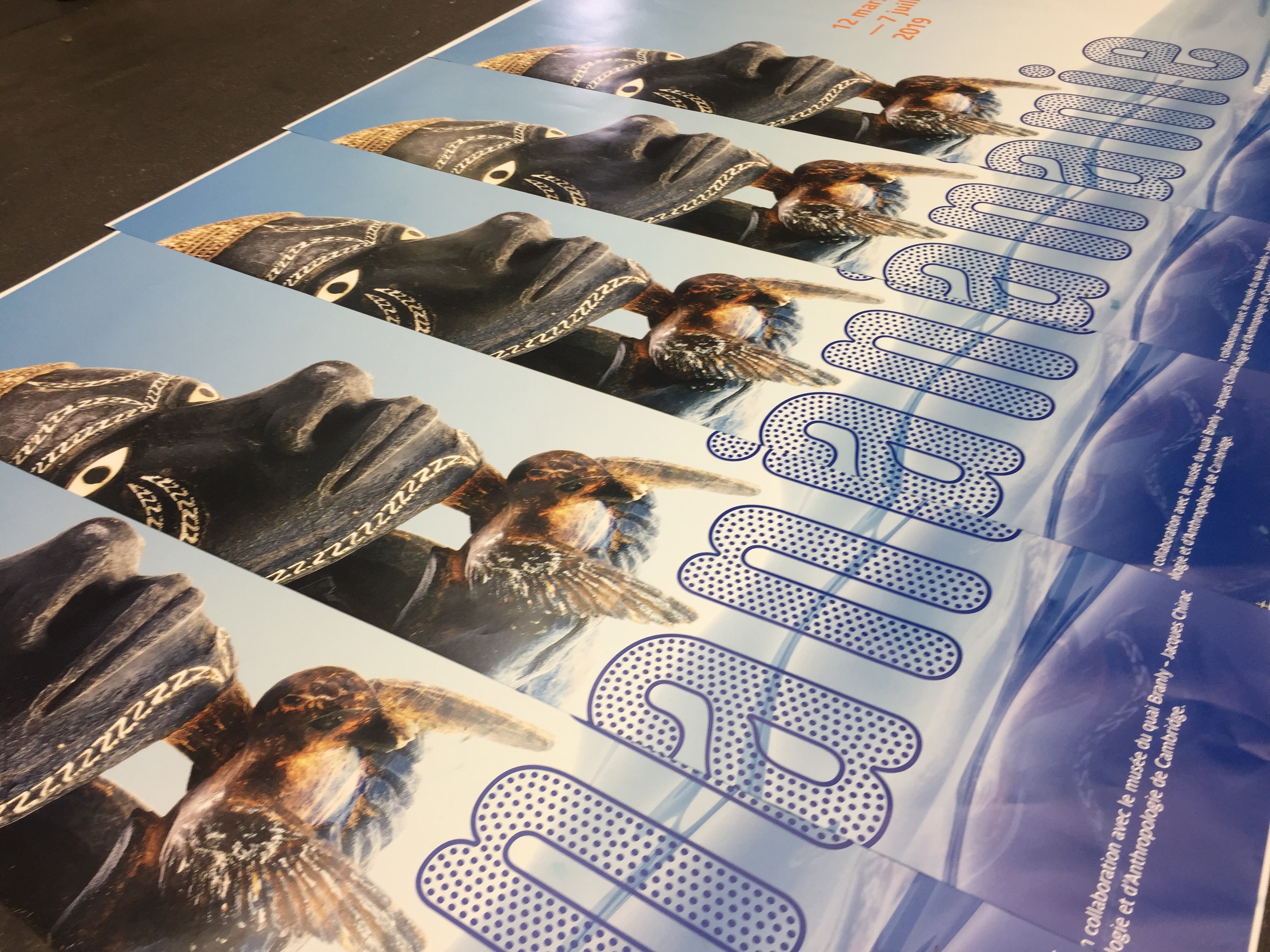

See more images from the Océanie campaign on the website of Guénola Six.

Web poster for Montez le son! (“Turn up the volume!”), a fundraising campaign for the restoration of the collection of musical instruments, with a wordmark starring Gothic Lab Tigre Snow. Some letters have been placed upside down, for a reversed gradient direction. The letter S is from Tigre SD.


")


 Belvédère(s)")

