
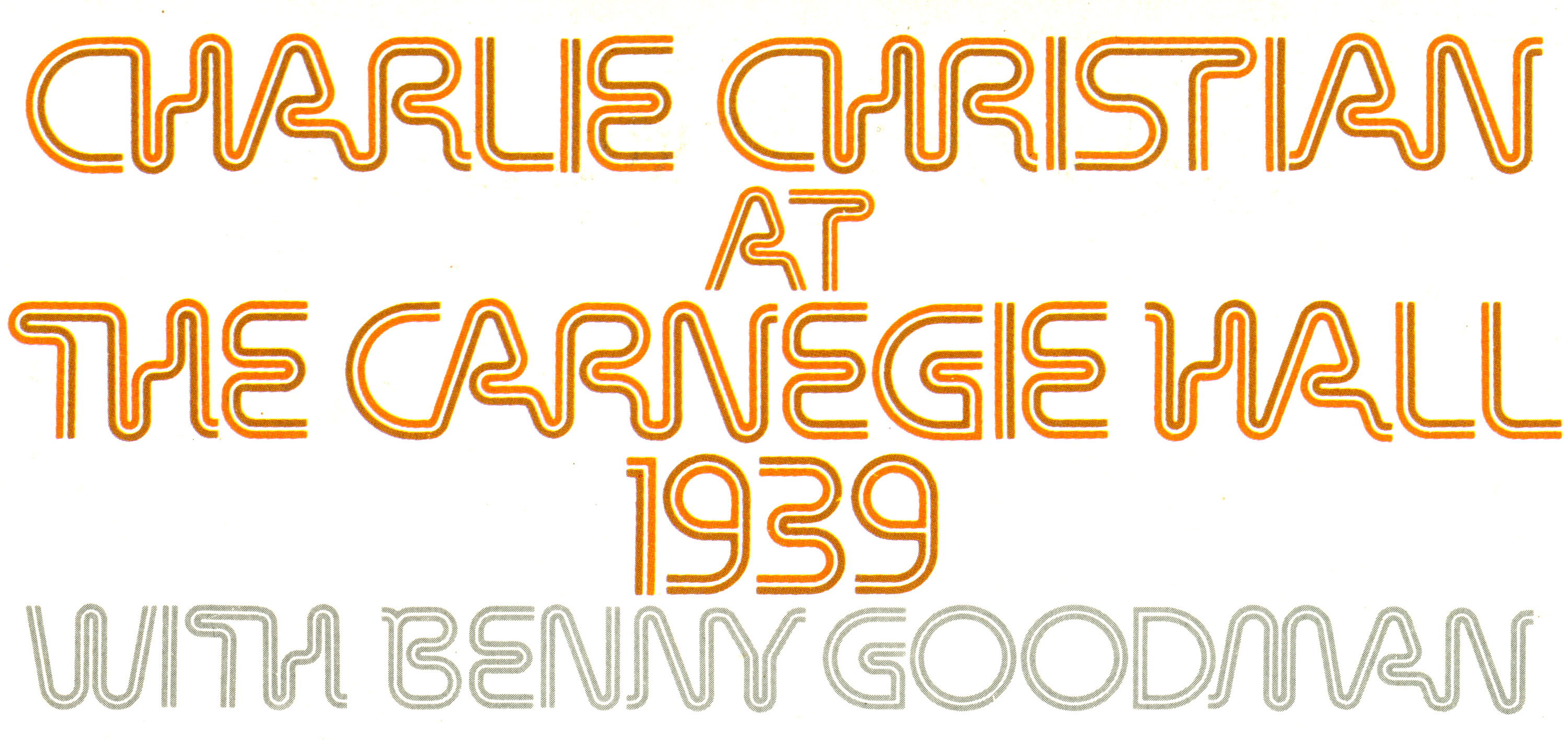
Charlie Christian at The Carnegie Hall 1939 album art

The illustration and design for this Elec Records release is credited to “K. Abe” (Katsuji Abe) who created hundreds of Japanese record sleeves (primarily as a photographer) from the 1960s to the 1990s. As soon as I saw this in the bin at Contact Records in Oakland I knew I had to have it — for the music, yes, but mostly for the cover.
Album cover detail with type isolated from the background.
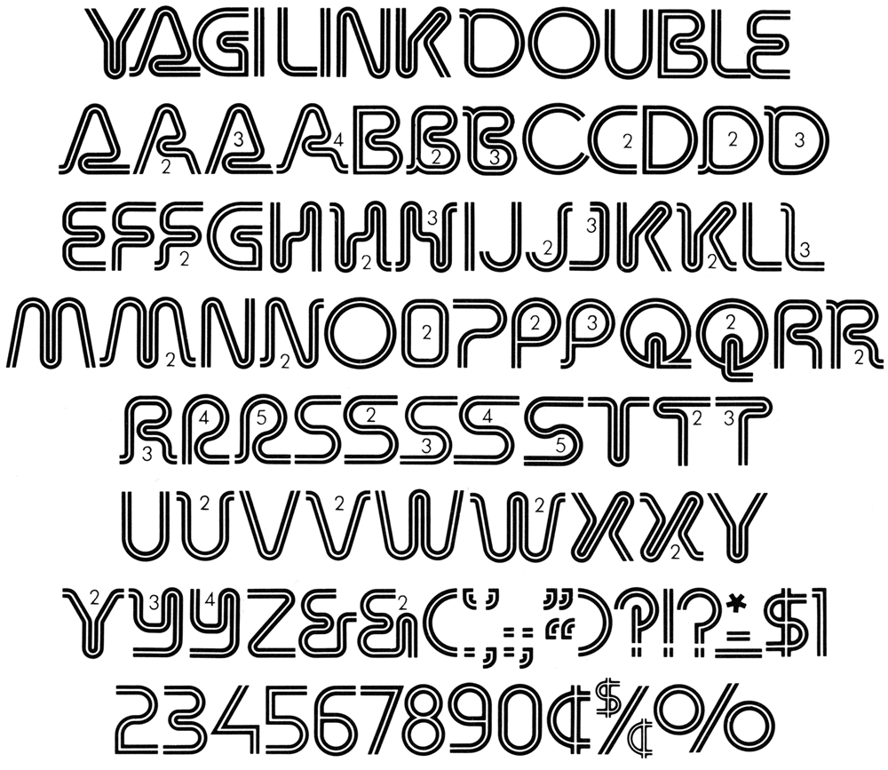
Yagi Link Double in Homage to the Alphabet.
Abe’s use of Yagi Link Double is the most skillful I’ve seen yet. Most designers failed to take advantage of the many alternate forms Teruoki Yagi offered to achieve an occasionally connected string of letters. Or, they would simply set the type too loosely.
Yagi Link Double, one of the more popular members of a large family of semi-related styles, was available as phototype and dry transfer lettering, but any version must have been extremely difficult to apply properly. That’s why Abe’s implementation is even more admirable — it’s as seamless as the typeface would allow, with a two-tone (orange/brown) effect to boot.
Last year, I presented a weirdly specific talk about the relationship between fonts and neon signs, and Yagi Link Double was one of the examples that I included as a less successful emulation of glass tubing. If I had known this record cover back then I surely would have included it.


")


")


