
Origens Grechi packaging

Source: teomenna.com.br License: All Rights Reserved.
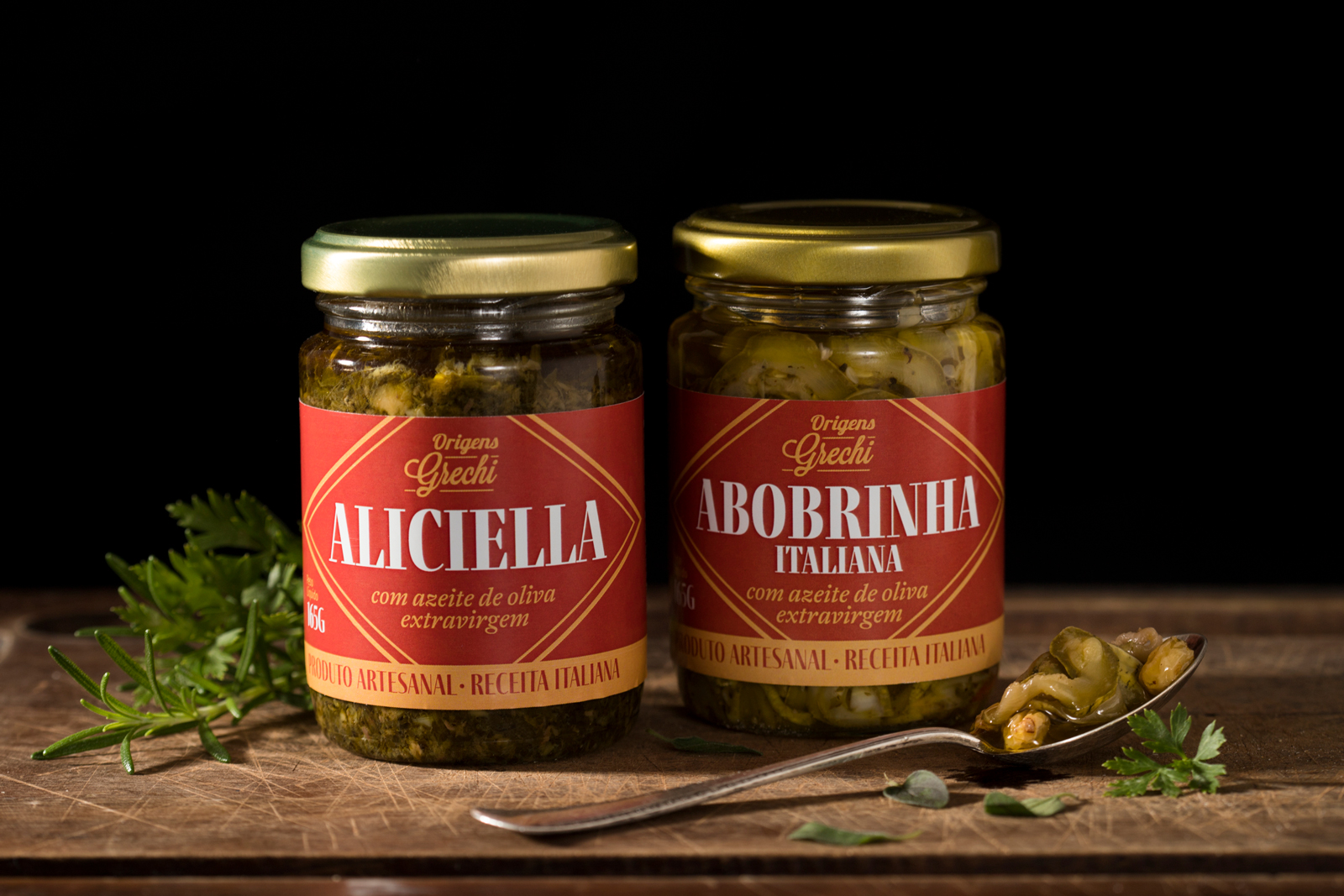
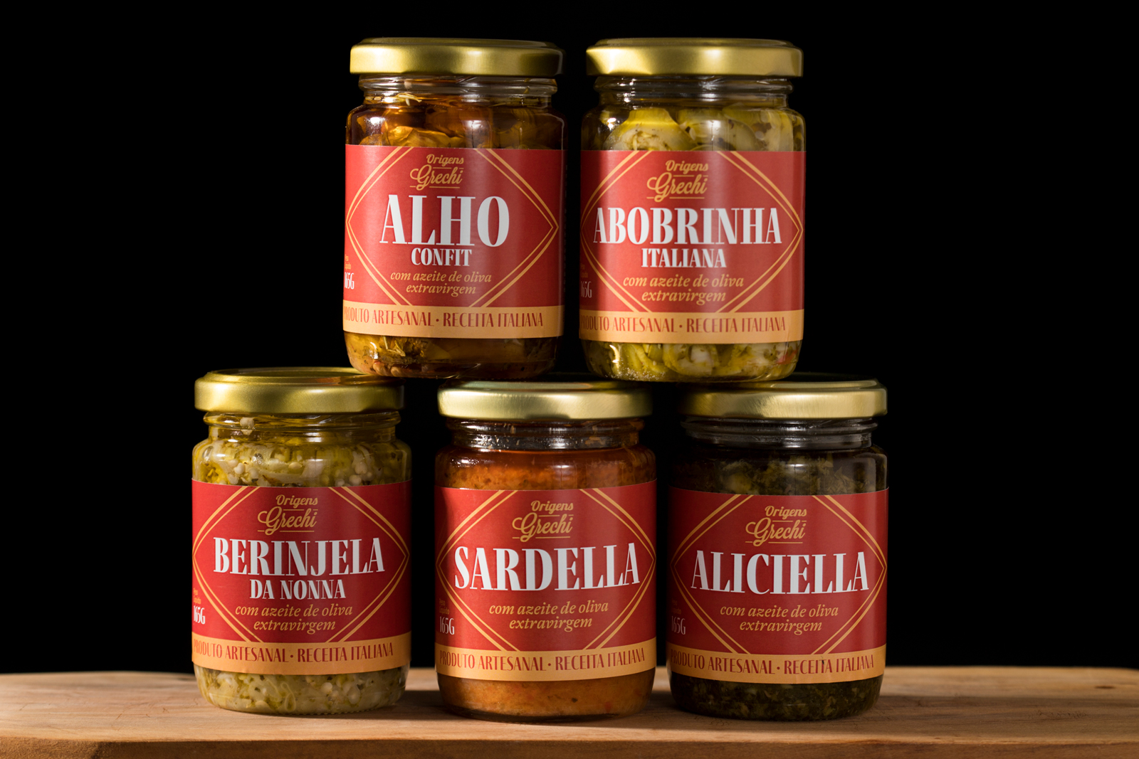
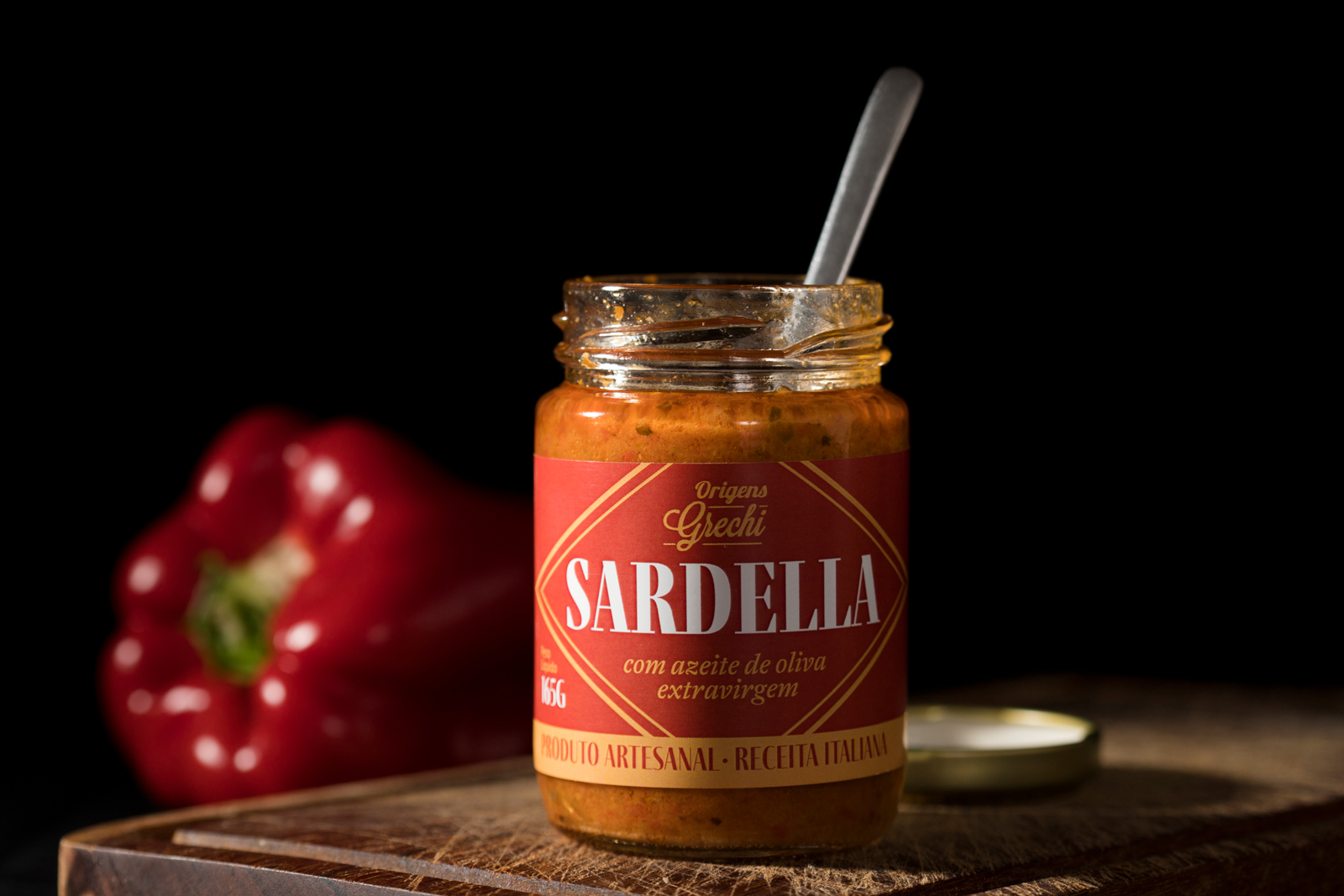
Origens Grechi is an artisanal producer committed to keeping Italian family recipes of antipasti and preserves alive. Their packaging should reflect this heritage, highlight the variety of the product, and, above all, distance itself from the visual commonplaces that refer to Italy, so overused in this niche.
The main element of the label is the Fino typographic family. With its high contrast in thickness and very condensed proportions, Fino and Fino Sans ensure good visibility of all varieties even in the longest names. Fino is paired with A2 Antwerp Italic.
Source: teomenna.com.br License: All Rights Reserved.
Source: teomenna.com.br License: All Rights Reserved.
Source: teomenna.com.br License: All Rights Reserved.


")


")


")


