
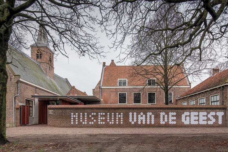
Museum van de Geest

In 2020, two Dutch art institutes merged: the Haarlem-based Het Dolhuys (“The Madhouse”, a former lunatic asylum) and the Outsider Art Museum from Amsterdam continue under the name Museum van de Geest (“Museum of the Mind”). Both locations remained active in their hometowns, with a shared identity. From the press release:
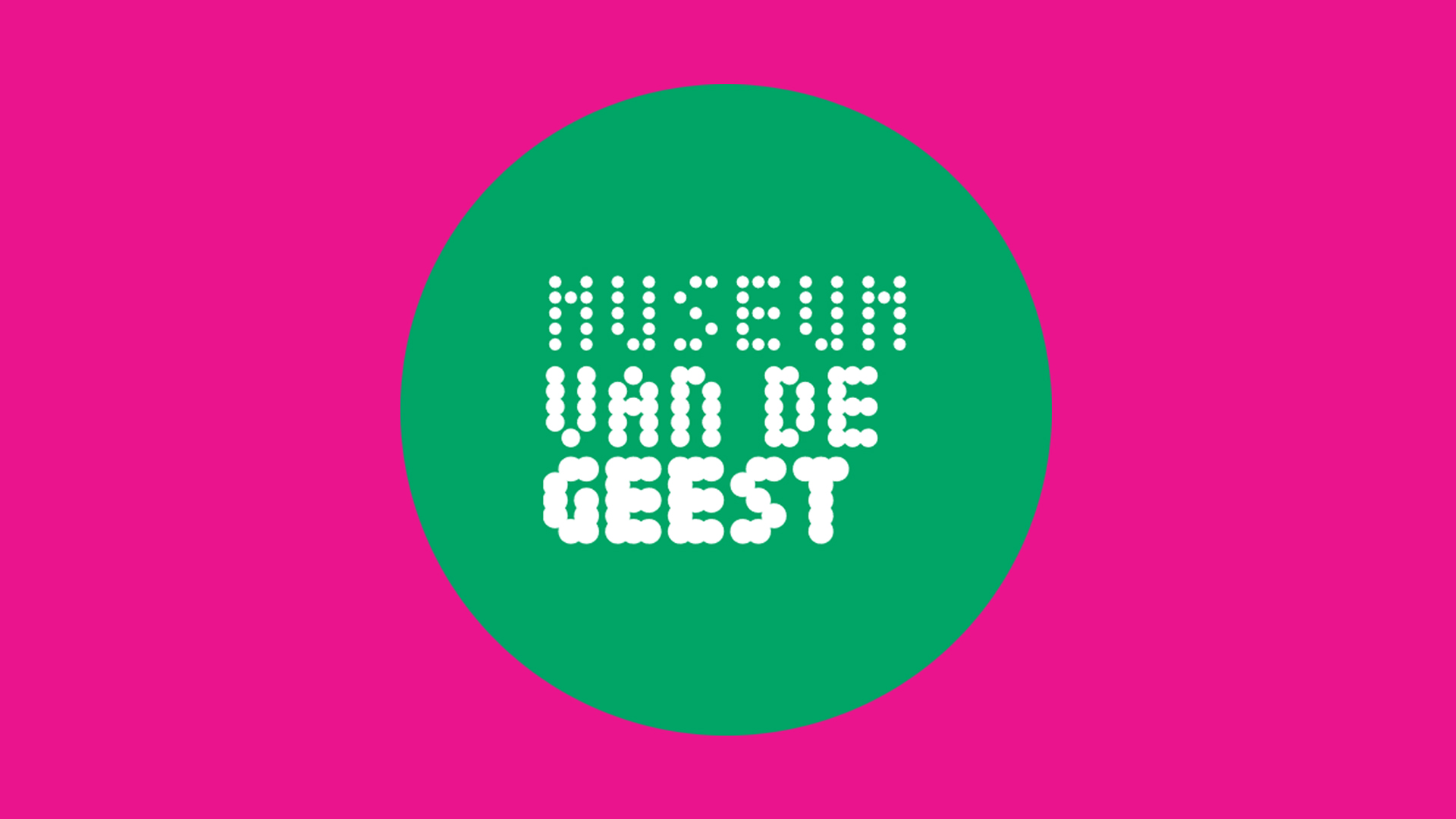
By merging both museums under one umbrella, we create one strong brand, create more impact and a greater reach. For this we have entered into a partnership with strategic campaign agency Fabrique. A new name also comes with a striking new visual identity, which will be rolled out in the coming period. The dots that come closer together in the new logo represent many forms of connection. Such as connections in the mind, connection between people and the connection between the two locations.
The new logo is set in all caps Tiny ( Jack Halten Fahnestock) with dots gaining in weight. At the entrance of the Haarlem dependance, the wordmark makes a striking appearance on a wall that used to separate the Dolhuys court from the street, keeping alleged lunatics from the public view.


")


")


")


 movie posters, trailer, titles")


