
Design is capital exhibition catalog

Cover of Design is capital. Lille Métropole 2020 World Design Capital.
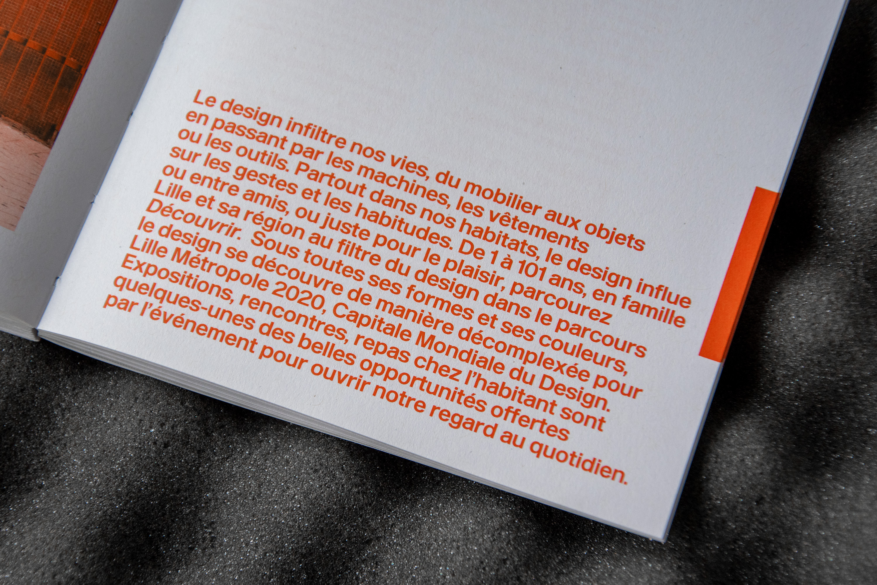
“Design is capital” is the slogan of Lille Métropole, France, as World Design Capital 2020. Founded in 1957 by Jacques Viénot, the World Design Organization represents industrial designers’ interests and contributes to the definition of industrial norms and to projects aimes at improving living conditions. Every two years a different city is elected World Design Capital, based on its innovative use of design for social, environmental or economical development. The title of World Design Capital will then lead to different regional actions: in 2020, Lille launched a call for proofs of concept, direct action projects proofed by large scale experiments, related to different themes: public action, circular economy, living, mobility, care, and the collaborative city.
The catalog Design is capital is a restitution of these actions as much as an exploration of Lille’s background as a city rooted in design issues. The graphic designers of Large worked on an object that would show the simplicity and evidence of a well-designed object, something that doesn’t have to be deciphered to be understood immediately. The use of blue, white and red is a reference to the French flag, anchoring the city of Lille in a national territory. At the same time it’s a deliberate return to primary colors that are at the basis of the color spectrum. This association offers great legibility and is used in the book as indicator for the different sections, made visible directly on the fore-edge.
Large chose to work with Enduro, designed by their own Emmanuel Besse and made available from Production Type. It’s paired with Untitled Serif from Klim Type Foundry. The flexibility of Enduro parallels the idea of design as a tool that adapts to the user’s needs, and is used to set titles and introductory texts. Here, the grotesque style evokes something of a modernist approach to direct information while at the same time having small details reminding of technical sheets for industrial objects, with sometimes clumsy letters (the only clue of that being in the wide eye of the a). On the other hand, legends and longer texts are set in Untitled Serif, contrasting with Enduro and clarifying the hierarchies and textual natures of the catalog. The design of the book could therefore be seen as a direct illustration of the psychological concept of affordance as theorized by James J. Gibson, which qualifies the capacity of an object to suggest its use on its own.


")


")


