
Bach Moog video artwork
Contributed by Thomas McLaughlin on Feb 28th, 2022. Artwork published in
.

Source: www.youtube.com License: All Rights Reserved.
Video screenshot 1
Intro artwork for a video on a Fugue written by Johann Sebastian Bach (Contrapunctus 9).
I found an original manuscript by Bach that featured a stunning handdrawn symmetry-based artwork below the manuscript (see his personal logo engraved in center). I traced this image with Adobe Illustrator to seperate the tapestry drawing and combined it with a German blackletter typeface for the title.
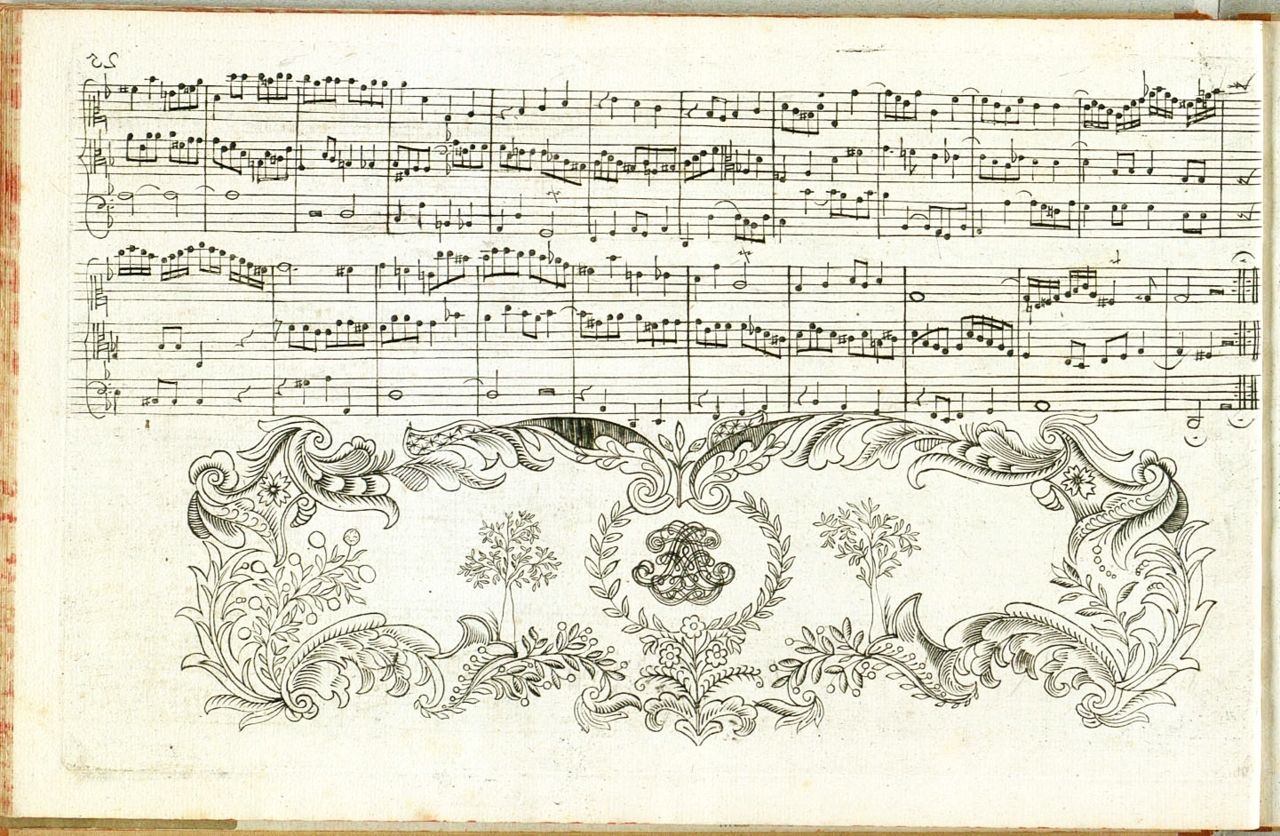
First edition of The Art of Fugue published 1751. Artwork by J.S. Bach shown above can be found on page 30.

Source: www.youtube.com License: All Rights Reserved.
Screenshot 2

License: All Rights Reserved.
Raw trace from Adobe Illustrator

License: All Rights Reserved.
“Die Kunst der Fuge” meaning “the Art of Fugue”


 poster, titles, promotional materials")


")


5 Comments on “Bach Moog video artwork”
Minor nitpick: This is not the manuscript of The Art of the Fugue but the first edition, printed a year after Bach’s death in 1751. It’s available online here, the ornament appears at the end of Contrapunctus VIII. Sounds great on the Moog though.
If you want to aim for higher authenticity, you could use a long s (ſ) in “Kunſt”. German typesetting rules for fraktur prescribe the use of two forms for the letter s. In a nutshell, ſ is the default while the “round” s only comes into play in the final position of morphemes.
There are several digital versions of Breitkopf-Fraktur which are different in all kinds of aspects, one of them being the support of this feature. The Profonts version doesn’t offer a long s at all, rendering it useless for any traditional application. In SoftMaker’s “Pro” version, the ſ is way too big and heavy (while the s looks too small).
Breitkopf Fraktur as offered by MacCampus not only has a properly designed ſ, but also offers a range of ligatures including one for ſt. The same is true for the freebies by Dieter Steffmann and Gerhard Helzel’s version for Lindenthal, although these don’t let you access the ligatures via OpenType features. Steffmann’s additionally suffers from poor outlines.
Hi Max,
Thank you for the comment. Not a nitpick at all! I should’ve researched the origin of the artwork more completely (I’ll be sure to update the post).
Hi Florian,
Thank you for the comment! It’s so interesting to see the subtle differences between each version of this typeface (especially the differing weights of stroke on the letter 'K’).
I was vaguely aware of the alternate 'long s’ character (as I had seen it in use on the title page of the manuscript) but was worried about translation and the fact it may be mistaken as the letter 'f’ (maybe by some viewers who aren’t as well versed in German typography as you seem to be).
Either way, thank you so much for bringing it to my attention…
You’re welcome, Thomas! I certainly didn’t mean to imply that you have to use the long s. Today that character can indeed pose a legibility challenge. Contemporary users in Germany are often unaware of the traditional rules, too. And period users didn’t always make a distinction between the two forms either, certainly in fields beyond print typography.