
Friends’ Central School brand identity
Contributed by Lucy Price on Jul 16th, 2021. Artwork published in
circa January 2021
.
Source: lucyprice.com License: All Rights Reserved.
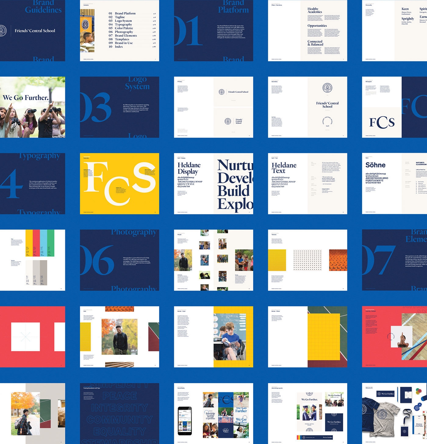
Founded in Quaker Values, Friends’ Central School is driven by a simple idea: We Go Further. This mantra embodies the school’s commitment to academic excellence and their dedication to awakening courage within each one of their students.
Typography and photography play a pivotal role in pushing the boundaries throughout the brand to express their mantra. Heldane and Söhne, by Klim Foundry, were a perfect pairing to go with this historic institution. The fonts’ classic forms, paired with the extensive library of weights, will carry the brand well into the future, and allow for innovation along the way.

Source: lucyprice.com License: All Rights Reserved.
.jpg)
Source: lucyprice.com License: All Rights Reserved.

Source: lucyprice.com License: All Rights Reserved.

Source: lucyprice.com License: All Rights Reserved.
Source: lucyprice.com License: All Rights Reserved.


