
Manners Institute visual identity and jerseys
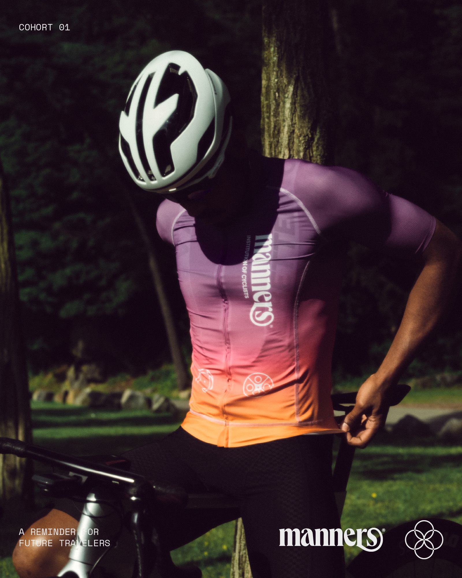
Renald Louissaint designed the visual identity and inaugural collection of Manners Institute, an experimental cycling entity focused on promoting physical and spiritual wellness, as well as inclusivity, nobility, and community-building through the sport of cycling.
Queens by Kilotype is used in the wordmark with the e slightly rotated and r and s joined dynamically. An animation by Connor Campbell with sound by Patrick Savile reveals the wordmark in all its glory.
On the jerseys as well as in a set of promotional posters (with photography by Aaron Laserna) and videos (directed by Stay Alive Studio) Queens can be seen next to Roobert by Displaay Type Foundry for headlines and text, and Space Mono by Colophon for captions. An as yet unidentified type outlined and with tight line spacing is used to create abstract patterns to striking effect.
The outlined lettering seen on one of the jerseys and in one of the social media images below uses a yet unidentified typeface. [edit: It’s Await, see comments.]


")


")


 movie posters")


3 Comments on “Manners Institute visual identity and jerseys”
The line A Better Tomorrow is considered to be Ryan Scheuer’s Await from 2019. it comes with Normal and Oblique styles.
Here is a link to the type designer’s website: sauce.design
Thanks, Jay! Added.