WOMXN: Sticks and Stones by Lexy Wren-Sillevis (Pyramid)
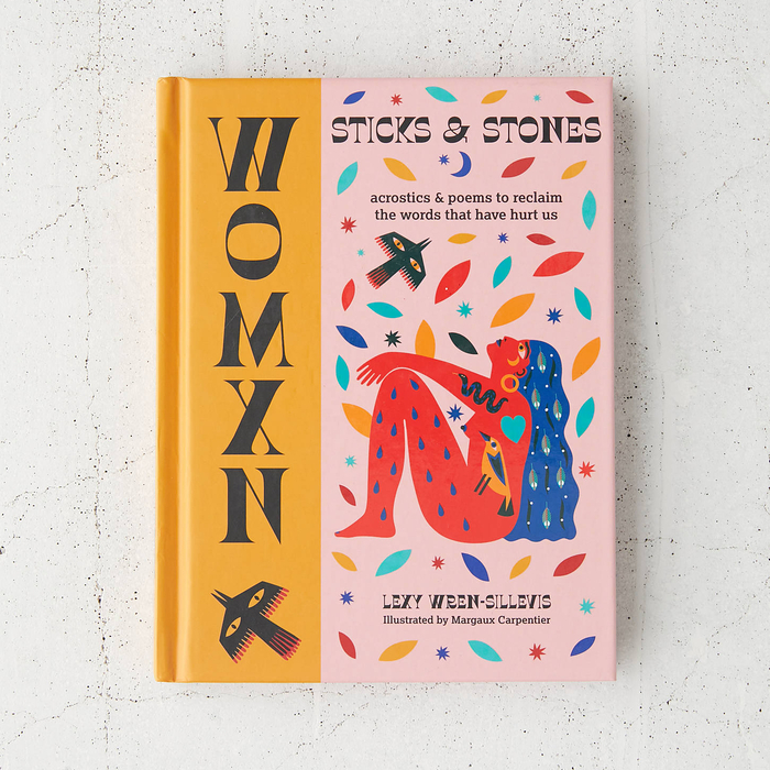
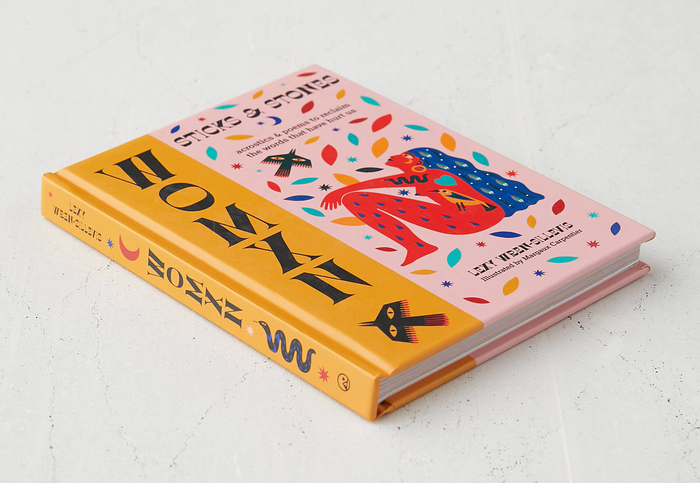
WOMXN: Sticks and Stones is a book written by Lexy Wren-Sillevis and illustrated by Margaux Carpentier. From the publisher:
“There are so many words, insults, labels and boxes for women to be packaged and packed off in. Often, but not always, they’re words coined by men.”
Why that is, is a bigger conversation that is starting to be had by women everywhere. We’re slowly, but oh-so-surely, making it clear that there is no man in womxn. We’re writing him out and writing us back in, and we deserve a suffix all of our own that is free from patriarchal roots. So from here on in, we are WOMXN.
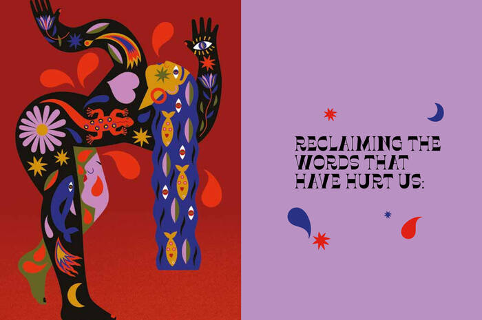
Sticks and Stones is a powerful reclamation of the slurs and insults thrown at women for centuries. It’s a righting of wrongs – a rewriting of sexist, belittling and shaming language. It’s a tool for breaking free from the stereotypes and impossible standards used to confine women, transforming them into messages of resilience and resolve. And, most importantly, it’s a rallying call for change, healing and empowerment.
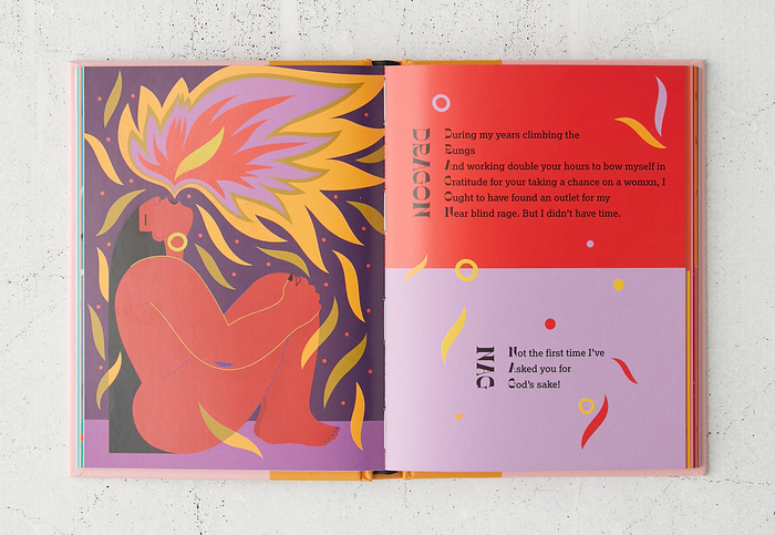
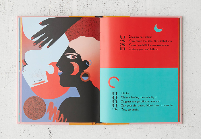
It takes the words, slurs, insults and labels that are used to diminish women every day and breaks them down and tears them apart. It transmutes and rewrites these words – sometimes with all of the pain they trigger, sometimes in the form of positive affirmations, mantras and poems – all told in acrostics.
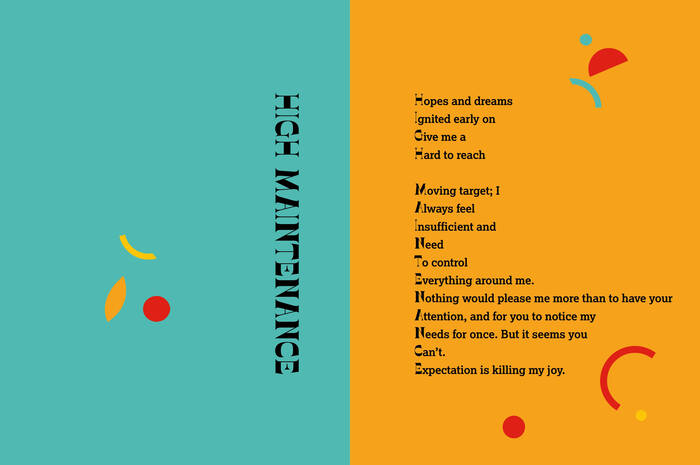
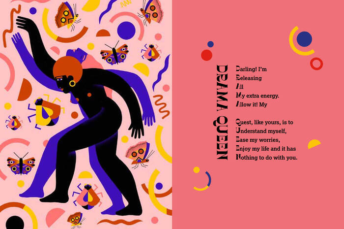
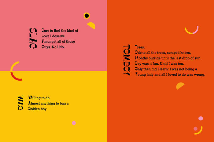
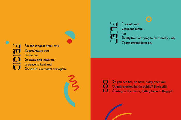
The cover was designed by Evi O. Studio and the interior by Hannah Coughlin at Pyramid. The typeface chosen for the title as well as for the reclaimed slurs and insults is Vulture. Drawn by Ellmer Stefan for his Pyte Foundry in 2016, this all-caps design is “wrong” in terms of contrast: conventionally thick letter parts here are thin, and vice versa. Vulture brings together various 19th-century influences: the reversed contrast of Caslon’s Italian is married to the trumpet-shaped flare serifs of faces like Athenian. In his review for Typographica, Frank Grießhammer commented: “This design satisfies voyeuristic tendencies; it feels like I’m seeing something I shouldn’t be looking at.”
The play with broken conventions is taken to extremes on the cover: With the stacked letters, the title “WOMXN” looks as if it was mirrored. This vertical arrangment works less smoothly for the initial letters of the acrostics. Especially the thin I lacks presence and doesn’t lend itself to vertical reading – it only really performs well in the context of a (horizontal) word image. Vulture is paired with Lexia, a low-contrast slab with humanist proportions that provides a strong contrast. The spelled-out words are repeated to the left of the poems. Here they are cleverly set rotated, and hence aren’t instantly graspable – like the solution to a riddle.
Formats
- Books (5434)
Topics
- Literature (2510)
- Activism (904)
Designers/Agencies
- Evi O. Studio (10)
- Margaux Carpentier (1)
- Hannah Coughlin (1)
Tagged with
- Lexy Wren-Sillevis (1)
- Octopus Books (5)
- hardcovers (1080)
- book covers (4804)
- book interiors (2890)
- illustration (1271)
- poetry (312)
- acrostics (1)
- women (194)
- gender issues (58)
- sex issues (10)
- feminism (188)
- emancipation (30)
- stacked glyphs (434)
- rotated type (1840)
- initials (162)
- book spines (1227)
- half and half (73)
- colorful/multicolored (994)
- Pyramid (imprint) (1)
- typeface combinations (3133)
- contrasting typefaces (393)
Artwork location
- United Kingdom (2762)
- London (1522)

