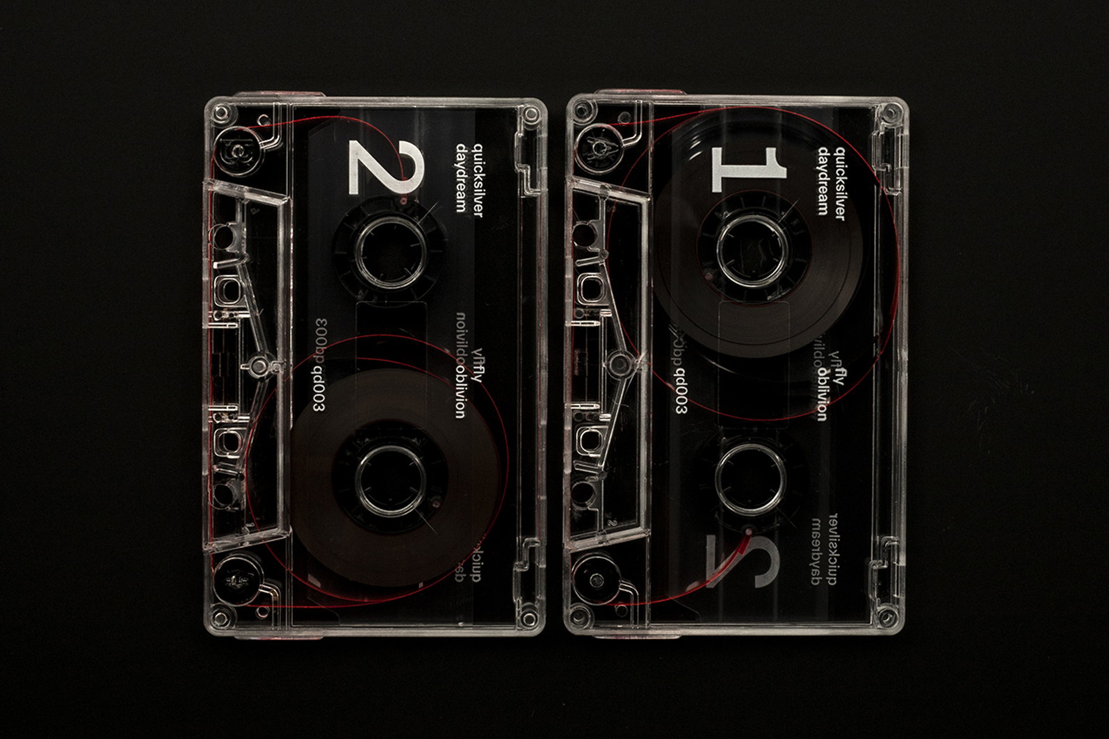
Quicksilver Daydream – Fly Oblivion album art
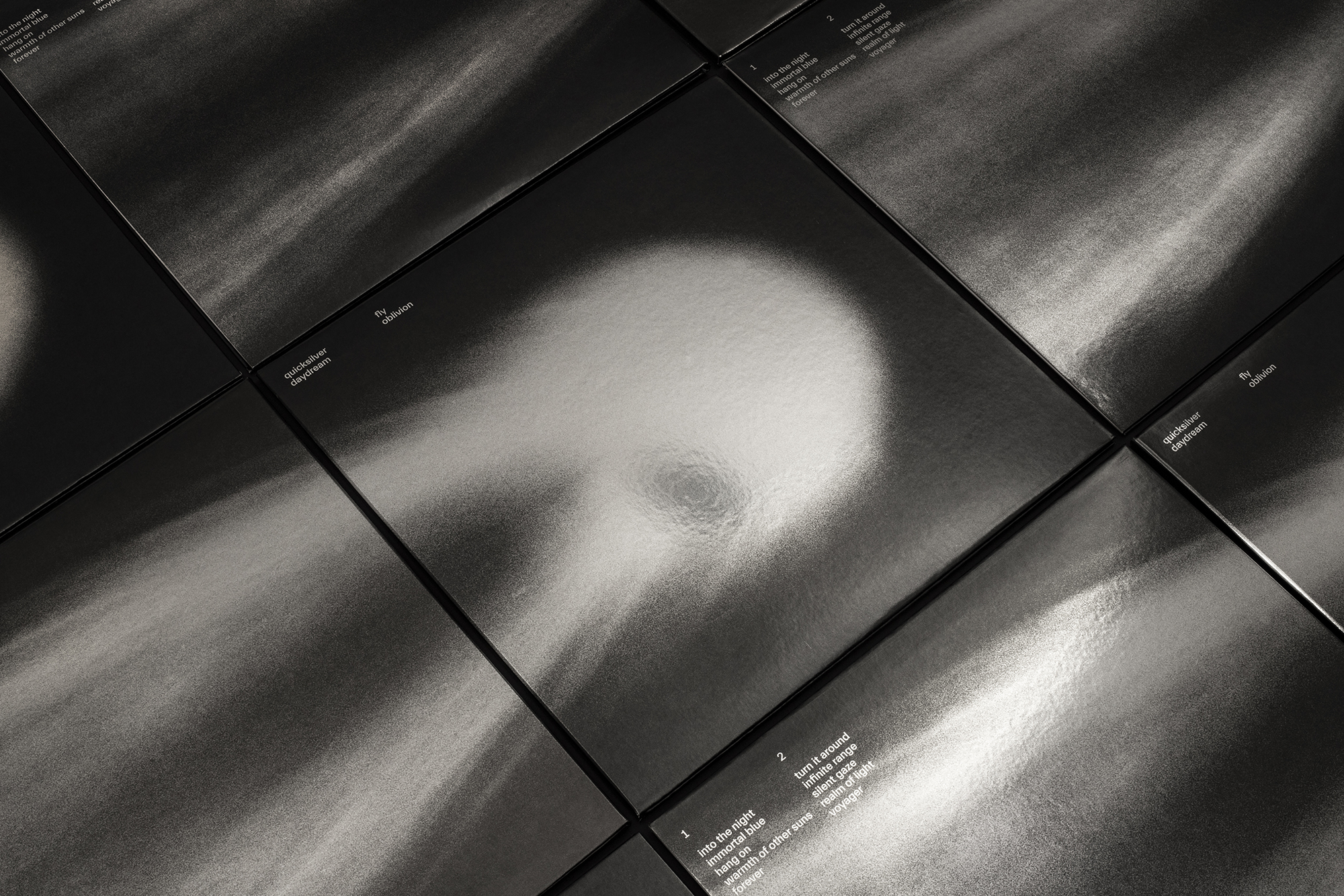
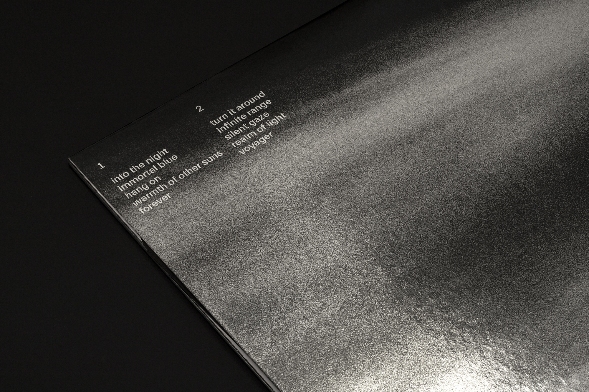
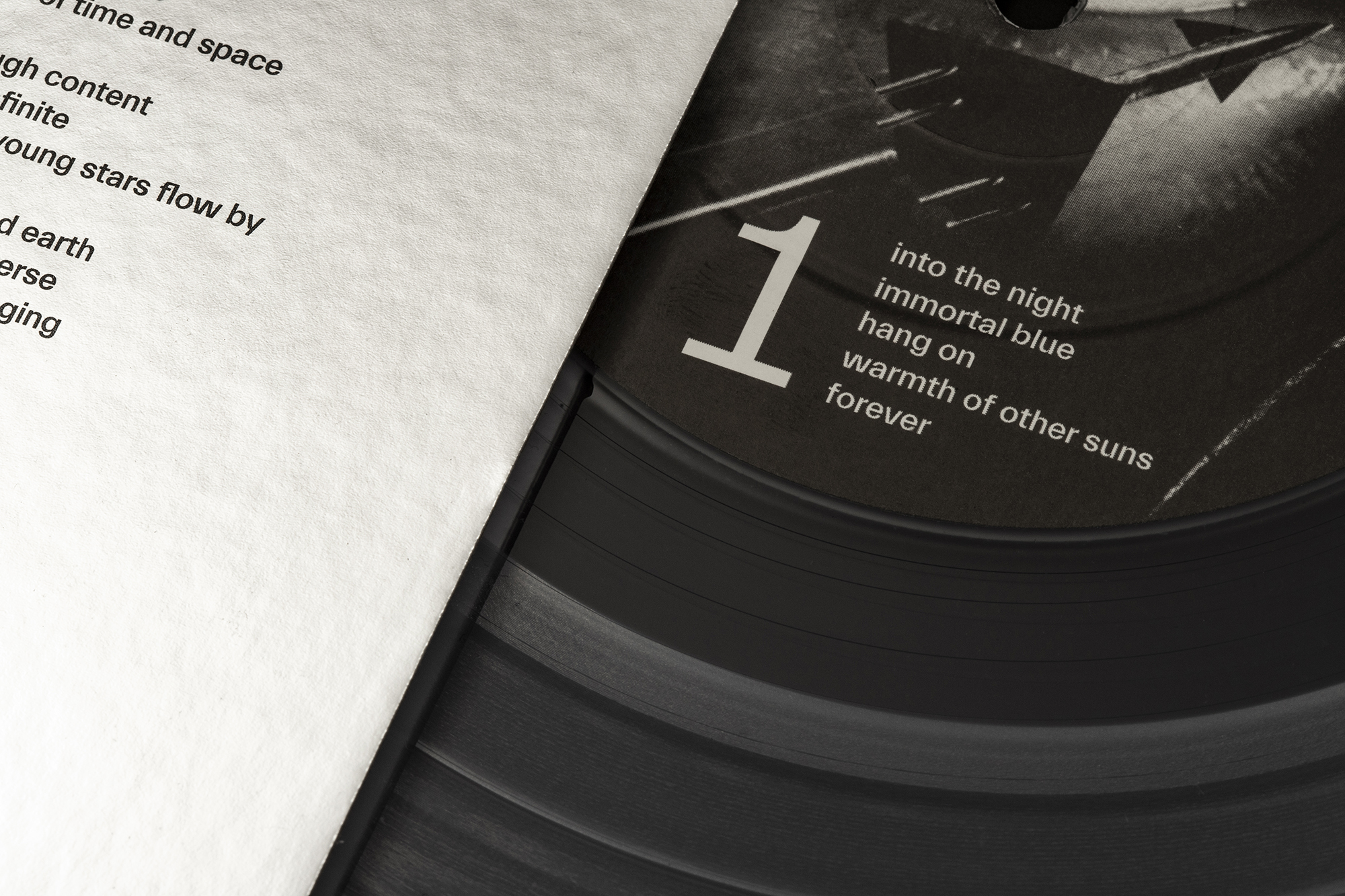
TWK Everett is used as the sole typeface on the artwork for Fly Oblivion, the second full-length album by Brooklyn-based rock band Quicksilver Daydream. The artwork was designed by Order:
The lyrics for “Fly Oblivion” have repeating themes of reflection, planetary orbit, light, immortality, and weightlessness, to name a few. As a way to visualize these themes, we searched for imagery that looked surreal — depictions of reality that were distorted through an active process.
Everett was chosen because of its “mechanical” nuances (flattened points), resembling aeronautic spacecrafts.
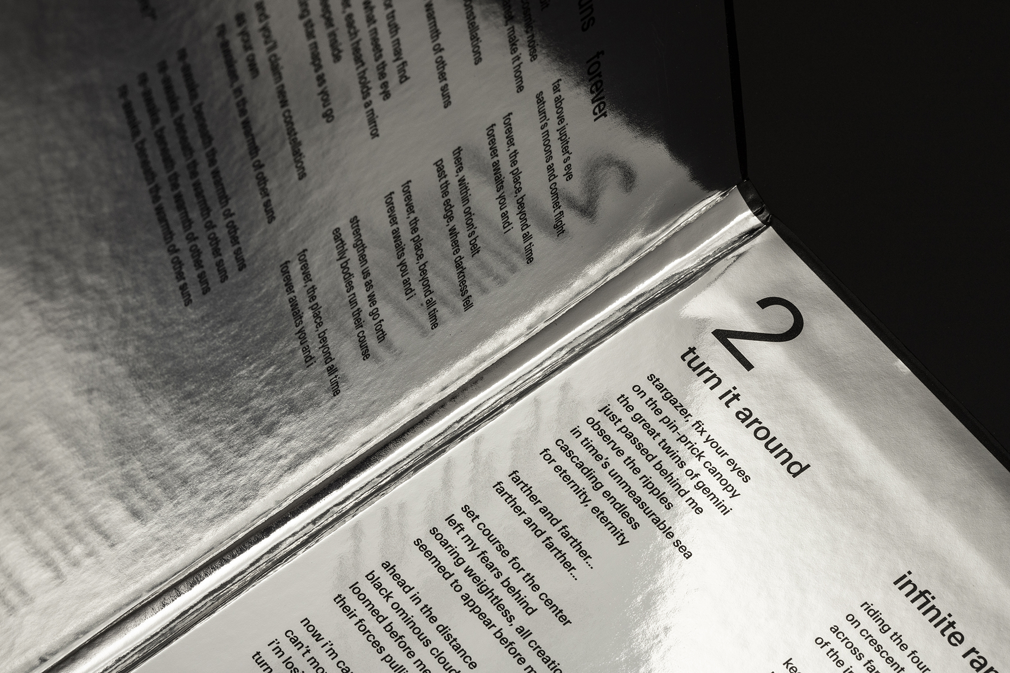
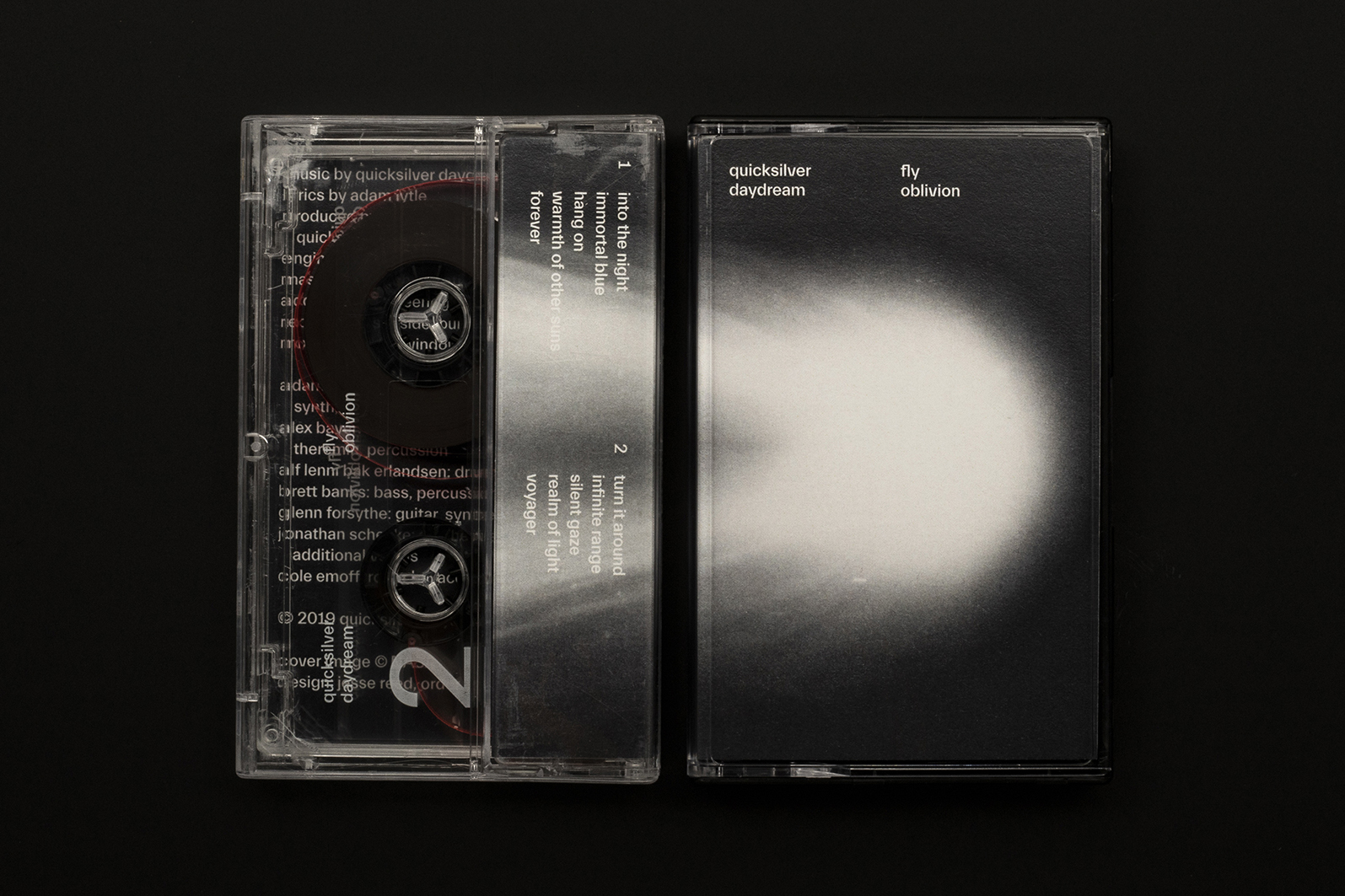
The final packaging system is a combination of reflective, transparent, and tactile material — the results are only fully understood in physical form.
The entire album jacket is printed on reflective silver paper — this allows the listener to literally reflect on the lyrics.
Tape cassettes follow the same themes — fully transparent shells hide and reveal information as the tape is transferred from one spool to the other.