
Arts de l’Islam un passé pour un présent exhibition
Arts de l’Islam un passé pour un présent:
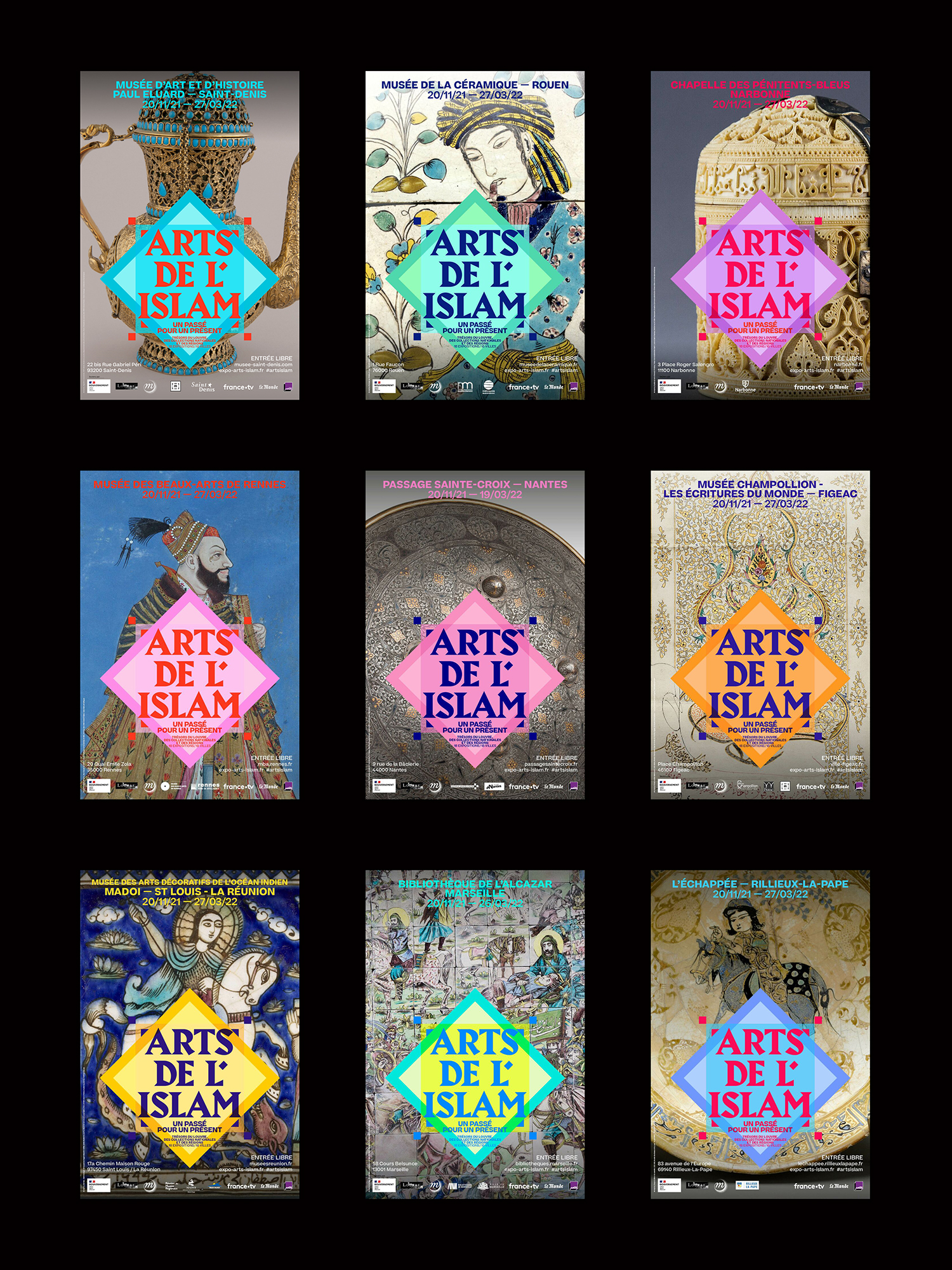
In the face of religious fanaticism, culture must relentlessly be a bulwark and a lever to transmit, open up to others, give back the keys to understanding crossed pasts in order to build a shared future. It is in this perspective that the Ministry of Culture has mobilized by asking the Louvre and the Réunion des Musées Nationaux – Grand Palais to organize in the fall of 2021 a project intended for a very large audience, and to the younger generations in particular, to take a fresh look at the arts and cultures of Islam. From November 20, 2021 to March 27, 2022, 18 exhibitions in as many cities in France will be presented to the public, in a museum, a media library, a library, a cultural space. For each hanging, 10 works, both historical and contemporary, from the Department of Islamic Arts at the Louvre Museum and from national and regional collections, will embody the richness of Islamic cultures and their inscription in history in France for over 1,300 years.
Each museum has its own colour palette, and hero image. Alias Harbour is used for the logotype and headline typography throughout, with Beatrice for secondary type for posters and website. The visual identity was conceived by H5, Paris.


Exhibition at Musée d’Art et d’Histoire Paul Eluard de Saint-Denis

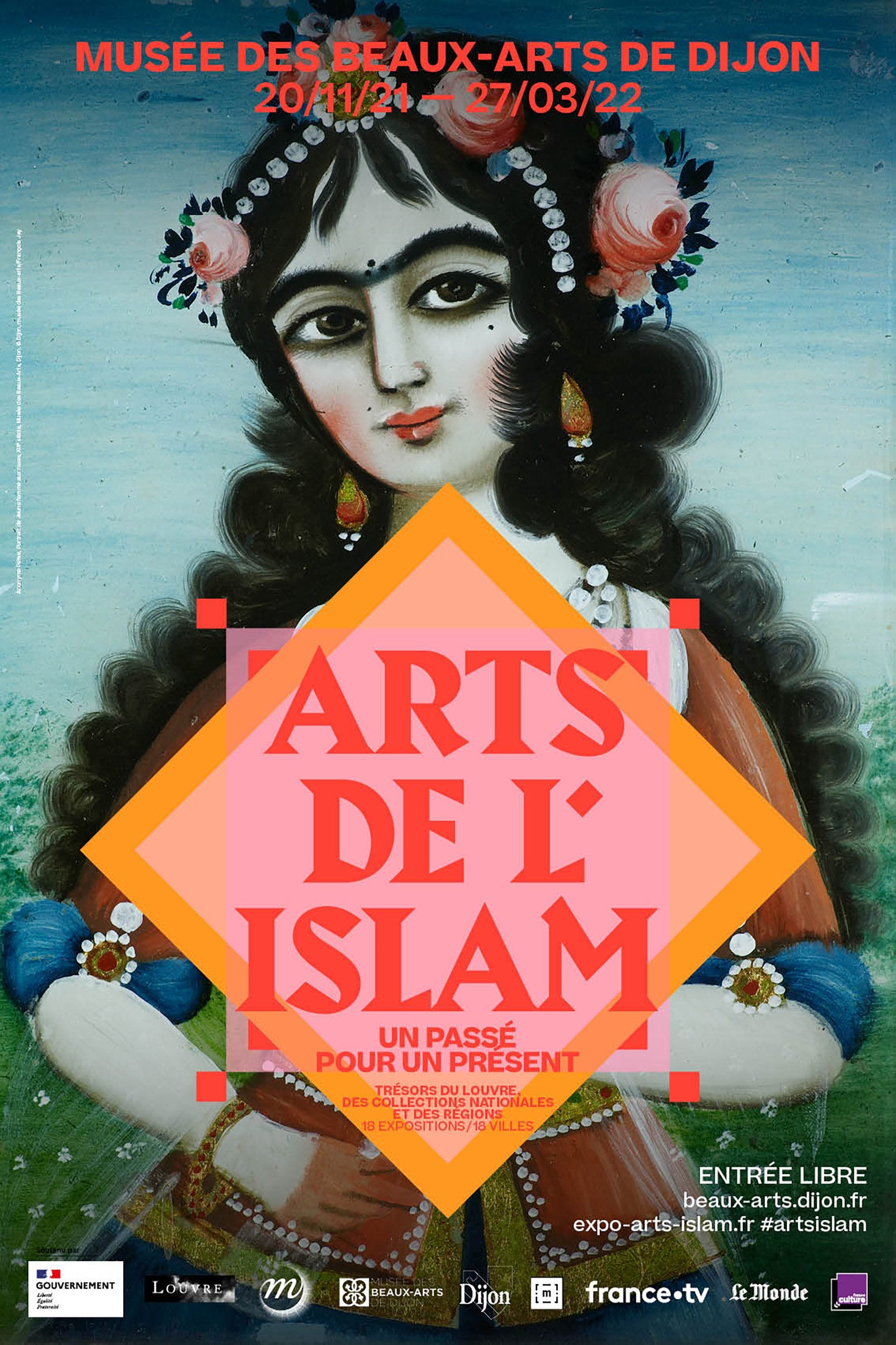
Exhibition at Beaux-Arts de Dijon

Exhibition at MADOI - Domaine de Maison Rouge, La Réunion
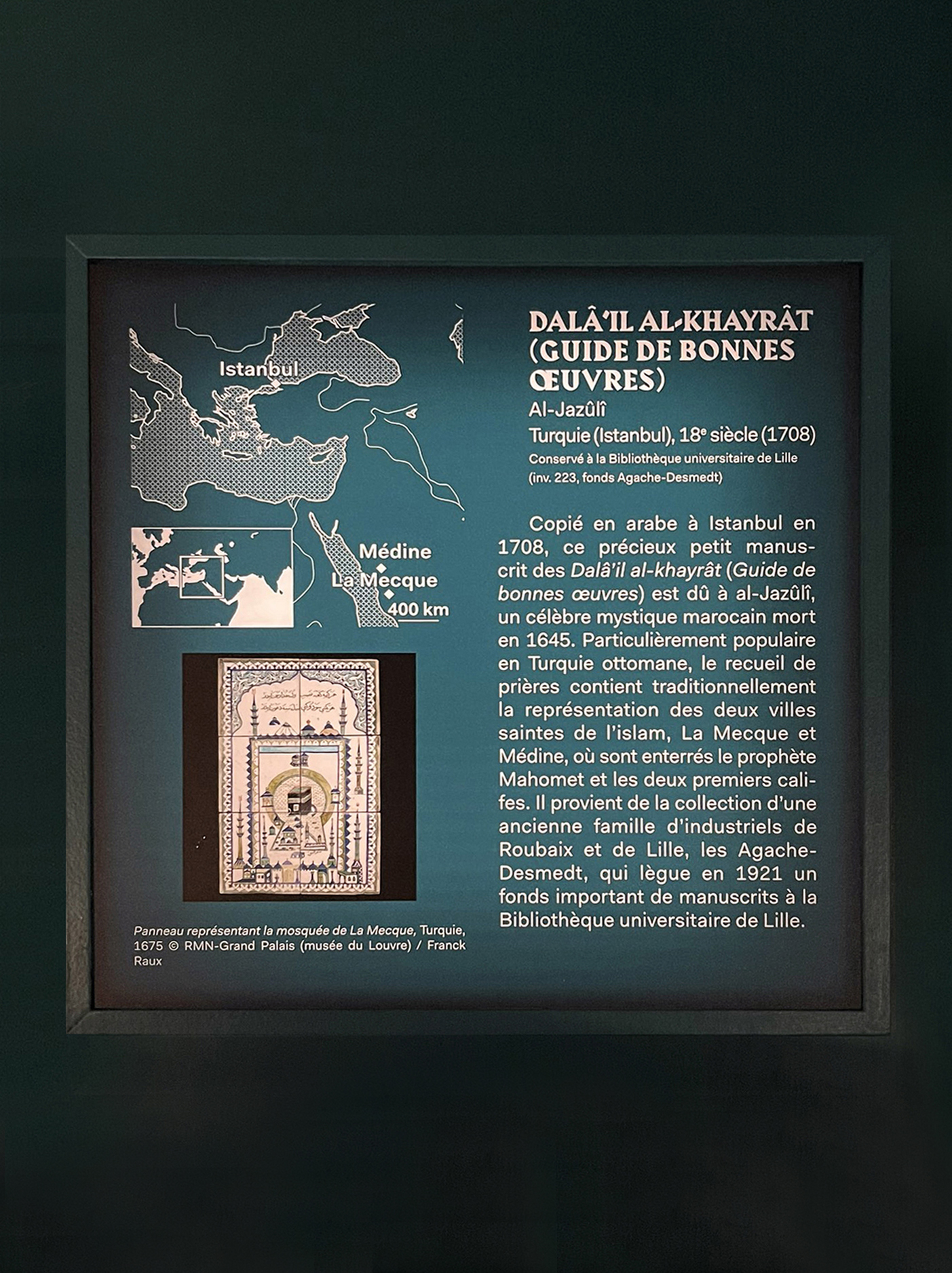
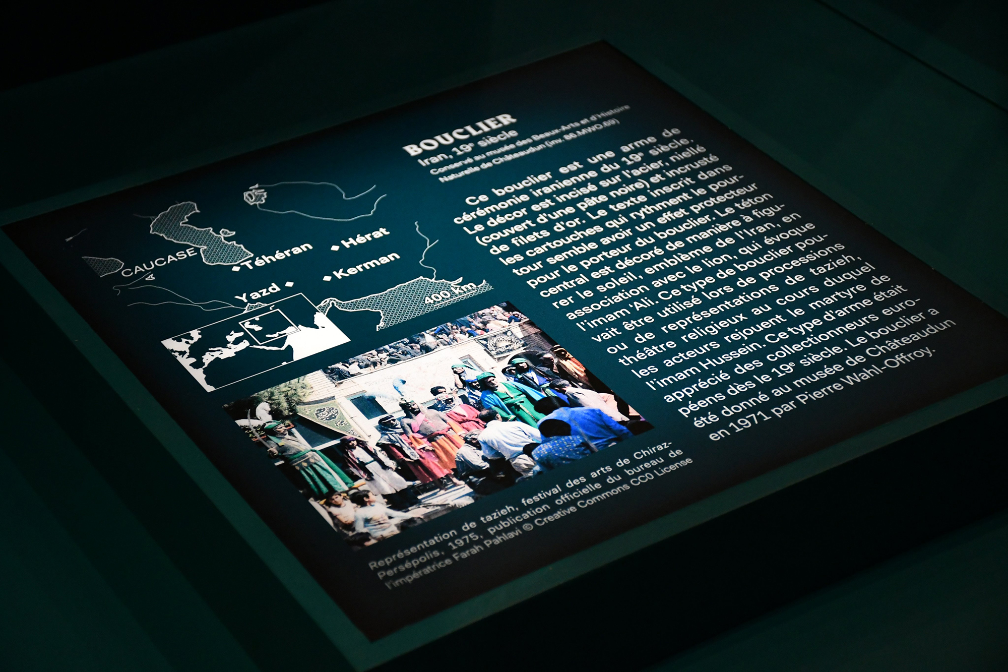
Back-lit caption panel
Exhibition at Musée des Arts Précieux Paul-Dupuy
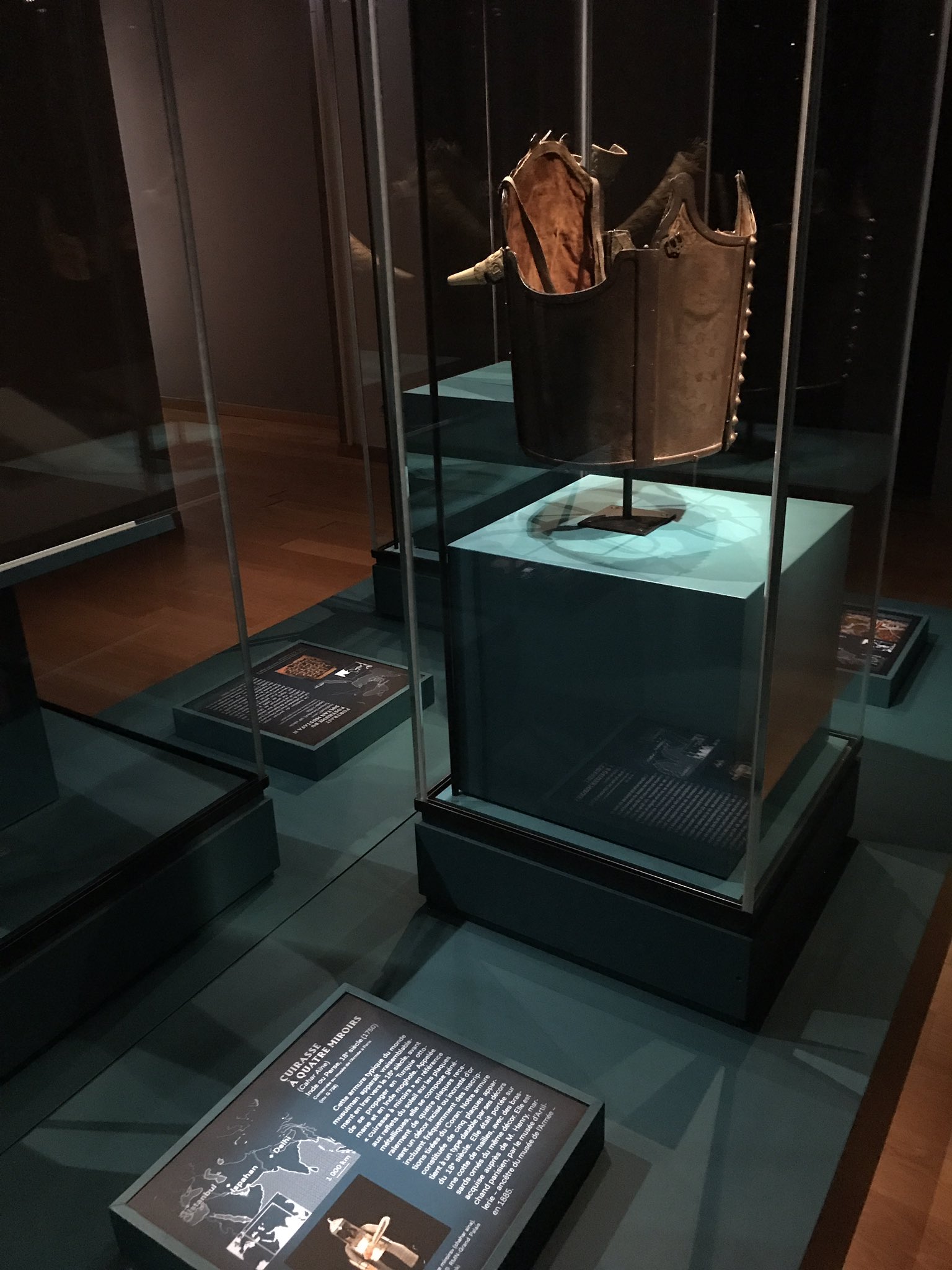
Back-lit caption panel


</cite> at The Poetry Club")


 movie posters")


")


3 Comments on “Arts de l’Islam un passé pour un présent exhibition”
That apostrophe…
Do you mean that it’s rectangular and not curved or tapered? Or the fact that it’s separated from the word “Islam”?
For the former: It’s not the default form included in the font. However, Harbour Bold’s original apostrophe is a parallelogram, too. Chunky, yes, but it goes well with the overall style of the typeface design. I’d argue that you have more leeway in a logo. The designers of H8 definitely put effort into the details – they decreased the size of the top right serif in L, so that the apostrophe has more space – which suggests that this isn’t an accident, but very much intentional. I can see how a rectangular shape might echo the general motif of squares, and the four framing squares in particular. Maybe they should have gone all in, and used a perfect rotated square (diamond), or a triangle, for a truly stylized solution. There are more modifications: the base of the second L was made less wide, to accommodate to the subsequent A. In M, the center vertex was moved to the left, and the top left enlongated. The bottom of the counter in R got straightened out.
Furthermore, the S got less flat terminals, and the roof of T is wider and heavier. Here’s a quick resetting in Harbour Bold, with adjusted spacing.