Théâtre de la Ville 2021–2022
Contributed by Swiss Typefaces on Oct 12th, 2021. Artwork published in
September 2021
.
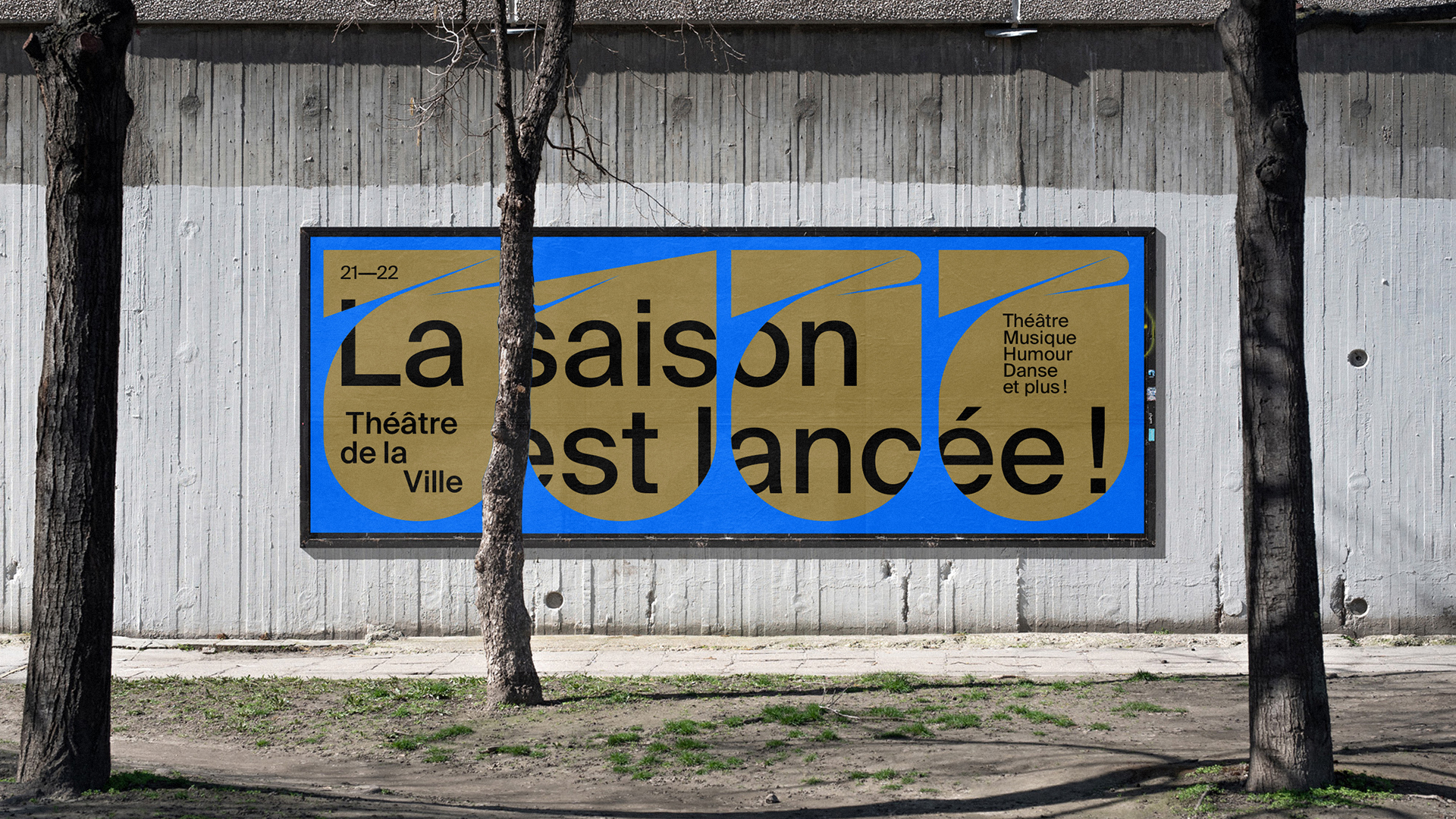
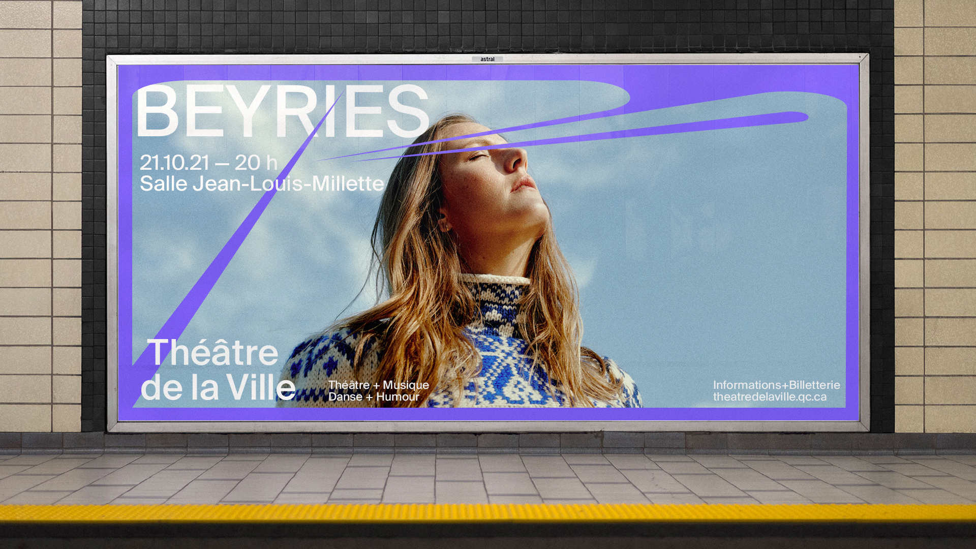
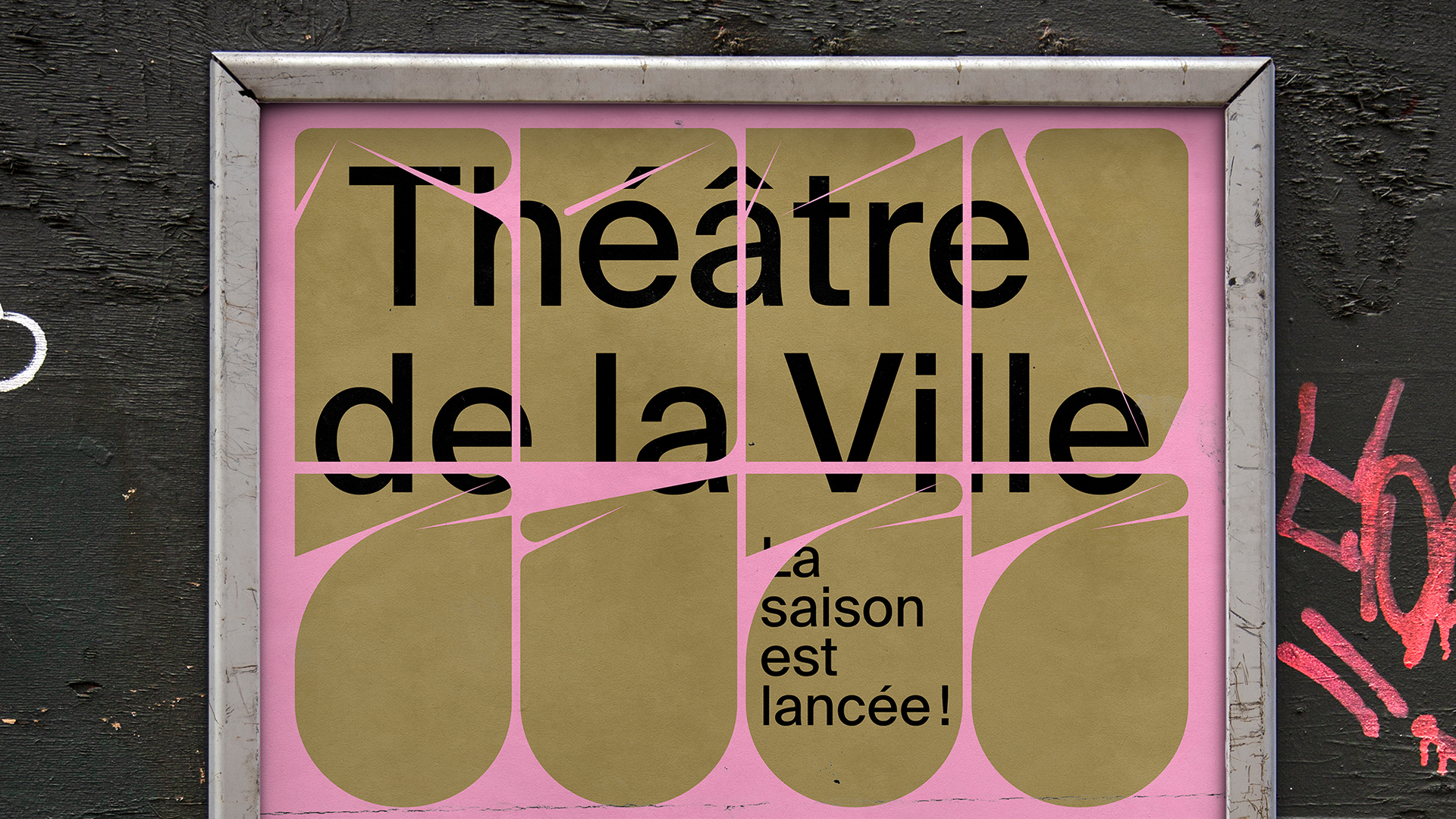
For the new identity of Longueuil’s Théâtre de la Ville, Compagnie et cie. used a radical and almost abstract typeface where each letterform is conceived as an organic piece of illustration, able to morph to the format. [This typeface is Dot19 by Metis, see comments.] These shapes are then filled with communications, either with type (set in Suisse Int’l) or pictures. A palette of a dozen colors adds to the flexibility of the system while preserving a consistent feel.
Suisse Int’l is part of the Suisse family, available from Swiss Typefaces.
















































2 Comments on “Théâtre de la Ville 2021–2022”
The letterforms and the rounded “21–22” could be Dot19, a typeface designed during 36 Days of Type 2019 and released in May of the same year by studio-io (aka Simon Bent) of Metis Foundry.
Absolutely! Outstanding, I hadn’t seen that one before. Thanks, Jay – added now.