

Vizkultura is an online resource and news portal for arts, architecture, design and creativity. To celebrate five years of digital publishing they created their first ever printed issue – V magazin. The eclectic layout utilizes many typefaces from established Croatian type designers. The main typefaces are Punta (designed by Marko Hrastovec, available from the newly launched type foundry Hot Type) and Mote (designed by Hrvoje Živčić and available from Typotheque). Additional typefaces include Zico Sans by Hrastovec, Gordian Kapitalen, Tremolo and Francis Gradient by Nikola Đurek, and Brenner Script by Đurek & Hrastovec (all available from Typotheque).
Photos by Marija Gašparović.


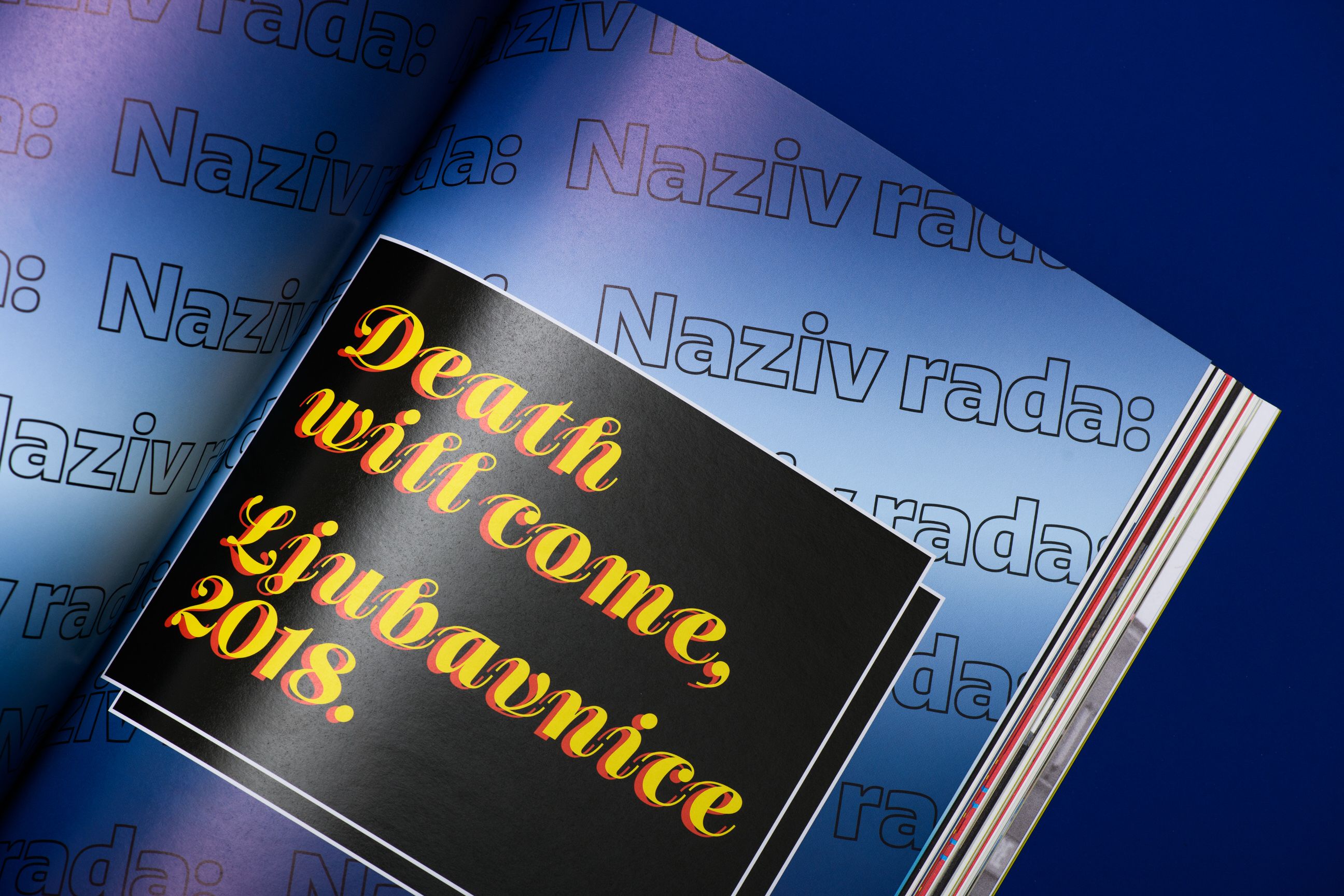
“Death will come” is set in Brenner Script. The outlined text on the background is set in Zico Sans.
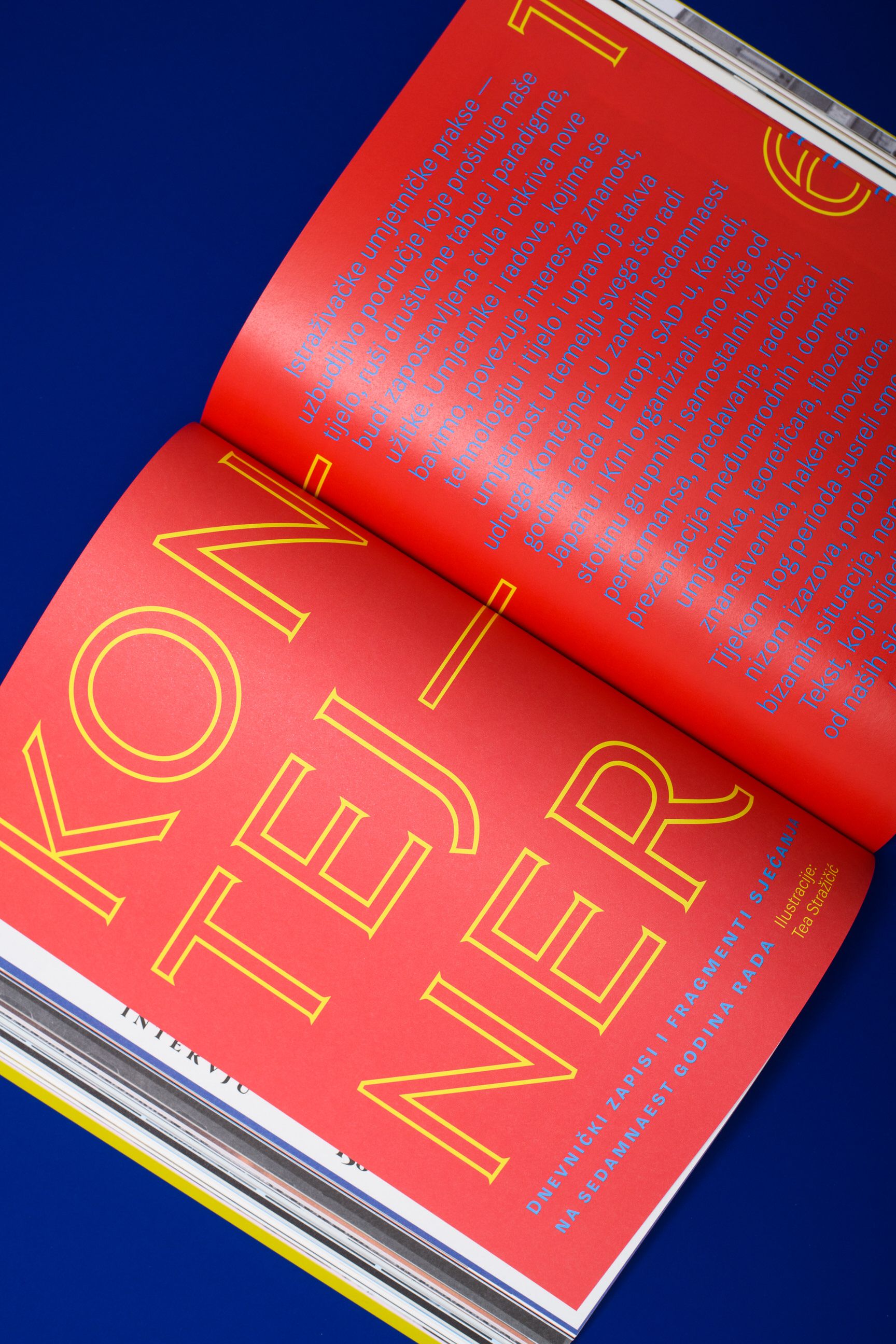
The large outlined caps are from Gordian Kapitalen. The sans serif is Mote.

The headline is set in Tremolo Stencil Text, the intro text in Tremolo Display.

Francis Gradient set on an angle, on top of custom lettering


")


")


1 Comment on “V magazin by Vizkultura”
I find the Zico very interesting, but actually personally use the Qubo, which is a bit more balanced. It’s another font candidate that’s underrated.