
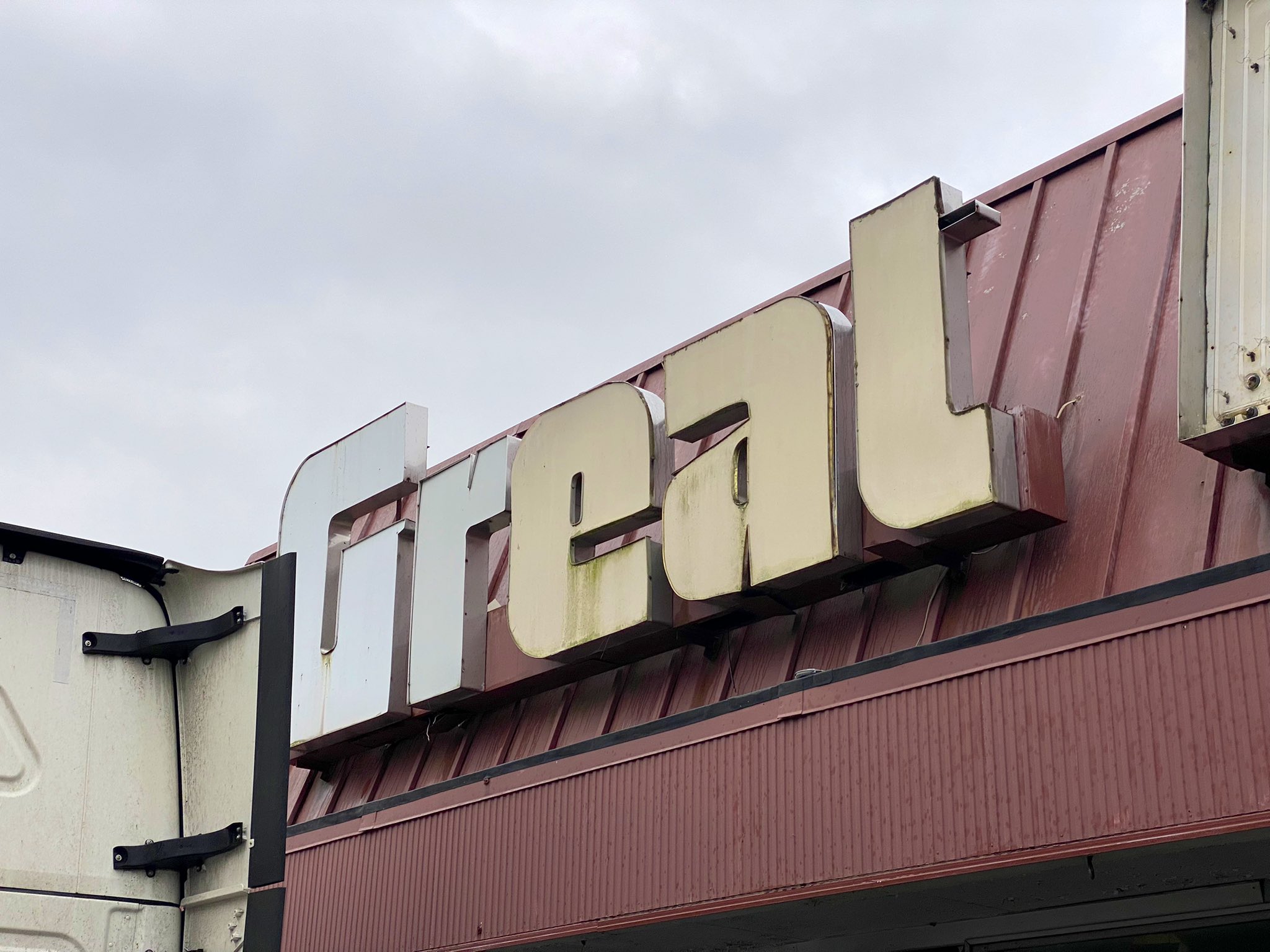
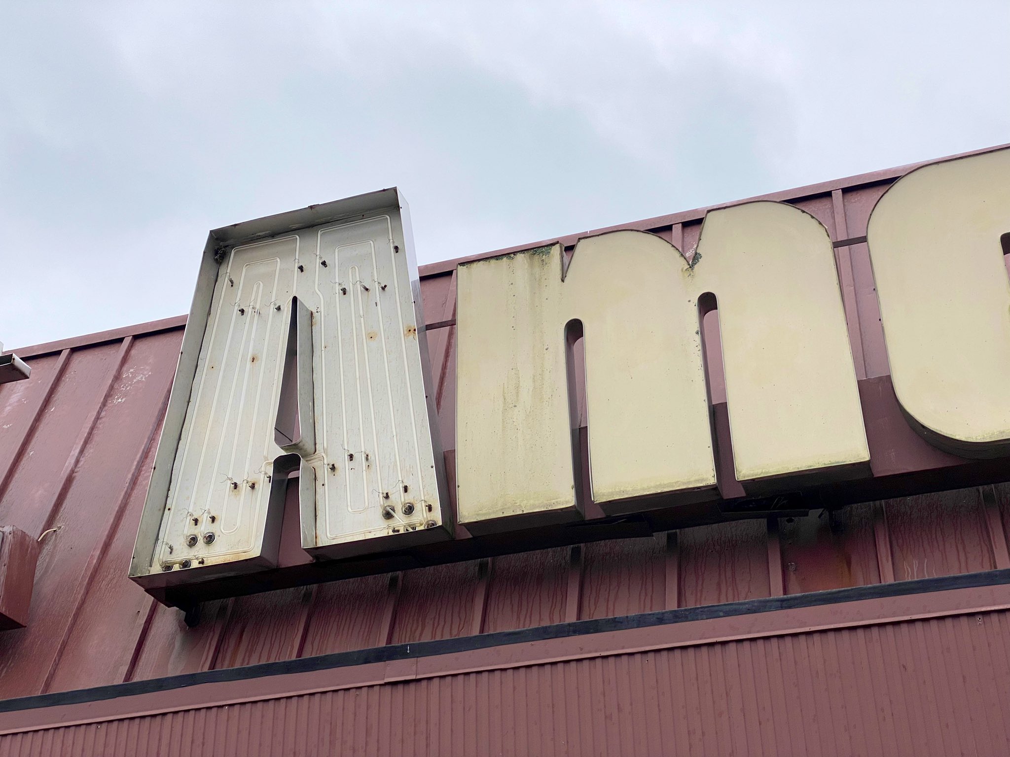
Great American, Bainbridge

Abandoned building and all-purpose metaphor in Bainbridge, NY (via Jesse Reed).
Great American is the name of a chain of grocery stores in Upstate New York. The logo is probably from around 1980. it’s based on Neil Bold, a photo typeface originally designed by Wayne Stettler in 1966 and released by VGC. The i dot was dropped and the hairlines thickened up.
From a 2018 article by Big Chuck Asks:
Eventually Great American felt the squeezes from the Price Choppers and Hannafords and other big box stores and they too went under. They had nearly 80 stores in Upstate New York at one time. That number dwindled as financial pressures became more severe. They entered bankruptcy proceedings in 1995.
After the financial debacle, the Great American stores began dropping like flies all over Upstate New York. In one year alone, from 1995 to 1996, Oneonta, Binghamton and New Berlin lost all of their stores. Norwich felt a big blow as the supermarket headquarters there shuttered. Today, what was once an embarrassment of riches for my little hometown, has now turned to rust. The Bainbridge Great American has been boarded up for years.
Flickr user drpep has images from back in 2009, when the stores in Bainbridge, Afton, and Unadilla were still open. See also this thread on Groceteria for more info about Great American.


")


1 Comment on “Great American, Bainbridge”
Over on Flickr, Paul (fotofish64) shares a picture of another Great American ghost sign. This one was taken in April 2020 in Canajoharie. Here the two words are stacked. Chances are that this is the original arrangement, which would explain the omitted i dot.