
Quite Nice

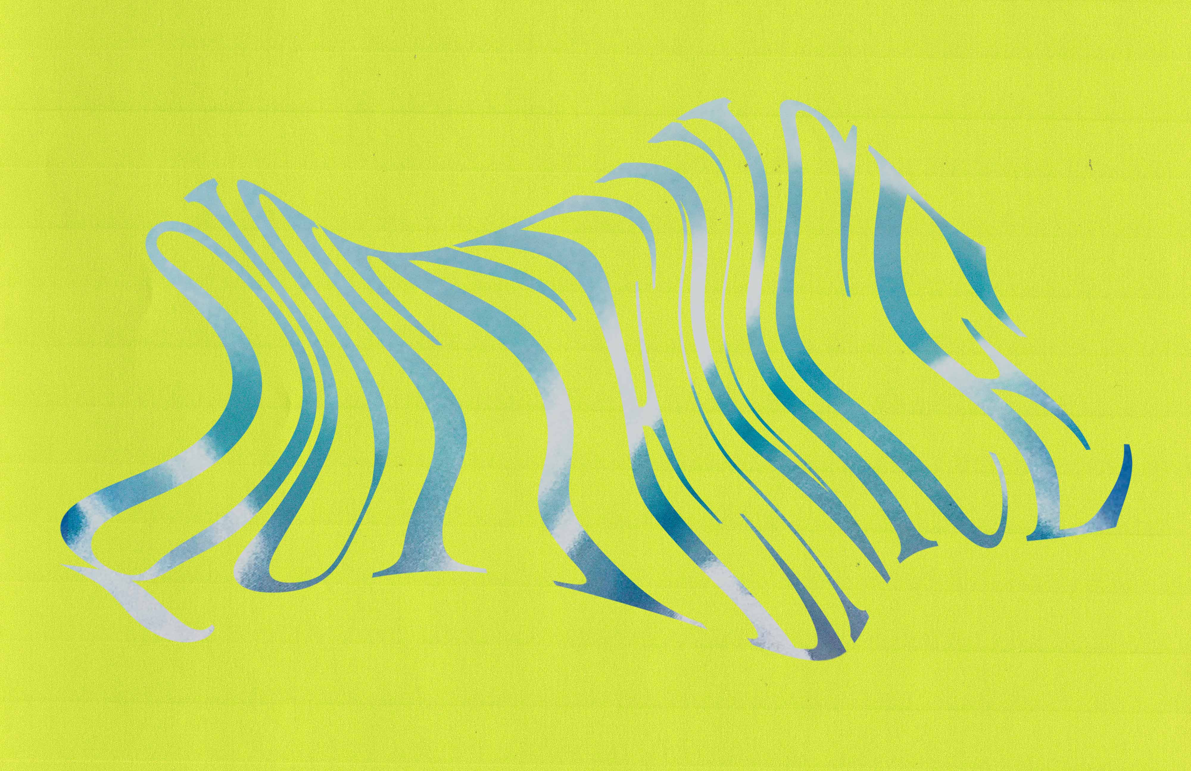
Let’s make your space vibrate. Quite Nice is an interior design studio and shop located in Oakland, California. The shop curates a selection of vintage curiosities, with an emphasis on glass work that is both elegant, mesmerizing and at times kitschy. Quite Nice needed a brand identity that embodied the beauty of the objects and transformative joy of making a space ‘quite nice’. The logo is dynamic and textural acting both as a mark and a window into the reality of the studio.
The logotype has been customized based off of Chronicle Display Compressed, which is also used in large scale messaging as seen on the poster series. Where as, on the business card the font has been distorted and stretched to fit the space. The brand has an overall bold, Illusionist aesthetic taking inspiration from the glass work and weed culture. On the business card to elevate the elegance, while keeping to the modern look and feel Cardinal Italic is used contrasted by the bold, straightforward Neue Haas Grotesk.


")


 movie posters")


