Reclaiming the City, Reclaiming Words: Póli Gynaikón – City of Women
Looking back on the Greek feminist periodical from the 1980s
Marsha Rowe, editor of the groundbreaking feminist magazine Spare Rib, famously recalled: “Suddenly, words were possible.” She was referring to a general climate of liberation in the early 1970s, when the creation of women-run print media allowed women to express themselves freely. This is also how women in Greece must have felt when the second-wave feminist movement erupted after a painful seven-year military dictatorship (1967–1974). But Greek women’s liberation and involvement in writing and publishing didn’t start then; in fact, women were present in publishing in Greece long before that.
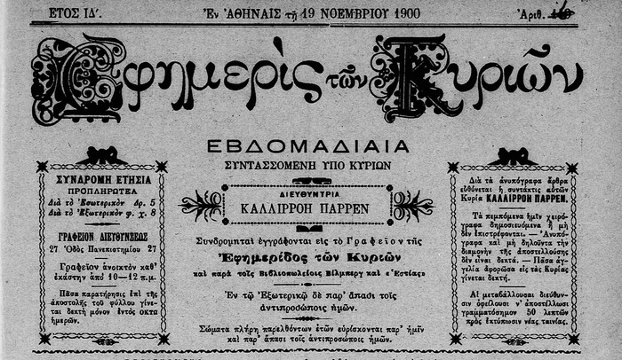
The newspaper Εφημερίς των Κυριών (Efimerís ton Kirión, “Ladies’ Gazette”), issue of November 19, 1900
One prominent example is Εφημερίς των Κυριών (Efimerís ton Kirión – “Ladies’ Gazette”), which covered the evolution of women’s liberation and employed solely women writers as early as the 1880s. These developments, however, were probably not recorded in any historical account in the 1970s, when a general process of democratization gave momentum to the feminist movement, expressed by a growing number of feminist periodicals. In many cases, these were politically affiliated magazines funded by large political parties. But because of the popularization of the means of typographic production – with the introduction of dry transfer lettering, phototypesetting, and offset printing – several independent, mostly anarchist publications also sprang up. Πόλη Γυναικών – ανοιχτό περιοδικό θεωρητικών και πρακτικών προβλημάτων χειραφέτησης (Póli Gynaikón, “City of Women” – an open magazine for theoretical and practical emancipation issues) was one of them.
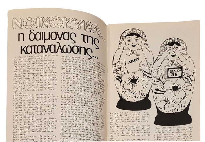
Article in Póli Ginaikón titled “Housewife: the Demon of Consumption.” The headline pairs Pluto and a Greek version of Helvetica Condensed, available from Letraset and Mecanorma, respectively. For all letters required to spell “ΝΟΙΚΟΚΥΡΑ,” the designer found equivalents in the Latin-only Pluto.
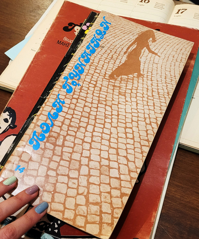
Poli Ginaikon first appeared in January 1982. It was initiated by Ntina Malliakou, who had taken an interest in feminist issues somewhat earlier, as her contributions to Leonidas Christakis’ Ιδεοδρόμιο (Ideodromio) in 1981 indicate. Christakis, a well-known artist deeply interested in graphic design, also designed Poli Ginaikon. He sought the professionalization of the field of graphic design in Greece and served as the editor of various independent publications from the 1950s on. For Poli Ginaikon, he is specifically credited with doing the editing, the “cache” (layout), the “page montage,” and the “page creation.” In later issues, the name of Niki Konidi, who according to the masthead was a member of the editorial team, appears next to Christakis’ for the “page montage” credit. The printing and binding was done in various print shops in Athens, also meticulously recorded in the credits.
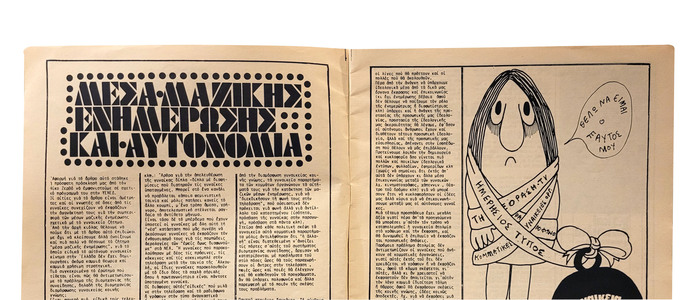
Article in Póli Ginaikón titled “Media and Autonomy.” The title set in Futura Black features an original capital Σ (Sigma) and Ω (Omega), the only letters in the words that did not have an equivalent in the Latin script. Even in absence of a proper Greek-script version, the modular nature of Futura Black must have facilitated the addition of these letterforms.
The fact that Christakis – a professional in the field who was not formally part of the editorial team – undertook the design of the magazine constitutes rather an exception to the way radical political periodicals were then produced. Many other publications followed a more pronounced DIY approach. For example, the lesbian-feminist Amazon Quarterly was typed and laid out with machinery purchased and operated by the editorial team. The design, however, was a difficult and multilevel operation, as the editor of Amazon Quarterly attests. It would have been much easier to entrust it to a veteran editor and experienced publication designer.

Article in Póli Ginaikón about feminist art in the 1970s. The title is set in Blanchard Solid. The first letter, Φ (Phi), looks like it comprises a rotated numeral 0 and the stem of a capital F or T. For Μ (Mu) and Ν (Nu), the designer didn’t repurpose the Latin M and N, as one might assume. In Blanchard, these follow the lowercase construction. As such, they were considered unfit to double as Greek capitals. Σ (Sigma) and Δ (Delta) are custom creations as well.
The topics covered in Poli Ginaikon were highly diverse, running the gamut from examining the representation and position of women in media, Greek folk art, and scientific theories to analyses of the traditional roles and activities of women (as mothers and housewives, for example, and their reproductive labor in the household). The magazine also reported on news about feminist art, and published poetry and interviews. What united all articles was their ideological compass: a far-left anti-authoritarian stance and a framing of topics with a deep knowledge of sociological and political theories. The articles also demonstrate that the magazine came about at a time when feminist organizations had matured; topics like feminist self-awareness groups were viewed critically as early as the first issue.
In terms of the imagery and typography, two core aspects of its design, Poli Ginaikon seems like a labor of love. The issues hint at extensive research for appropriate iconography and typographic experimentation with many different headline typefaces.

Generally speaking, graphic designers, sign makers, and indeed anyone who worked in visual communication in Greece in those days had to perform incredible feats of ingenuity to enhance their designs with display typefaces. The vast majority of such typefaces were produced abroad and did not offer Greek characters. Greek type designer, educator, and artist Takis Katsoulidis recalls that to widen the palette, graphic designers had to step into the role of type designer, repurposing Latin letterforms, modifying them to make them resemble Greek ones, or even creating new glyphs in the spirit of the desired typeface. The process of creating official Greek script extensions by established non-Greek type designers was much the same, as illustrated by sketches for the Greek extensions of Eric Gill’s Perpetua or Jan van Krimpen’s Romulus. Treating an alphabet this way – as derivative of the Latin script – has been criticized as impractical for the intended audience (mostly native users of the script), as not very creative, and as disrespectful of the specific cultural context the script belongs to. Despite the fact that the practice of deriving Greek letterforms from Latin ones is formally similar in the cases of both Gill and Van Krimpen on one hand and Greek type users on the other, the power dynamics at play and the occasions are in fact very different. Designers in Greece were responding to a need – the lack of typefaces – and had insight into the formal possibilities and limits of their native script. They were therefore capable of creating readable, usable letterforms even in a makeshift, one-off way, in order to express their individuality and creativity.
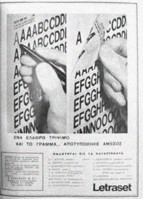
“With a soft rub and the letter … is imprinted instantly.”
Advertisement by Letraset in the Greek magazine Αρχιτεκτονική (Architektoniki, “Architecture”) in 1967. Reproduced in Marina Emmanouil, Graphic Design and Modernisation in Greece: 1945–1970. Doctoral dissertation, Royal College of Art, London, 2012.
For Poli Ginaikon, the majority of the titles and headlines seem to have been done with Latin-script typefaces produced for dry transfer lettering. The logo is based on Candice, a bold script issued by Letraset in 1976. While most of the Greek letters are repurposed Latin glyphs, some had to be customized. The Greek capital Π (Pi), for example, apparently is a combination of a swashy stem as found in the Latin capital T, merged with the left part of V and rotated 180 degrees. Other typefaces used include Pluto, Blanchard, and Futura Black, all likewise available from Letraset. These elaborate typographic choices, especially in the context of radical presses, have been perceived as breaking away from the minimalistic orthodoxy of the International Typographic Style. When designing for graphic design magazines, Christakis himself used sans serif typefaces, in a departure from his work for Póli Ginaikón. This suggests that he understood the publication’s specific requirements and was familiar with DIY publications abroad. The body copy in Poli Ginaikon, just as in other instances of radical magazines like the The Black Panther and Amazon Quarterly, was produced on a typewriter, using various monospaced styles. The specific typewriter styles have not yet been identified.
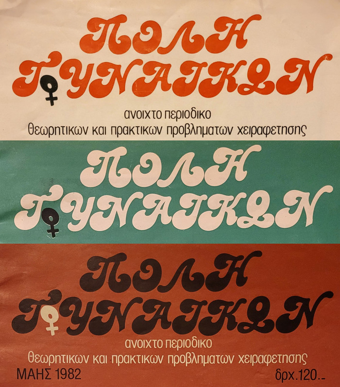
Collage of the Póli Ginaikón logo from issues 1, 3, and 4. In addition to Π (Pi), several other Greek letters were also created by modifying Latin glyphs from Candice: Λ (Lamda) is an upside-down V, Γ (Gamma) probably started out as a T, Υ (Upsilon) is a Y with a trimmed descender, and Ω (Omega) was made by mounting the numeral 0 onto the base of L.
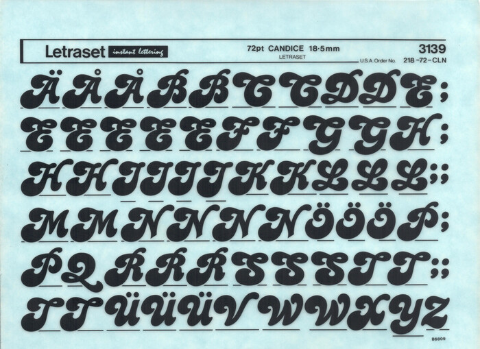
The source material: an instant lettering sheet for 72pt Candice as produced by Letraset. The shown detail depicts the capitals from which Christakis assembled the logo for Póli Gynaikón.
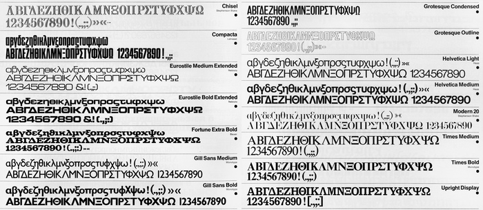
The range of proper Greek typefaces offered by British manufacturer Letraset was limited: a catalog from 1981 lists ten families, with fifteen styles in total. For comparison: users working with the Latin script could select from 471 different styles. The same fifteen styles with Greek support were already shown in a catalog dated 1971: Chisel, Compacta, Eurostile Medium Extended and Bold Extended, Fortune (a.k.a. Volta) Extra Bold, Gill Sans Medium and Bold, Grotesque Condensed and Outline, Helvetica Light and Medium, Modern 20, Times Medium and Bold, and Upright Display (cf. Monotype Egyptian).
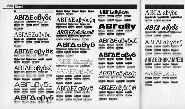
Mecanorma, the French competitor to Letraset, showed fifteen families with twenty-three styles in the Greek section of their Graphic Book 14 from 1988, out of a total of 605 styles: Futura Demi Bold; Pascal; Helvetica Medium and Light; Eurostile Extended and Bold Extended; Times Bold; Univers 68 and 83; Eurostile Outline; Avant Garde Light and Medium; ITC Fat Face; Antique Olive Nord; Handel Gothic; Helvetica Bold, Medium Italic, and Light Condensed; Sully-Jonquières; Sayer Script Bold; Gill Sans Medium; Grotesque Condensed; and a formal script of unknown origin. The number of typefaces with Greek support increased from eleven styles in 1980 to nineteen styles in 1986.
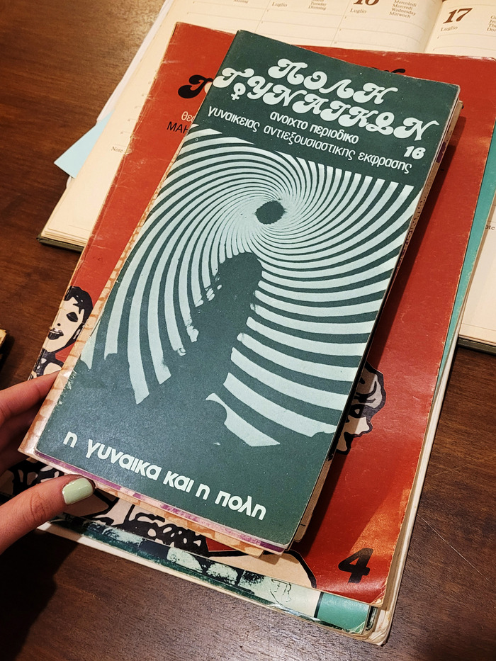
For the covers and also the interior illustrations in Poli Ginaikon, images by foreign feminist groups (from Denmark, for example) were included, as well as artwork by feminist artists like Judy Chicago, forging a link between the Greek women’s liberation movement and efforts abroad. One can also find sketches and engravings by local artists that visually explored relevant issues, maintaining a link to the local art scene, of which Christakis was an active member. Last but not least, images found in alternative magazines from the 1930s on (Charlie mensuel, Bizzare, and others) were included, not only demonstrating an interest in periodicals as a genre, but also presenting ways in which similarly gendered themes have appeared in media throughout history.

Cover of Póli Ginaikón, issue 2. The image on the cover is a reproduction of “the poster of the first feminist school in Denmark, 1979” as documented in the credits. The featured typefaces are Greek versions of Helvetica Condensed, Times Bold, and ITC Souvenir Bold Italic. The issue number is taken from Candice, just like the logo letters.
With its vertical structure dominated by narrow columns, Poli Ginaikon’s layout reflected the serious tone of the magazine, faithful to the reconstruction and dissemination of knowledge – but it also made a playful jab at puritanism with its imagery and typography. It initially measured 28 × 14 cm; after the fifth issue, though, the size was reduced – a change readers seemed particularly fond of.
Poli Ginaikon ceased publication in February 1985, having produced sixteen issues. The theme of the final issue was the precarity faced by women living in cities, thus coming full circle to the topic that gave the magazine its name. Its contribution to the reevaluation of the narratives and dismantling of myths that have cemented the traditional gender roles of women, and especially the gender roles of women in Greece, is undeniable.
Formats
- Magazines/Periodicals (1610)
Designers/Agencies
- Leonidas Christakis (2)
- Niki Konidi (1)
Tagged with
- feminism (188)
- Greek (language/script) (70)
- Greece (21)
- 1980s (594)
- magazine logos (432)
- all caps script (95)
- magazine covers (1184)
- magazine interiors (957)
- series (926)
- female sign (♀︎) (10)
- repurposed glyphs (193)
- rotated/upside-down glyphs (202)
- counterculture (44)
- DIY (91)
- women (194)
- women’s magazines (34)
- dry transfer lettering (145)
- typewriters (104)
- two columns (430)
- three columns (212)
- ragged right text (776)
In Sets
- DIY language extensions (Florian Hardwig) (44)
- Letraset (Florian Hardwig) (469)
- Mecanorma (Florian Hardwig) (194)
- Colossal Combinations (Jay Mellor) (2103)
- Book Design (Lucas Bevilaqua) (1113)
- Favourites (Lucas Bevilaqua) (855)
- vernacular/roots (Lucas Bevilaqua) (4)
- RADIOGIAPPANESE (Leonardo de la Fuente) (72)
- Vintage Font (Studio C u b e Y) (90)















10 Comments on “Reclaiming the City, Reclaiming Words: Póli Gynaikón – City of Women”
This is not entirely true. An undated (but c.1970) catalogue of Letraset typefaces from Πάλλης shows 11 more Greek typefaces, and another 14 in preparation (among which also Futura Black). All of these had Letraset codes, and were produced by Letraset; but perhaps they were a custom order by Pallis – this is why they were not shown in the catalogues of the company.
Achilles, thank you for chiming in! I had hoped to learn more about this matter.
Letraset’s catalogs didn’t always show the complete range, and were limited to those products the company deemed to be in demand for the market in question. The 1981 catalog from which the shown pages are taken from is a French one. A German one from 1983 shows a measly five typefaces for Greek. It makes sense that catalogs made for the local market presented a larger range. (The situation is similar for other scripts: Yotam Hadar shows an index of Hebrew typefaces from the Arta/Letraset Reference Book, 1988. It has many more designs than what is included in West European catalogs.) Still, the point stands: in comparison to the faces available for the Latin alphabet, the range of Greek typefaces was limited.
I see that A. Pallis Co. in Athens was Letraset’s principal agent for Greece already in 1964. Do you happen to know more about the company? I found that it was “stationery store at [Ermou] No 8, founded in 1870, which closed in late February [2007] after a decision by the group that holds 100 percent of the company’s shares” [Mandrakou]. It may have had a similar role as Arta in Israel. Can you share the names of the typefaces listed in the mentioned catalog? It would be particularly interesting to learn if there were any original designs. By that I mean such that weren’t made as an extension to a Latin precursor.
I don’t have a source on Letraset but Helena Lekka’s PhD thesis on Linotype’s Greek typeface development around the same time is online and Letraset is mentioned a bit there. Lekka says that graphic designer Sophia Zarabouka and Matthew Carter felt that Letraset’s Greeks were unidiomatic but Carter did wonder if Letraset’s pre-existing Helvetica Greek had “caused resistance” to Linotype’s “real one”, but it doesn’t say who designed them or where.
Achilles, Blythwood, thanks a lot for your additions, that’s very interesting!
That’s good to know! Well, everything that the caption claims still holds true: this Greek adaptation of Blanchard is derived from the Latin original, with Φ being cobbled together from rotated numeral 0 and the stem of a capital like T, etc. It’s just that it’s one step removed: in this case, it wasn’t the graphic designer who made these modifications ad hoc, but rather someone who worked on the Letraset release.
Christakis employed this Greek Blanchard for Ideodromio, too. As he used all lowercase letters there and all caps for Póligynaikón, and also because both uses are by the same designer, we couldn’t deduce with certainty that it was a ready-made font. Ideodromio additionally features some other of these Greek Letraset faces, such as Pump and maybe Flash (alongside Mecanorma’s Antique Olive Nord).
Is the Greek Futura Black a match for the letters used by Christakis (see the fourth image)?
Previously, Maria found three examples for Greek Zipper, another one for Pump, and one for Profil. Do any of these match the retrospective Letraset versions?
Σας ευχαριστώ πολύ!
In Ideodromio, Flash does not match Letraset’s version; Pump and Cooper black do. In issue 63 of April 1981 Helvetica bold & Univers 68 by Mecanorma are also used.
Futura black & Profil match Letraset’s version; Zipper doesn’t (perhaps except for the use by Politistiki), Pump doesn’t either (note that the two Sigmas [Σ] are different from one another).
Does anyone know if a digital version of Mecanorma’s Olive Nord with the greek character set is available anywhere?