La Metamorfosis by Franz Kafka (Alianza Editorial)

When Alianza Editorial brought out a paperback edition with a Spanish translation of Die Verwandlung (English: The Metamorphosis), cover designer Daniel Gil came up with an ingenious idea: why not translate the novel’s theme to a purely typographic solution? Instead of depicting salesman Gregor Samsa transforming into a monstrous insect, the title gradually morphs from News Gothic Condensed into Franklin Gothic Extra Condensed.
For later printings, this design was altered repeatedly. Poppl-Exquisit, used in 1972 for the publisher’s name, was replaced by News Gothic, and the title’s color changed from white to two shades of grey. Later on, someone from marketing might have raised a flag about the colors being too dull and the author’s name not popping out enough. In any case, in 1985, “Franz Kafka” was printed in red, and the parts in Franklin in brown. For my part, these changes didn’t make Gil’s design any better, but luckily, they didn’t ruin it either. I think it’s funny that they added a second level of metamorphosis to the cover and its publication history!


1985 printing

1995 printing


")


")


")


")


3 Comments on “La Metamorfosis by Franz Kafka (Alianza Editorial)”
Lorraine Li and Jonathan Maghen’s open-source Robert Brownjohn font (published by Primary Foundry in 2021) has a similar trope to Gil’s cover but apparently in a different take using a serif and an even bolder sans serif (both of the faces widths are condensed).
Comparison (Note that the correct spelling is “Robert”)
It says that this font was based on a concert poster (hence, as said “cover art” on the foundry’s website) for Grishman-Ryce Duo by Robert Brownjohn in 1959.
Any thoughts?
Jay, sorry, I missed your comment in October.
Yes, that’s a great reference! There are a number of such “Frankenstein” typefaces. Centralschrift from 1853 combines a fraktur for the lower half and a neo-classical roman for the upper half of the letters. Fraktendon (2002) is a more recent example.
I wonder what typefaces Brownjohn combined (BTW, the official Robert Brownjohn website says it was a concert flyer, made in the 1950s). The sans isn’t Franklin Gothic. It might be Modern Gothic Condensed, but I haven’t made a comparison. The serif is something like Condensed No. 3 or Torino Condensed.
Li and Maghen don’t comment on their sources, which I find a bit sad, especially for an open-source typeface. The sans used for the lower half (and all of the lowercase) is ITC Franklin Condensed Black, distinguished from the original ATF design by the angled terminal in S, among other things. The serif seems to be OPTI Roman Compressed, some early-1990s abandonware, complete with its misaligned tops of E and T. It comes very close to the originally used serif, though.
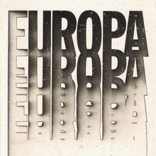
See also Gil’s cover design for Europa: el surgimiento de una nación from 1973: