
A Day in the Life
A Day in the Life show open
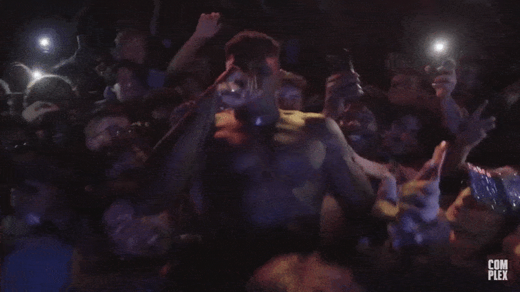
Titles, on-screen graphics, and identity for A Day in the Life, a Complex documentary series.
A Day in the Life brings you on a ride along with artists en route to performances, photoshoots, and events giving us an intimate look at their hopes & dreams, personal goals, past accomplishments, views, careers and more.
This show is all about a moment in time and place, and the visuals play off of the idea that “x” – in this case the dot – marks the spot. I chose GT Haptik as the main typeface for its distinctive shapes and almost clock-like letterforms such as its uppercase R. The goal was to have a simple but striking system that would let the in-the-field footage do the main push.
Associate Creative Director: Gina Batlle. Art Director: Warren Cochrane. Designer: Bárbara Abbês. Motion Designer: Sara Hilany. Creative Project Manager: Maya Shanker. Photos and Videos: Complex.

Title card

Location card

Show timer


Lower thirds

Mortise

Location transition


")


")
")


