
Holistix

Holistix is one of the largest wellness brands in Brazil. Founded in 2019, Holistix creates content and products that seek to inspire a healthier lifestyle, in a simple way. Balancing modern science and ancestral wisdom, there are dozens of posts and products that help people develop good habits.
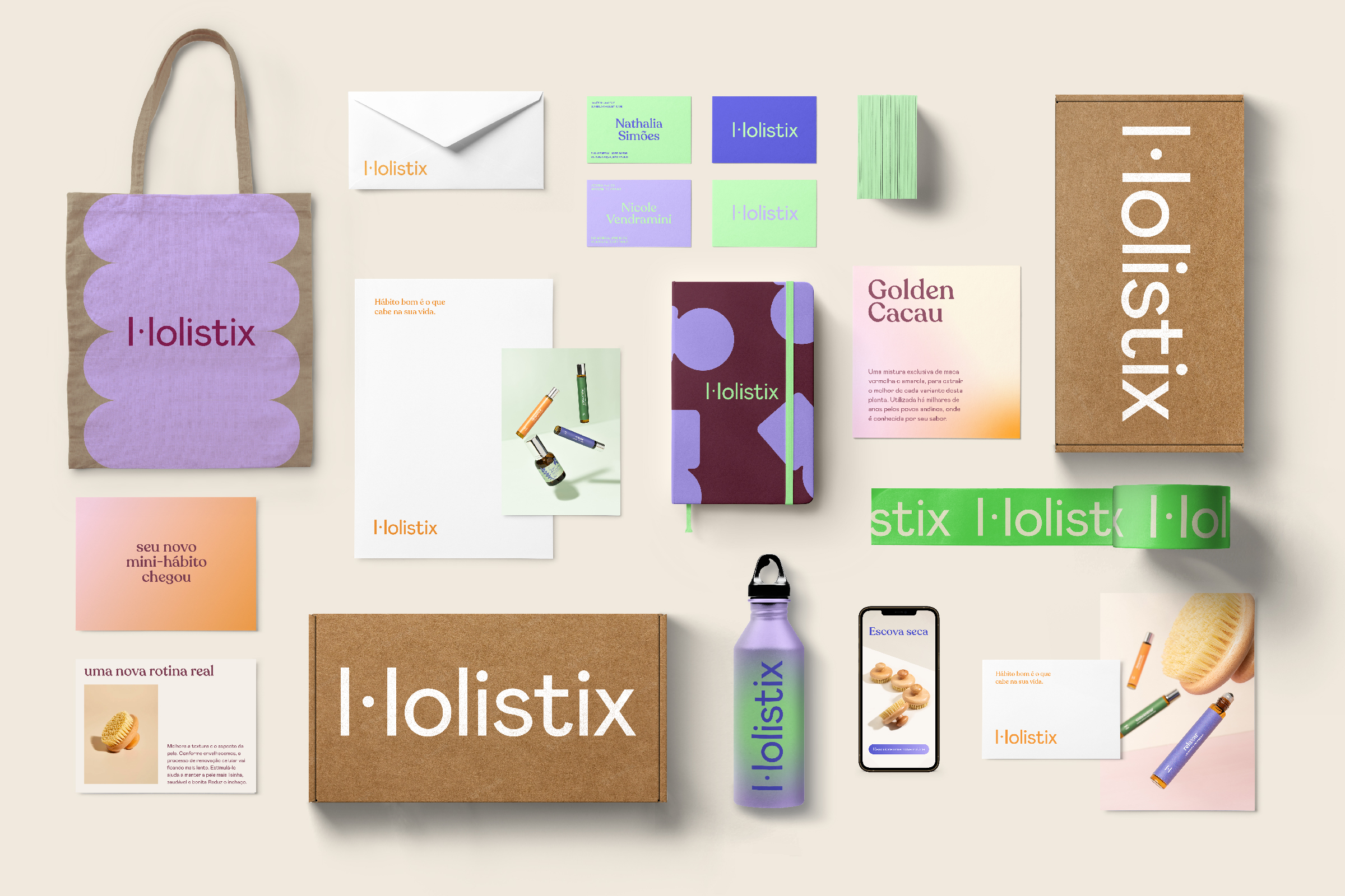
Together with Holistix’ team, we identified that the spread of a wellness lifestyle in Brazil gave the brand the opportunity to reach new audiences, expanding the reach of its message and its product portfolio. To accomplish this, it was necessary to establish a systemic design project that would encompass both the production of digital content and packaging, with graphic assets that, when combined, simultaneously guarantee variation and consistency.
With this objective in mind, the project began with the logo redesign. Honoring the building principles of the previous brand, our objective was to make its representation even more proprietary, proposing a new friendly design, full of personality, while maintaining the sophistication and simplicity already known. The result was a logo that looks fresh, yet still familiar to Holistix’ brand lovers.
We also organized a complete typographic system, as well as its usage guidelines. The typographic behavior was divided into two distinct moments: institutional communication and content creation. In order to maintain cohesive institutional communication, we worked with Mabry and Recoleta on all brand materials, packaging and product campaigns. This typographic duo guarantees, at the same time, personality and reliability for the applications.
For content creation, the brand needed even more versatility and presence. That’s why we added Hatton and Continua to the typographic system, both typefaces with a strong personality and for exclusive use in social networks, giving each content department its own look.
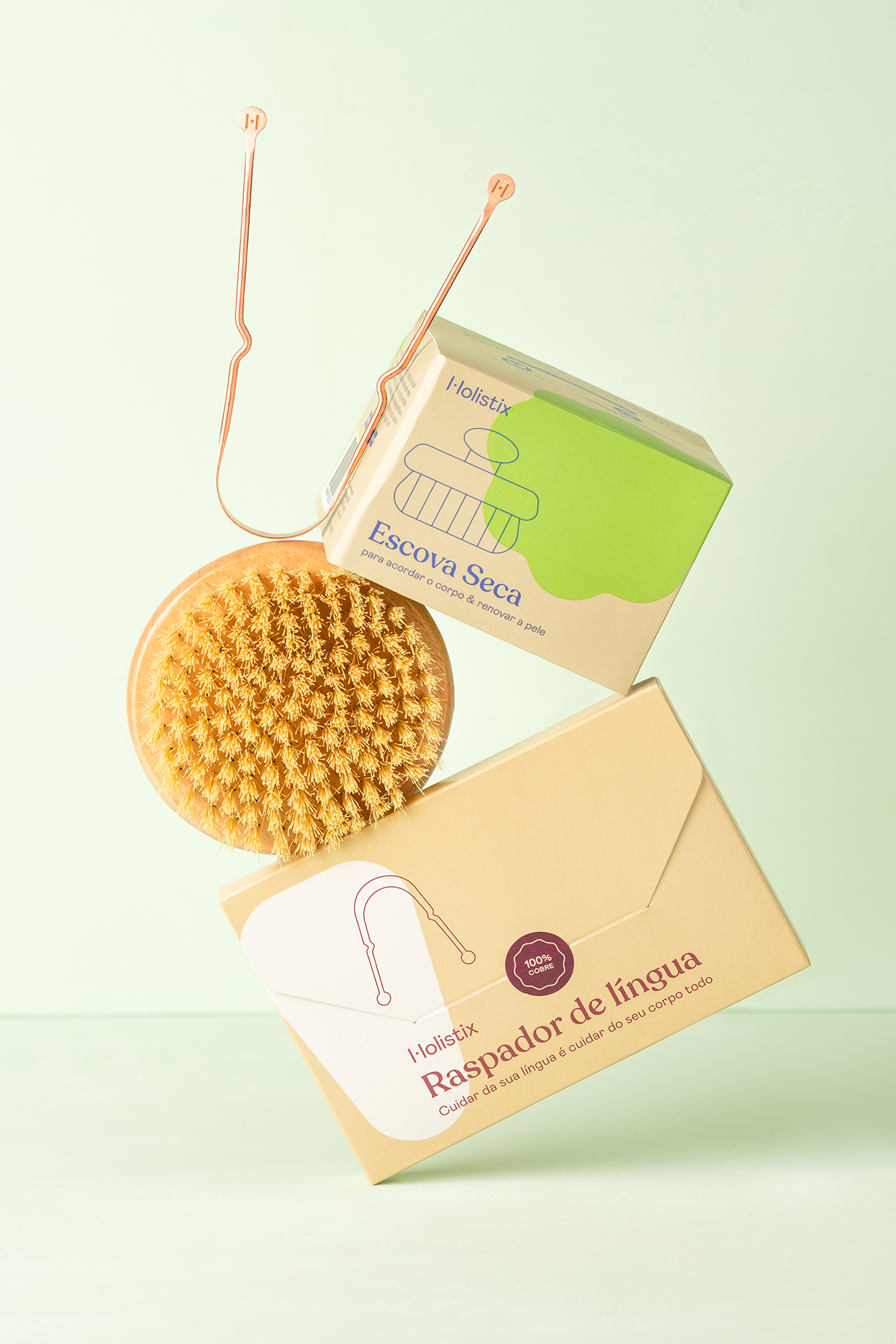
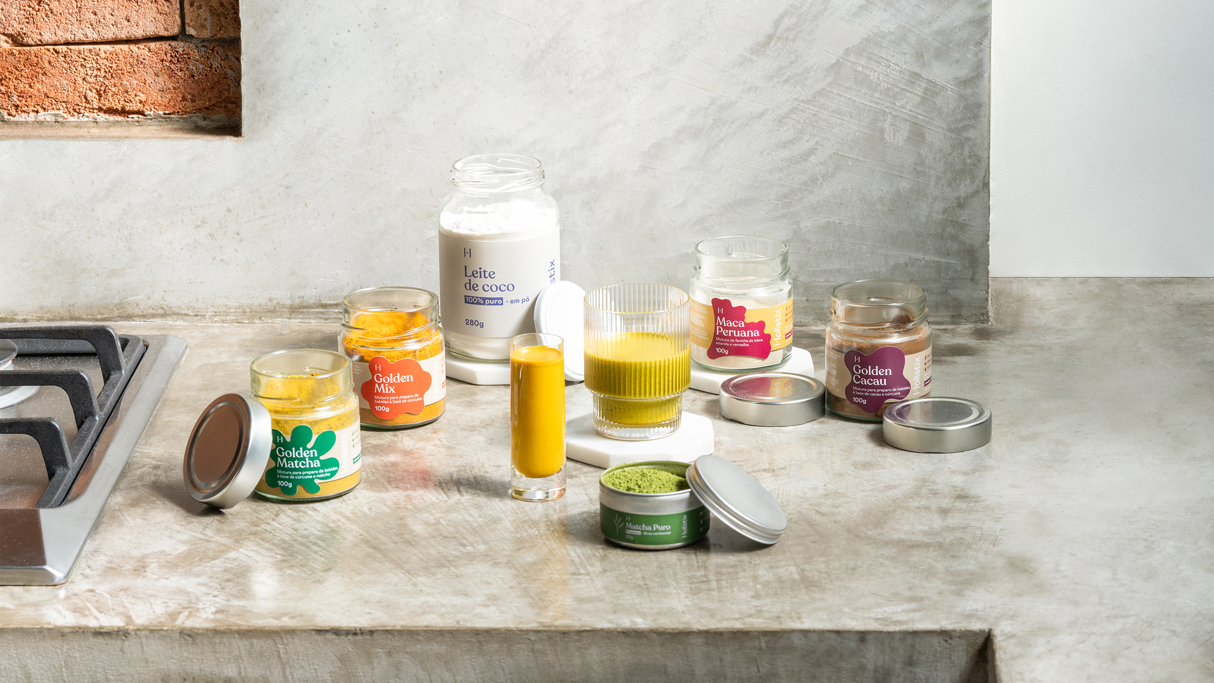
The identity gains more complexity when combined with the chromatic palette and the graphic elements system we designed. The chromatic palette, extensive and multicolored, allows the brand to work with dozens of combinations to keep communication and packaging dynamic and engaging. The graphic elements system, on the other hand, proposes shapes that shift between organic and geometric, symmetrical and irregular, abstract and figurative, enabling the construction of new forms to follow the evolution of the brand. To make the set even more flexible, each element can take on different treatments — flat, outline, gradient, blurred.
Finally, we developed the illustration style, as well as the iconographic language. For the illustrations, we sought to create a style with irregular textures and lines, making the design warm and relatable. Marked shadows bring the sensation of bodies and objects bathed in sunlight and full of vitality. For the representation of human figures, we worked with proportions and chromatic applications that illustrated different bodies and ethnicities.
Polar team:
Creative direction by Matheus Sakita and Ralph Mayer
Design by Estela Mendes, Matheus Sakita, Ralph Mayer and Stella Bonici
Holistix team:
Isabela Serafim, Nicole Vendramini and Renata Kameda
Photography by Naira Mattia
See the full study case on the Polar portfolio website.


</cite>")


