
Panic Room movie poster
Contributed by Patrick Concannon on Oct 30th, 2022. Artwork published in
.
License: All Rights Reserved.
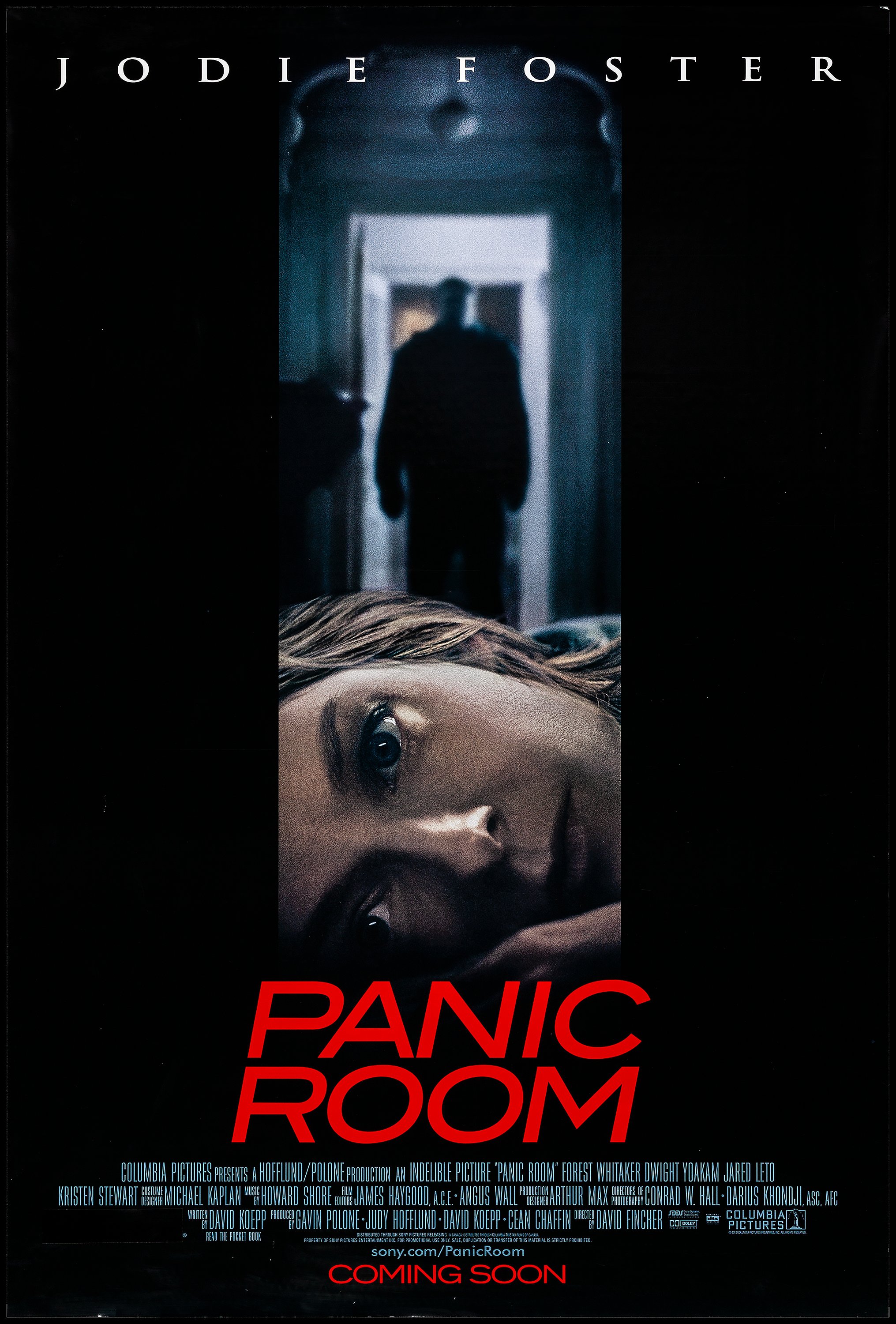
US one sheet poster designed by Intralink Film Graphic Design for the 2002 thriller film Panic Room, directed by David Fincher and starring Jodie Foster, Kristen Stewart, Forest Whitaker, Jared Leto and Dwight Yoakam.
The film’s title and release date is set in ITC Blair, with the above-title billing set in Trajan. The credit block is set in Bee Three and the website link is set in Futura.


")


 Trailer")


")


")


5 Comments on “Panic Room movie poster”
I just received the Bee update I requested weeks ago. There is now also the SZ ligature for the cuts Bee One, Bee Two and Bee Three, which previously only existed in Bee Four. Unfortunately, I had to immediately point out that the quotation marks are inconsistent, which needs to be updated further. Funny that this font has been in use for a long time and no one noticed such important things.
Oh, I see what you mean. Instead of an eszett (ß), Bee One to Three show a regular s glyph for this character. (The string I typed for the samples above is „Straße“ = “street”.)
The “English style” quote marks in those three fonts are straight, which might be a stylistic choice, but feels a little lame. Not having harmonizing forms for the „German style“ marks in Bee One and Three definitely is an error.
Bee Four has so-called sign painters’ quotes, that is quote marks where the opening and closing form are mirrored along a vertical symmetry line. That’s perfectly acceptable for US expectations, but doesn’t work for German typography.
It’s indeed funny that these inconsistencies and downright errors went unfixed for so many years. Even more so considering that the fonts were produced at URW in Germany. I guess that Bee simply hasn’t been used a lot for German text, or at least not with eszetts and quote marks.
The Bee fonts were digitized in the early 1990s, based on the “B-series” by VGC, which in turn consisted of alphanumerically renamed copies of Filmotype’s Galaxy, Gable, Garfield, and Gamma from the 1950s.
Hey, I don’t want to sound like that guy, but the credit block is actually set in a font that I believe is called Motion Pix, which is very similar to Bee but has some subtle differences (such with as the S and R). I can’t find any info online about it, but I only know the name of it because I found it on a PDF of a Sony Pictures poster that I found through Internet Archive on the website of Graphic Orb, a design firm that apparently had connections to the other ad companies that Sony Pictures frequently employed in the early 2000s (i.e. Creative Domain). I’d try adding the font to the site, but I don’t know how.
It’s so very close to URW’s Bee Three that I’m not sure why they would even bother to create such a slightly different version. Licensing fees, maybe? Forum discussion here suggests the MotionPix fonts were created by Graphic Orb in 1998.
PDF lists fonts as:
MP4MotionPix-Med
MP5MotionPix-Demi
MP6MotionPix-Bold
And there’s also MP3MotionPix-Reg. So four weights in total. None are as heavy as Bee Four.