
Society of Children’s Book Writers and Illustrators
The Society of Children’s Book Writers and Illustrators describes itself as “the preeminent membership organization for children’s book creators,” with a global community also extending to “translators, publishers, librarians, advocates, and other industry professionals.”
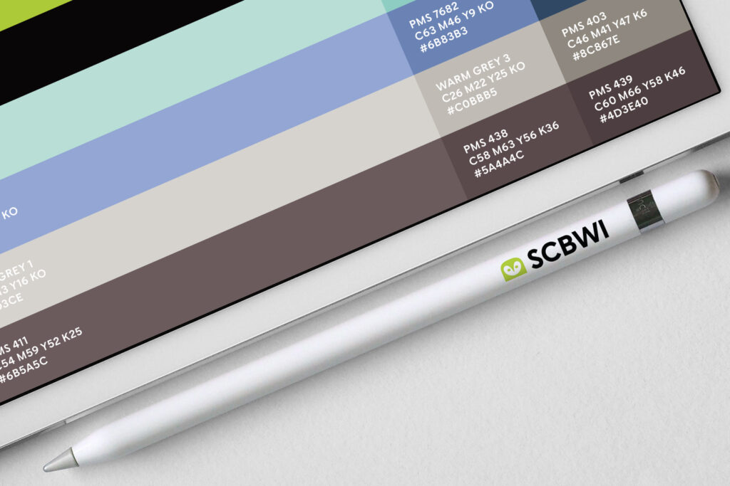
Ben Loiz describes his work redesigning the organization’s identity system:
The shape of the owl’s beak is in the likeness of a writers ink pen nib which points back to the creative community they serve. Various logo lockups were designed for maximum flexibility. The new mark is durable and works at all sizes, from a billboard, to an app icon, social profile, or web browser favicon.
We teamed up with Jesse Ragan from XYZ Type to slightly adjust Escalator, one of his typefaces. SCBWI Escalator was used in the logotype and as part of their new identity system.
In the slightly customized version of Escalator the curled descender on the y was replaced by a straight diagonal stroke in all styles.


SCBWI Escalator has a straight diagonal descender on the y
SCBWI’s previous logo


")


")


