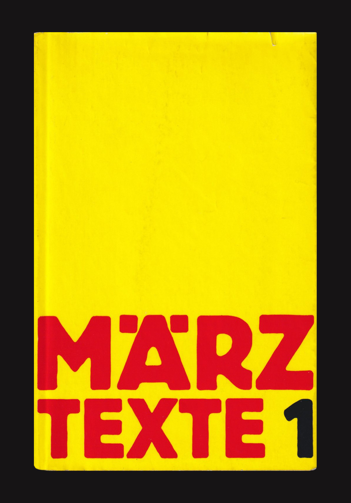
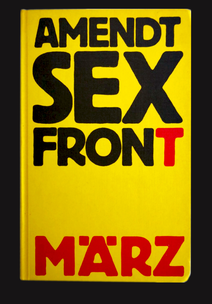
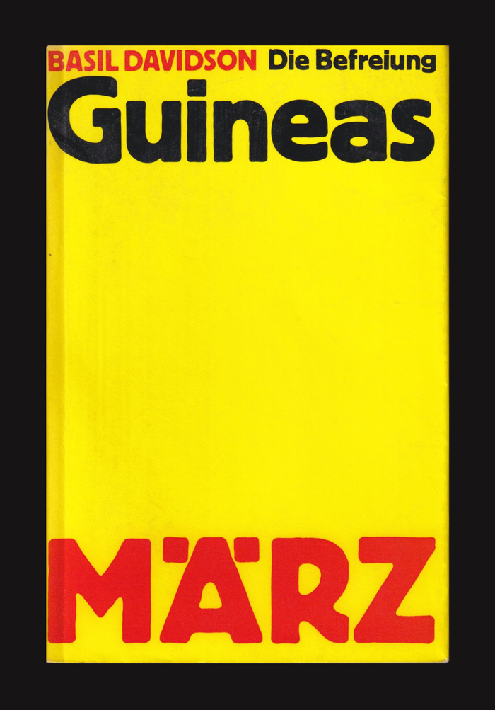
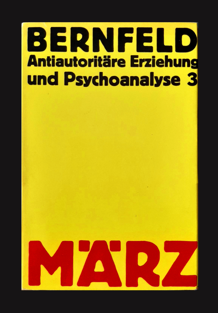
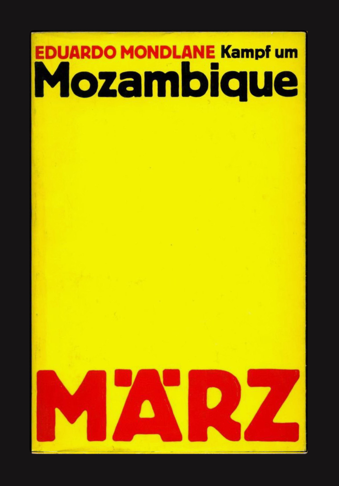
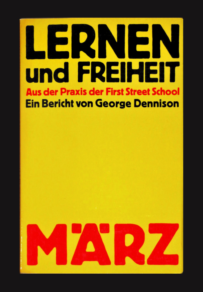
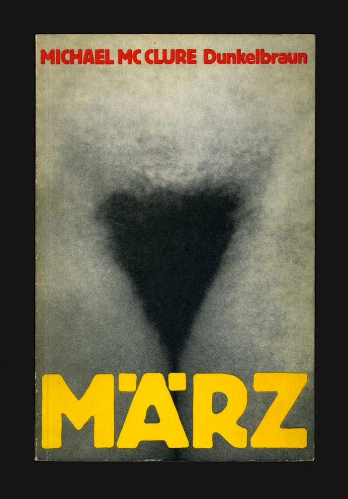
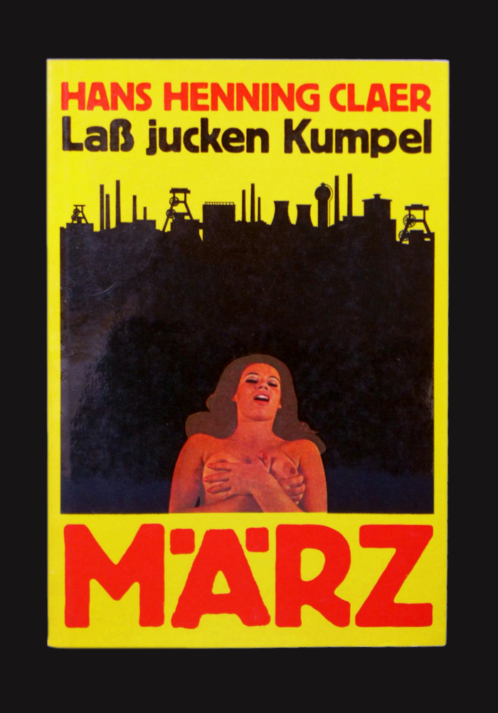
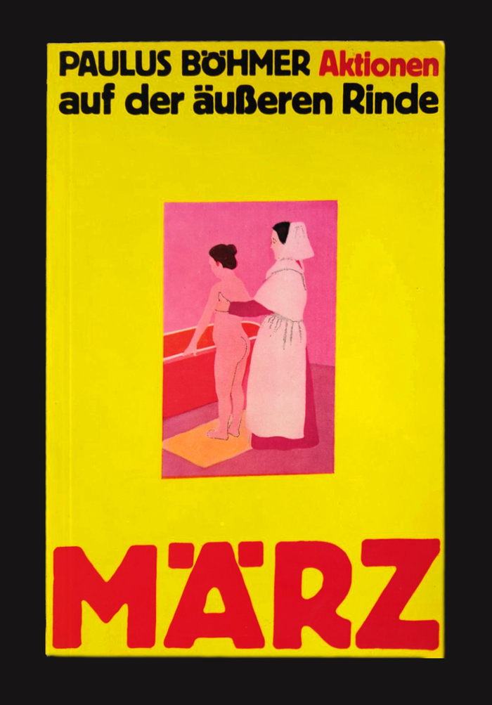
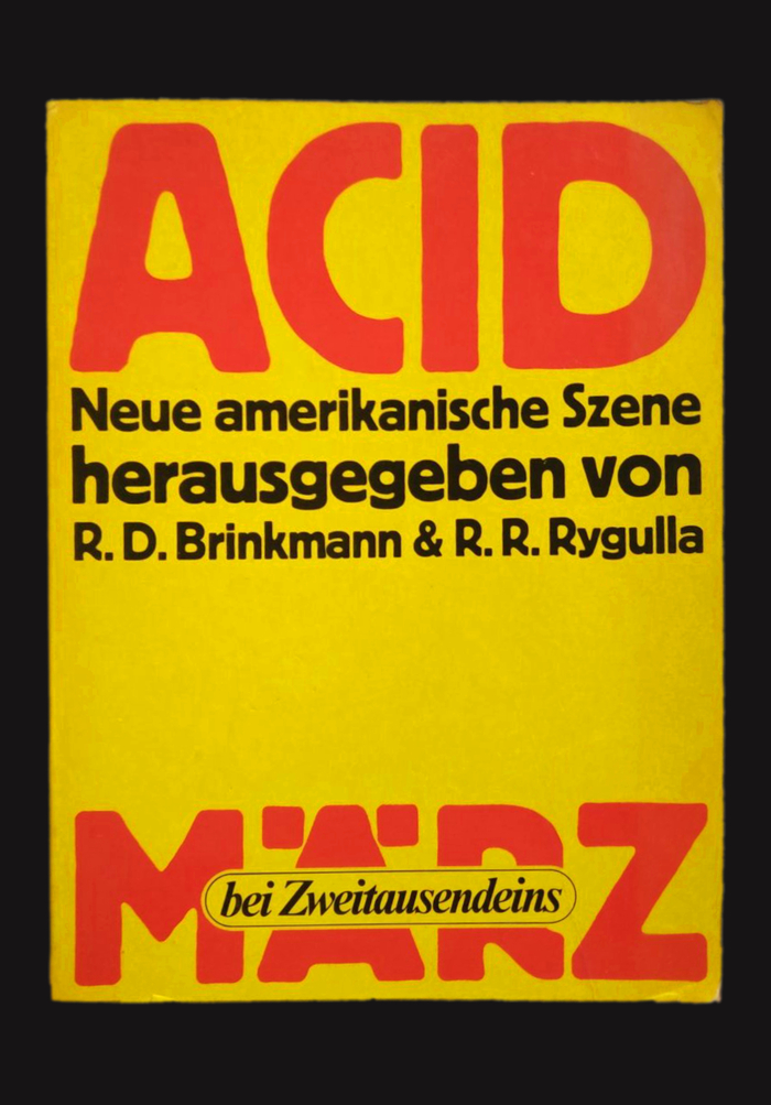
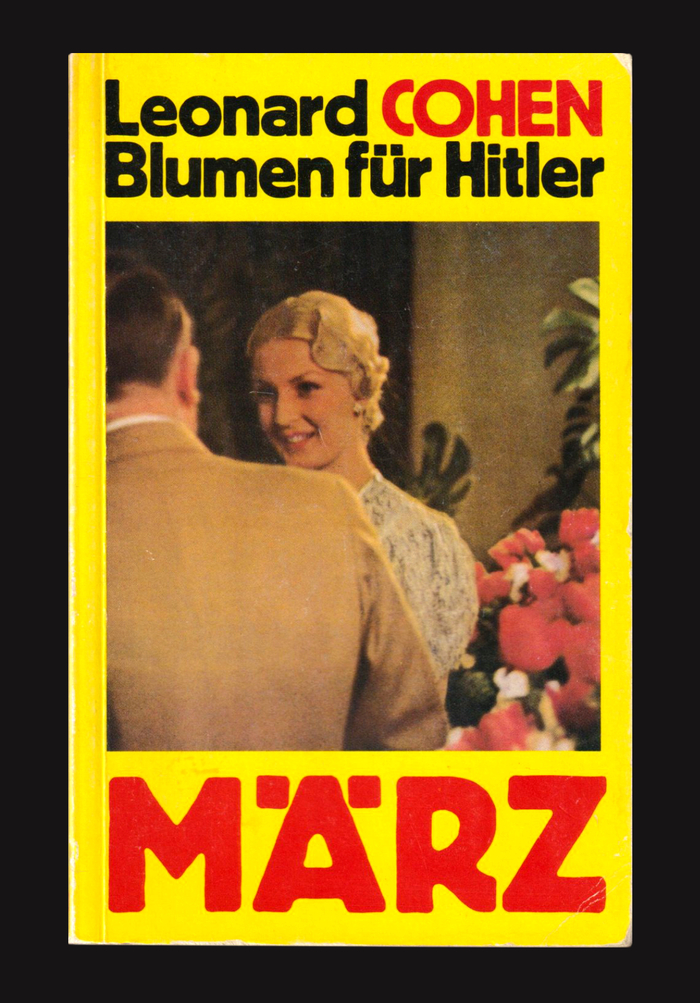
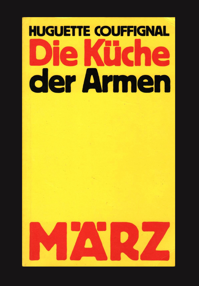
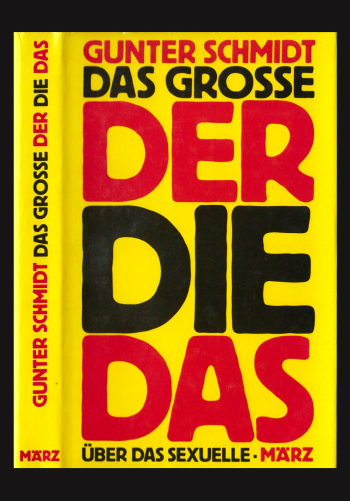
Among German publishers, März is probably the most iconic example for our tag “typeface plus color equals brand”. In this case, the first ingredient is Block, a bold advertising typeface with rough contours that was first cast by the Berthold foundry in 1908. The second one is the color yellow, or rather the color combo yellow, red and black. März has stuck to this formula throughout its turbulent history, creating a striking identity for their emancipatory books.
Richard Stoiber describes what made their publishing program special:
[MÄRZ] used to publish what other publishers didn’t dare to: Beat literature from the U.S., comics, poetry collections, sex ed books, pornography and political theory. For many years, MÄRZ set trends for a new aesthetic and a new political movement in the old Federal Republic. Leonard Cohen’s poems were published at MÄRZ, long before he became a singer-songwriter in Europe. For 20 years the publishing house offered the German public a multi-layered program.
The publishing house was founded in Frankfurt/Main in 1969 by Jörg Schöder and others. It was also Schröder who came up with the concept for the cover designs and the typeface choice. The co-founders left already in 1971, and in 1973, Schröder had to file for bankruptcy for the first time. The company was rebooted a year later, now with Zweitausendeins as distribution partner. Barbara Kalender joined Schröder in 1981. In 1987, after Schröder suffered two heart attacks, März Verlag had to be liquidated. The project lived on in the form of the März Desktop Verlag, which relocated to Berlin in 2005.
When Schröder died in June 2020, it seemed that März had come to a final end. In 2021, however, Richard Stoiber together with Kalender relaunched the publishing house. You can read about this new chapter in the post by Andreas Seidel, and see his custom typeface MaerzType in use on the new covers.
2 Comments on “März book covers, 1969–1987”
“Your successes will increase if you use good advertising typefaces.” In 1908, H. Berthold AG promoted the new Reklameschrift Block with a specimen booklet. The cover? Black with red on yellow!
The compact Ä in the MÄRZ logo is not a customization. Such umlaut glyphs with lowered dots were included in the fonts right from the start, as seen on Berthold’s Blockheft from November 1908.
Here’s Andreas Seidel’s post about the relaunched März: