De Warande is one of the larger cultural centres Belgium has on offer. After fifty years, 20,000 performances, 2,000 exhibitions and countless events, it was time for a renewed look at the branding.
Inspired by the building’s Brutalist/Modernistic roots, we used the versatility of Söhne’s extensive family to create a dynamic identity with broadly strategic and communicative capabilities.
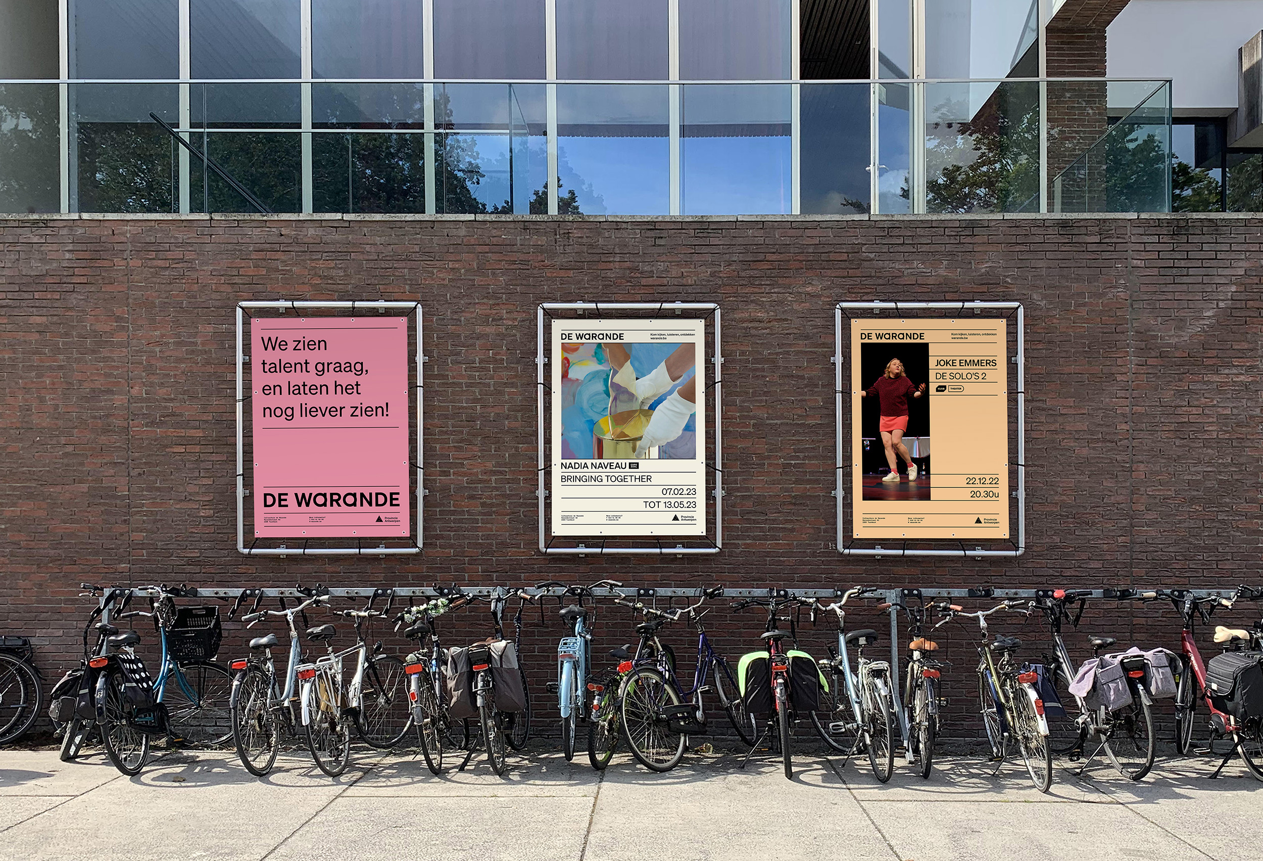
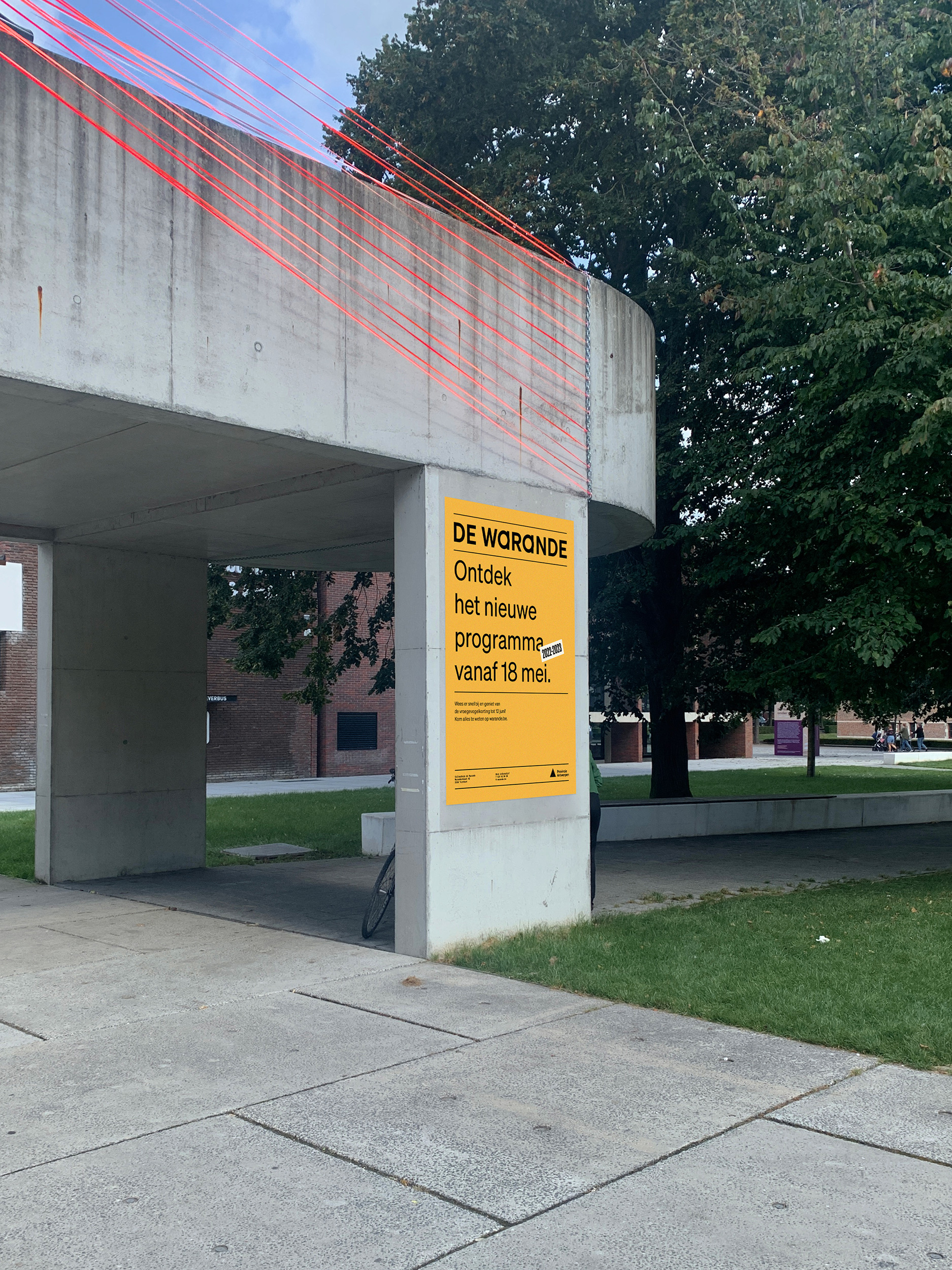
The team at de Warande gets to play with a typographic palette that fits their diverse needs and enhances their rich history, underlining the unique character of this vibrant and inviting place.
The custom-drawn A in the logo originates from the intrinsic centre of de Warande; the main theatre stage and the large welcoming entrance hall, reflected by two overlapping geometric zones. Every aspect of this branding is supported by a story, tying the past to the present. The sum of all these elements resulted in a branding that feels welcoming, accessible and unpretentious, ready for the next half-century.