
The Rolling Stones – Some Girls album art
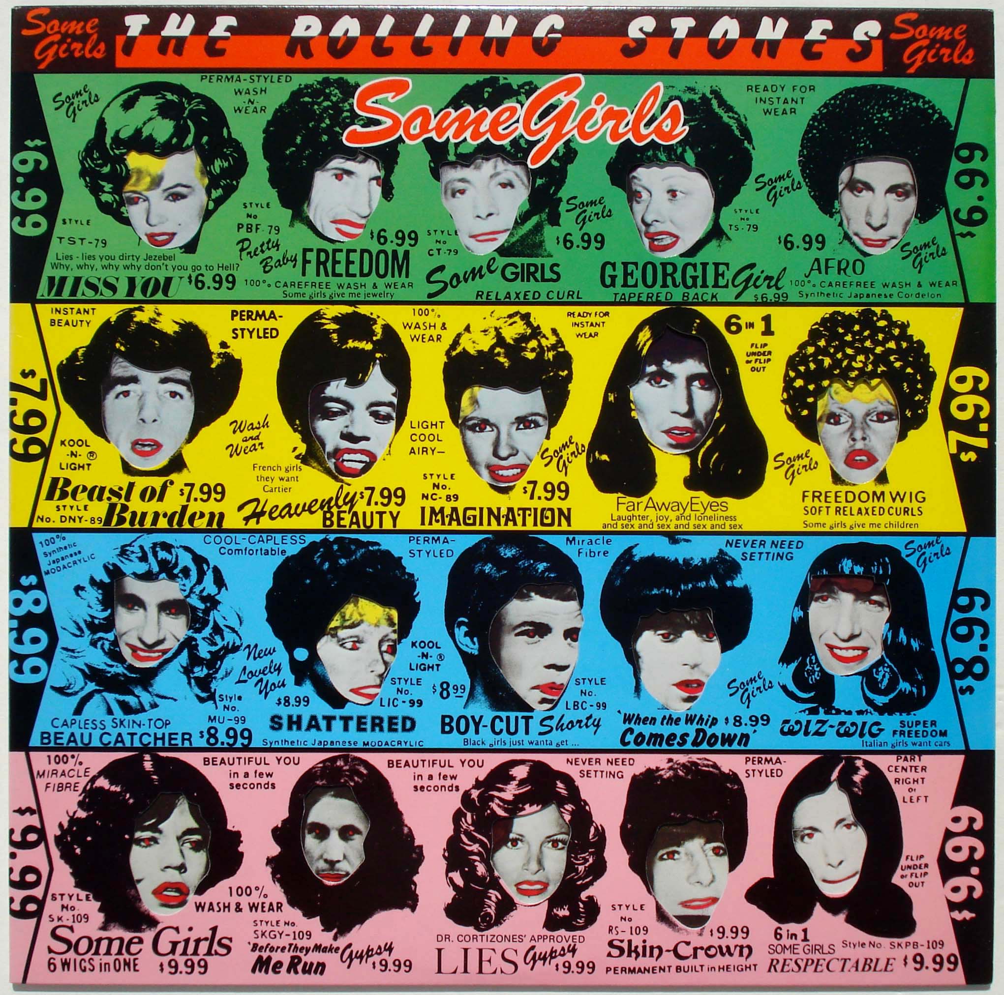
Front cover of the original LP cover, with faces from inner sleeve side 1
Some Girls is a 1978 album from the English rock band The Rolling Stones, generally regarded as something of a comeback after a few years of declining popularity.
The album cover was designed by Peter Corriston with illustrations by Hubert Kretzschmar. Making use of an elaborate die-cut design, it inserts the faces of the Rolling Stones and various female celebrities into a vintage advertisement by Valmor Products Corporation. This design was quickly met with a lawsuit due to the unauthorized use of the likenesses of Lucille Ball, Farrah Fawcett, Judy Garland, Raquel Welch, and Marilyn Monroe. The album was quickly reissued with a redesigned cover that removed the celebrities. Valmor also took legal action and was awarded money for the reuse of their design.
“The Rolling Stones” is set in Flash Bold, and “Some Girls” is Brush Script. A wide variety of other typefaces are used in the advertising copy. “AFRO” might be Filmotype Homer with alternates. The bold scripty caps used for “WIZ-WIG” are from an unidentified source – Bold Mercantile Italic is in the same ballpark [edit: they appear to be derived from Kalligraphia, see comments].

Inner sleeve side 1

Detail showing the die-cuts

Front cover with faces from inner sleeve side 2

Inner sleeve side 2

Front cover with faces from inner sleeve side 2, variant with different color order, EMI Electrola, Germany

Back cover, Dutch version, EMI Records Holland

Magazine advertisement
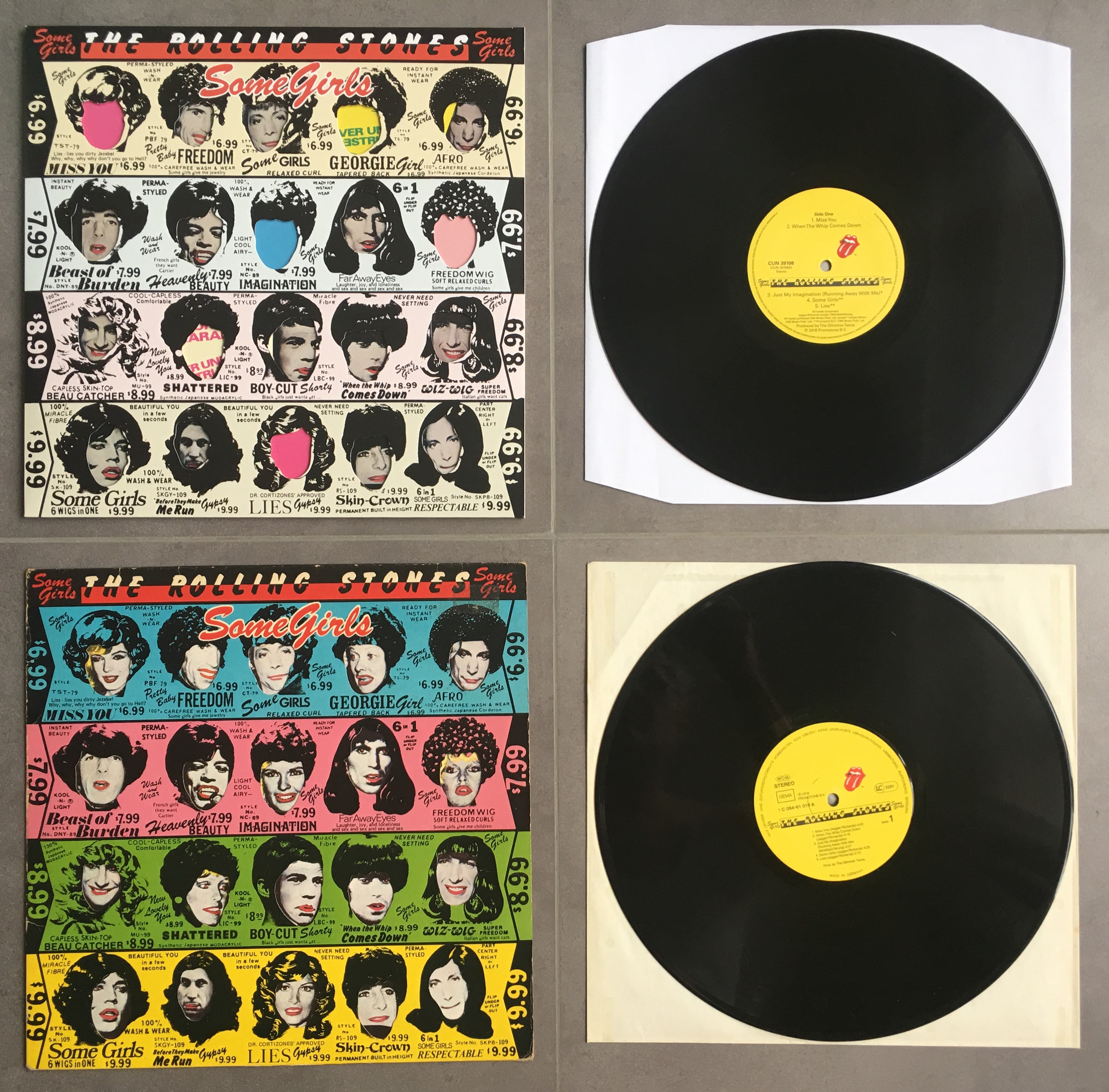
Original version (bottom), revised version (top)

The revised cover, which removed the celebrity images

Interior sleeve side 1, revised

Interior sleeve side 2, revised

A third version of the album cover with the hand-drawn faces from the original Valmore ad was used on the 1986 CD reissue.


")
")


")


")


2 Comments on “The Rolling Stones – Some Girls album art”
It looks like 'Wiz-Wig’ is lowercase Kalligraphia without dots for the i’s or a center bar for the z? The G still doesn’t appear to match… A custom glyph?
Ooooh… you nailed it! Maybe the designer used the Letraset adaptation of Kalligraphia and cobbled the G together by rubbing down parts of other glyphs.
As far as I can tell, that was the last unidentified typeface for this Use. Thanks, Ian!