
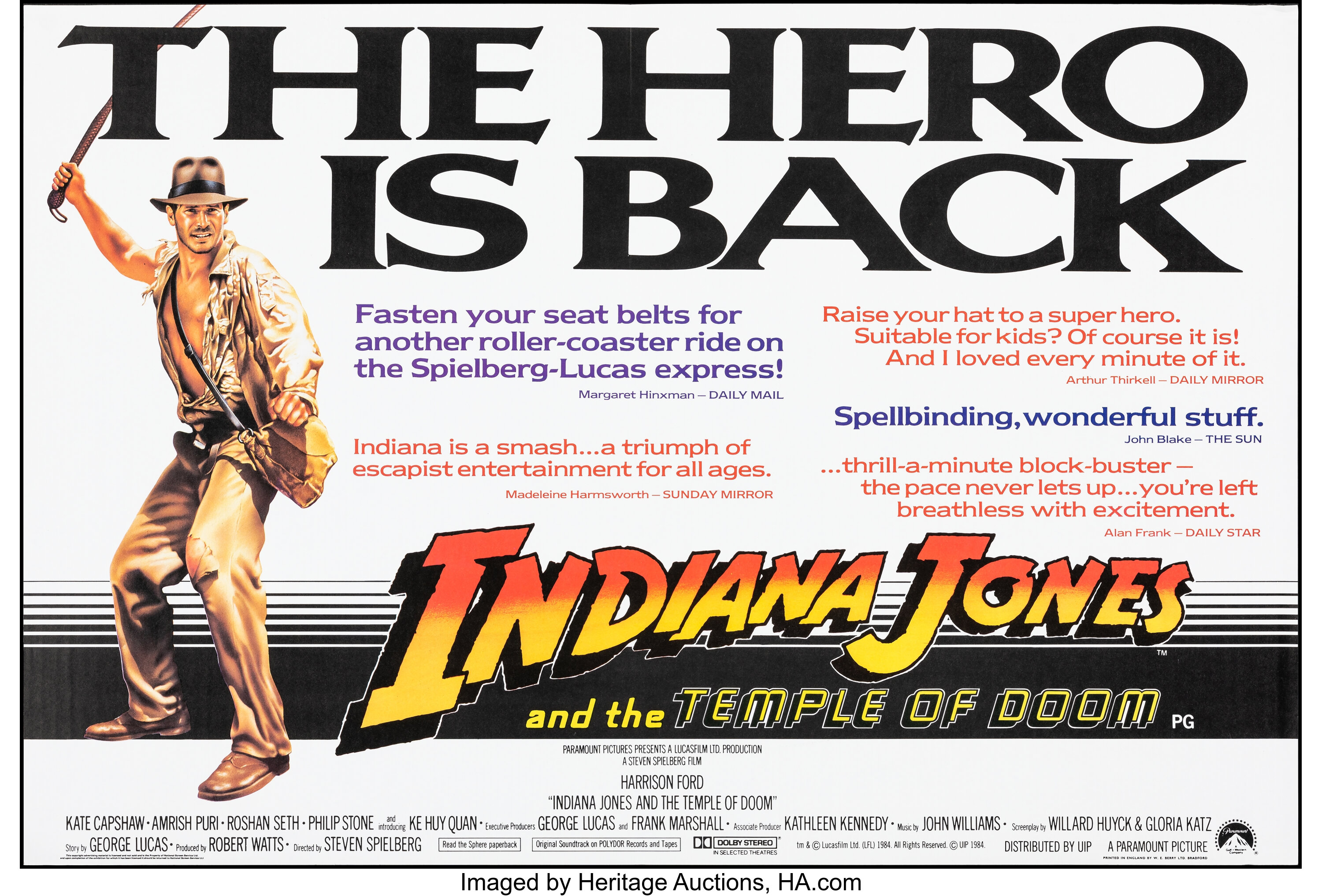
Indiana Jones and the Temple of Doom movie posters and film titles
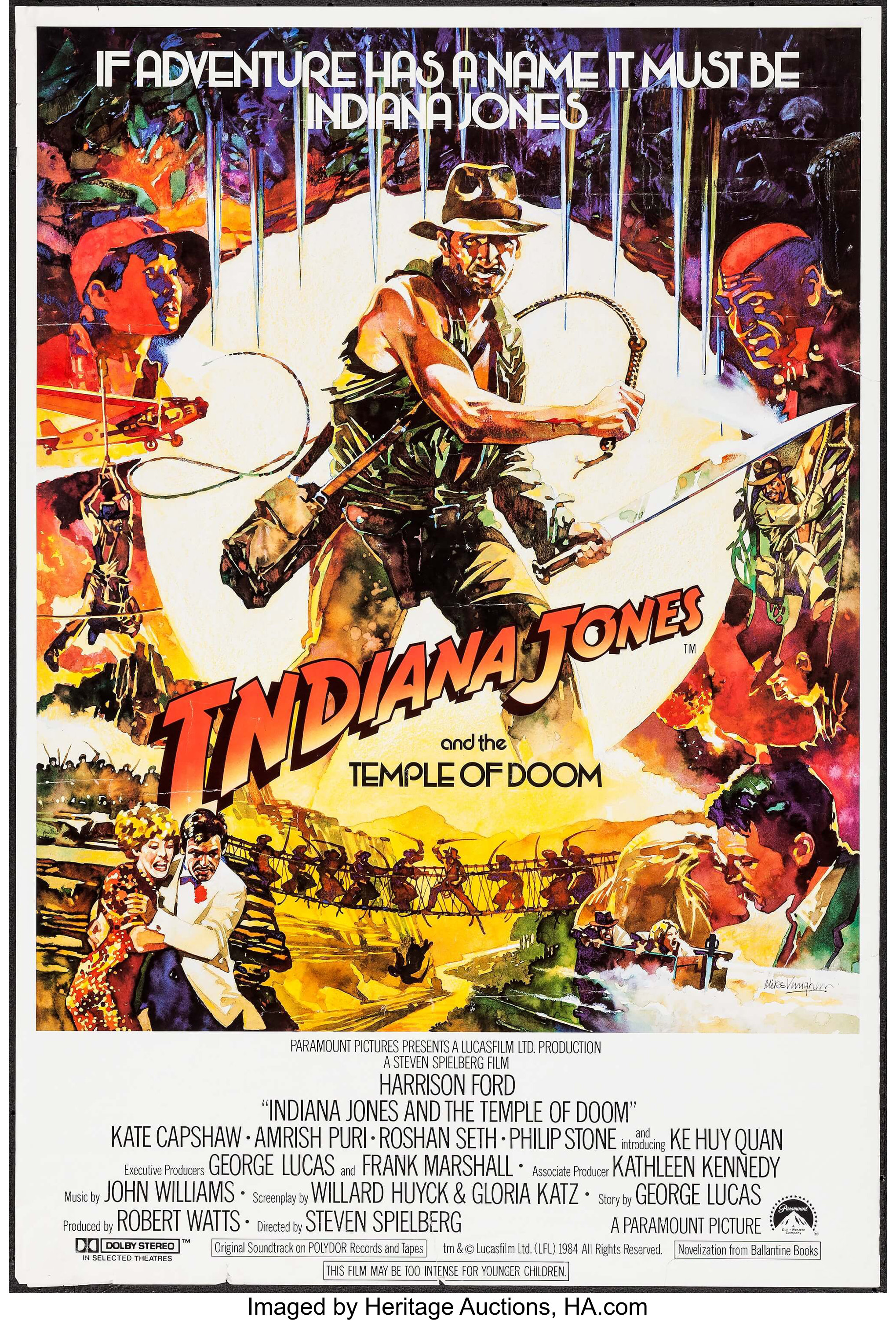
British one sheet poster. Illustration by Mike Vaughan.
From Wikipedia:
Indiana Jones and the Temple of Doom is a 1984 American action-adventure film directed by Steven Spielberg. It is the second installment in the Indiana Jones franchise, and a prequel to the 1981 film Raiders of the Lost Ark, featuring Harrison Ford who reprises his role as the title character. Kate Capshaw, Amrish Puri, Roshan Seth, Philip Stone and Ke Huy Quan, in his film debut, star in supporting roles.
The British one sheet poster features a tagline and the second half of the film’s title set in Wexford. The British quad and one-third posters feature a giant tagline, “The Hero is Back,” set in the Extrabold weight of Largo. Pull quotes and additional text are set in ITC Newtext. The credit blocks are set in News Gothic Condensed. The British quad poster promoting the “Royal European Première” features text set in Continental and Helvetica.
Illustrations featured on posters are credited to Mike Vaughan. Poster designer/s currently unknown.
The film’s title sequence features credits set in a faux italic Bauer Topic (see Steile Futura). The Club Obi Wan signage is based on Zig Zag, an art deco alphabet design by Marcia Loeb that is shown in New Art Deco Alphabets (Dover, New York, 1975). The end credits are set in Eurostile. Titles are by Modern Film Effects.
The Indiana Jones and the Temple of Doom logo is hand-lettered, likely by Mike Salisbury, who also designed the logo for Raiders of the Lost Ark. Furthermore, the look of the original Raiders logo was likely inspired by the very similar cover lettering (see comments here) seen on 1940s issues of the American science fiction magazine Amazing Stories. A more elaborate comparison can also be found here.
British quad poster (trimmed). Illustration credited to Mike Vaughan.

British one-third poster. Illustration credited to Mike Vaughan.

British quad poster promoting the “Royal European Première” featuring text set in Continental and Helvetica
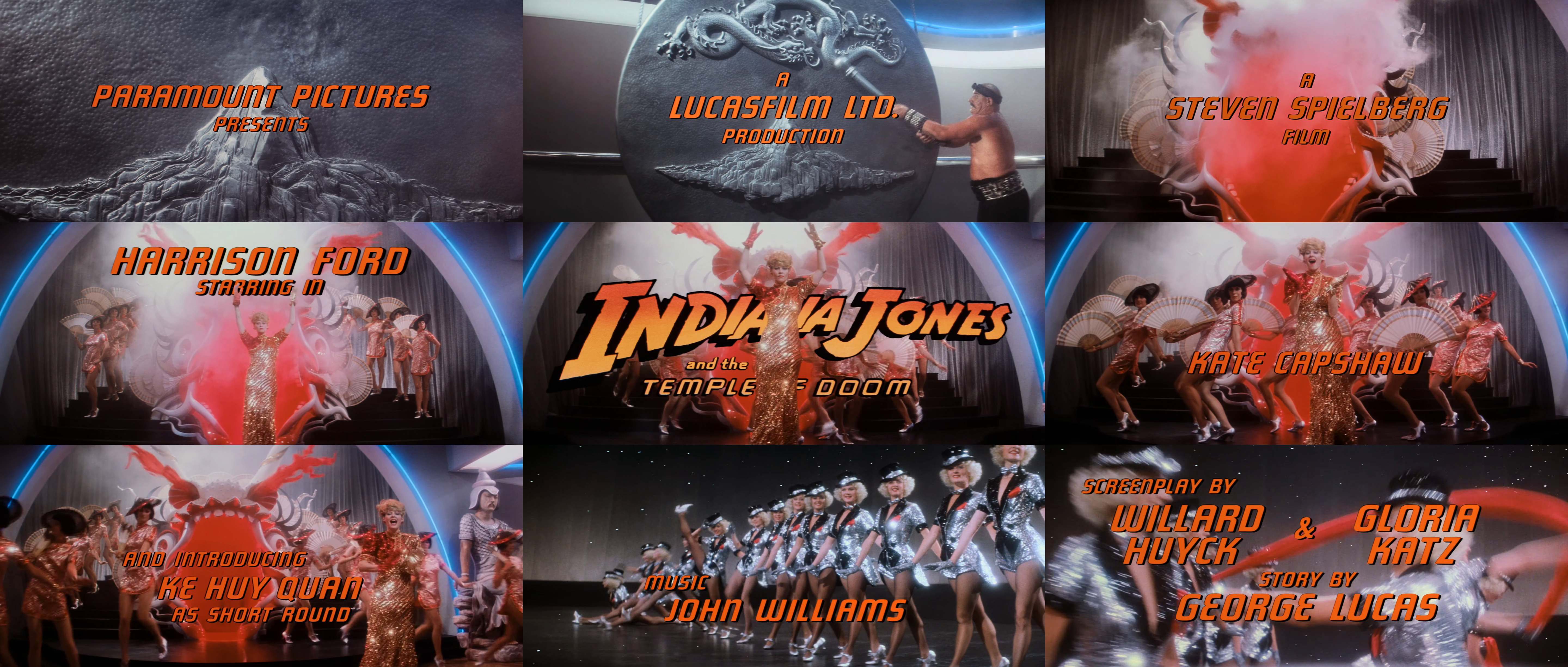
Titles by Modern Film Effects featuring Bauer Topic (see Steile Futura) in a faux italic.

Establishing title for “Shanghai, 1935,” also set in a faux italic Bauer Topic (see Steile Futura). Club Obi Wan signage based on Zig Zag. End credits set in Eurostile.


")


2 Comments on “Indiana Jones and the Temple of Doom movie posters and film titles”
Today I discovered that Maricia Loeb was the designer of Zig Zag (which was used in the Temple of Doom film) amongst additional fonts that appeared in the 1975 Dover Publication New Art Deco Alphabets.
As stated in Luc Devroye’s type info page below, there are several digital fonts based on her work:
Let me know if it needs confirmation :-D
Thanks, Jay! Zig Zag now has a page with designer credits and more info. Will look more into Marcia Loeb’s alphabet designs another time.