
ZEITmagazin Online

ZEITmagazin Online is the newly launched digital version of the supplement to Die Zeit, the most widely read German weekly newspaper. It was designed by Edenspiekermann (Team: Erik Spiekermann, Christian Hanke, Moritz Guth, Harry Keller, Christoph Rauscher, Julian Panzer, Peter Rudolph, Sara Hesse and Michael Börner; art direction Zeit Online: Tibor Bogun, art direction ZEITmagazin: Katja Kollmann). Unsurprisingly, the resulting reading experience is remarkable. In this post, I share a few observations and quibbles.
The fonts in use are Tablet Gothic (José Scaglione & Veronika Burian, 2012) and FF Franziska (Jakob Runge, 2014). See more of the freshly released Franziska in the Blog post.

Homepage (top), detail. The challenge of putting type on images has been tackled by offering a choice between white type on a dark gradient overlay and black type on a bright gradient overlay. That’s a more sophisticated approach than plain boxes or — especially for smaller type — text shadow. Still, it doesn’t work for all images. The image shown above was soon replaced with the one shown in the image at the very top of this post.
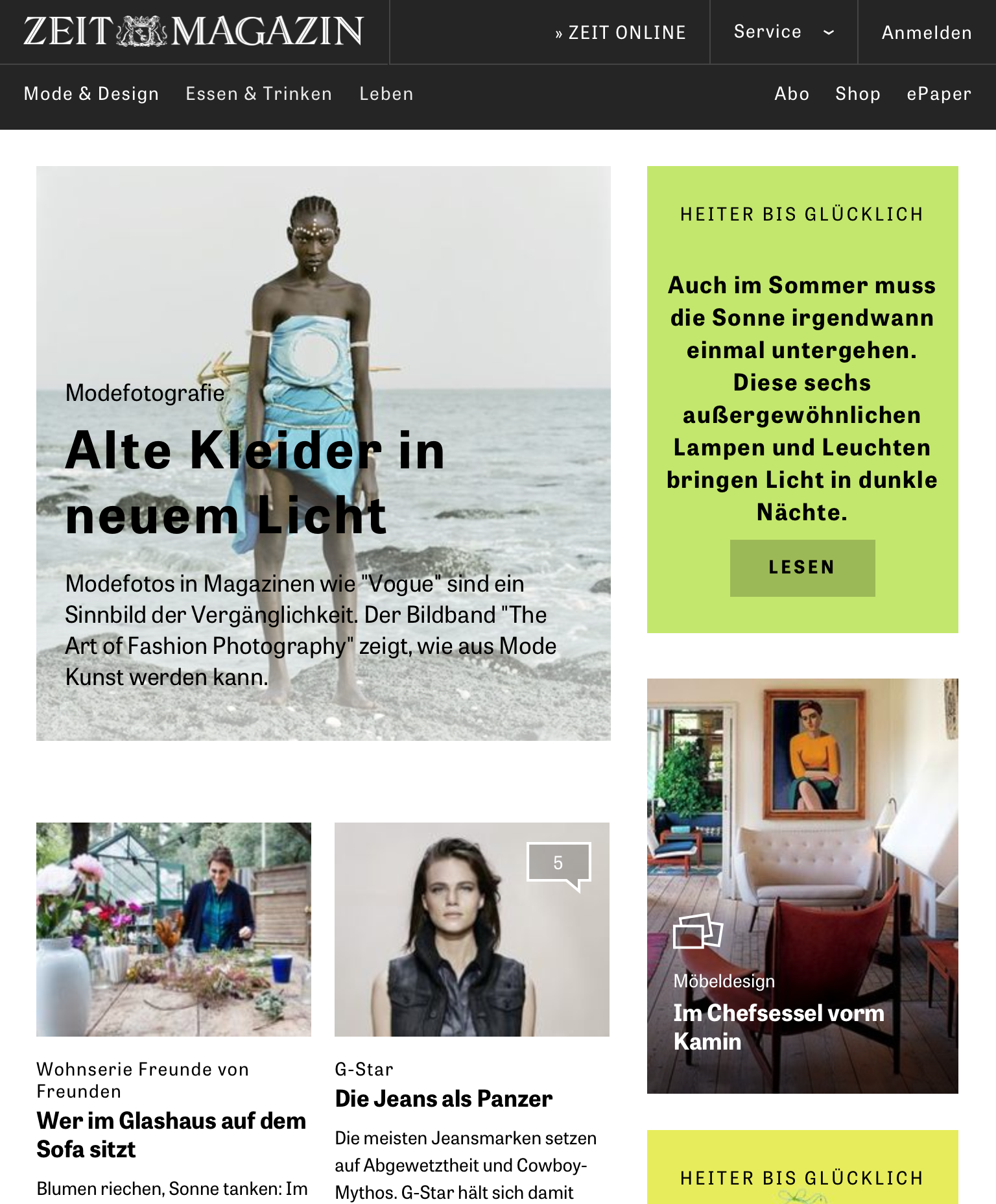
Mode (Fashion) & Design. I’m not a fan of letterspacing lowercase letters, especially when they are bold. Increasing the tracking messes with the rhythm of inner-letter and inter-letter whitespace as defined by the typeface designer. In a Bold, counters are small; spacing should be accordingly tight. Here, the rationale might have been that otherwise the dense type would completely obscure a certain portion of the image. At least the smaller center-aligned type in the top right box shouldn’t have been letterspaced, though.

The high-contrast figures for the ranking of the most popular posts and articles are from Tiemann-Antiqua. This typeface is the headline typeface in the print edition of Die Zeit and has also been heavily used in the printed ZEITmagazin. This is the only appearance of Tiemann online.

At least on iPad proportions, the floating portrait box has extremely short lines. With long German compound words and no hyphenation, this can lead to ugly results. Interestingly, Tablet Gothic has been paired with Franziska’s italics here. This might have been an unintended and temporary thing, though: I see (faux-)obliqued Tablet Gothic now.
Tablet Gothic has italics, but they haven’t been included as webfonts here. Italicized words consequently are created automatically by the browser and rendered as faux-italics. A typographic taboo? In principle: yes. In practice: only if you can tell without looking into the source code. Tablet Gothic’s italics are obliques anyway — they don’t have cursive forms. Is having true (i.e. optically corrected) obliques worth serving another font file (or two)? The best solution would probably be not to use any italics for Tablet Gothic at all, and instead use Franziska Italic, just like for the portrait boxes shown above. It’s an unusual yet charming solution and doesn’t affect the page load time.

Header for a longform article (with video).

Longform text in Franziska with floating blockquote in Tablet Gothic

Inconsistent quotation marks: straight (“dumb”) quotes and guillemets are used next to each other. Read more on the difficulty of getting quotation marks right on the Web in this related Blog post.


")


")


2 Comments on “ZEITmagazin Online”
Waah, that letterspacing of mixed-case headlines …
(Ah, just now see you hid a comment on this in the captions. Easy to miss, and hard to read here.)
Florian focused on the web and tablet experience here, but I noticed another misstep on the iPhone. The line-height remains constant despite the column width, making it a bit too loose on mobile. (The font size is probably too large as well.)
I’ve seen far worse, of course. Overly loose line-height is a very common negligence in “responsive” web design that André has griped about…
…and FontFont themselves reminded us about the basic fundamentals of linespacing in their latest newsletter.