
Florence + The Machine – Dance Fever album art and single covers
Contributed by Jenna redacted on Sep 12th, 2026. Artwork published in
May 2022
.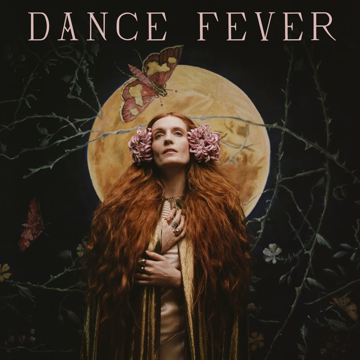
The album art for Florence + The Machine's Dance Fever
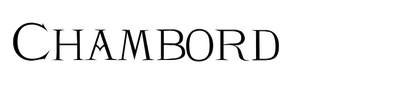
Florence + The Machine’s fifth studio album Dance Fever features a slightly modified version of Chambord by Scriptorium in a design by Thunderwing. The album and its singles were released in 2022.
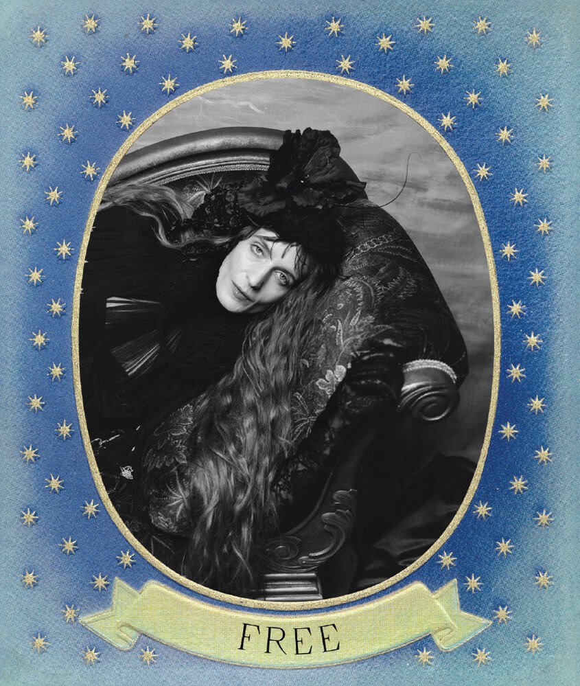
The single art for the song “Free” from Florence + The Machine's album Dance Fever
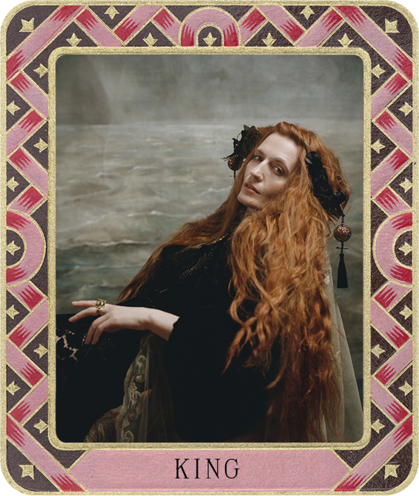
The single art for the song “King” from Florence + The Machine’s album Dance Fever
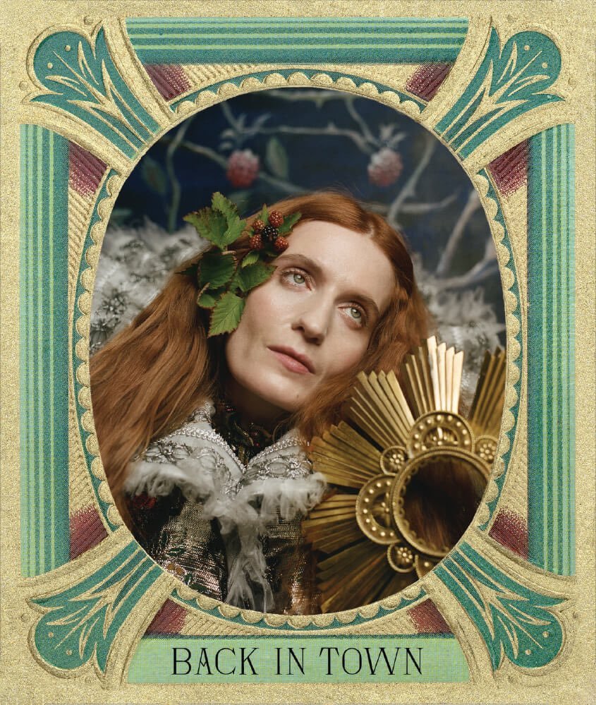
Autumn de Wilde. License: All Rights Reserved.
The album booklet art for the song “Back in Town” from Florence + The Machine’s album Dance Fever
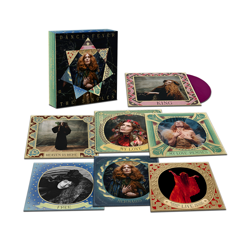
The Dance Fever 7″ Singles Boxset from Florence + The Machine
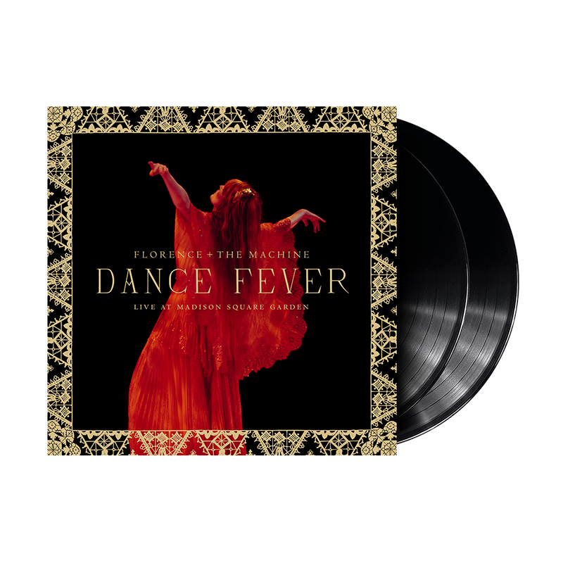
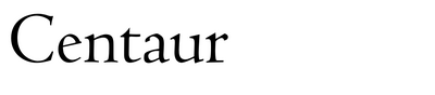
Dance Fever (Live At Madison Square Garden) LP by Florence + The Machine. The second typeface used here is Centaur.





















1 Comment on “Florence + The Machine – Dance Fever album art and single covers”
Hi Jenna,
You write that Chambord was “slightly modified”. I’d argue it goes beyond that: Virtually none of the glyphs is a match for the font. At the same time, the common characteristics – first and foremost the angled bar in A and the curved terminal of the diagonal in N – suggest there is indeed a connection to Chambord.
Now it could be the case that Thunderwing did start with Chambord, but condensed the proportions, changed the angles of serifs and the length of the middle bar, redrew the round glyphs, the R, and a couple other letters. Since the vast majority of Scriptorium’s fonts are based on existing designs, it could also be a custom font made by Thunderwing that happens to be inspired by the same source as Chambord. I haven’t found such a historical precursor yet. I have added our “uncertain typeface ID” tag for now.
In February 2025, Reddit user Expensive-Touch7479 collected all the glyphs used in the art made for Florence + The Machine and turned it into a font dubbed Dance Fever. Take note that this is not the font used for the art. It likely isn’t authorized, has a limited character set and is of poor quality.