
Agnès Varda posters
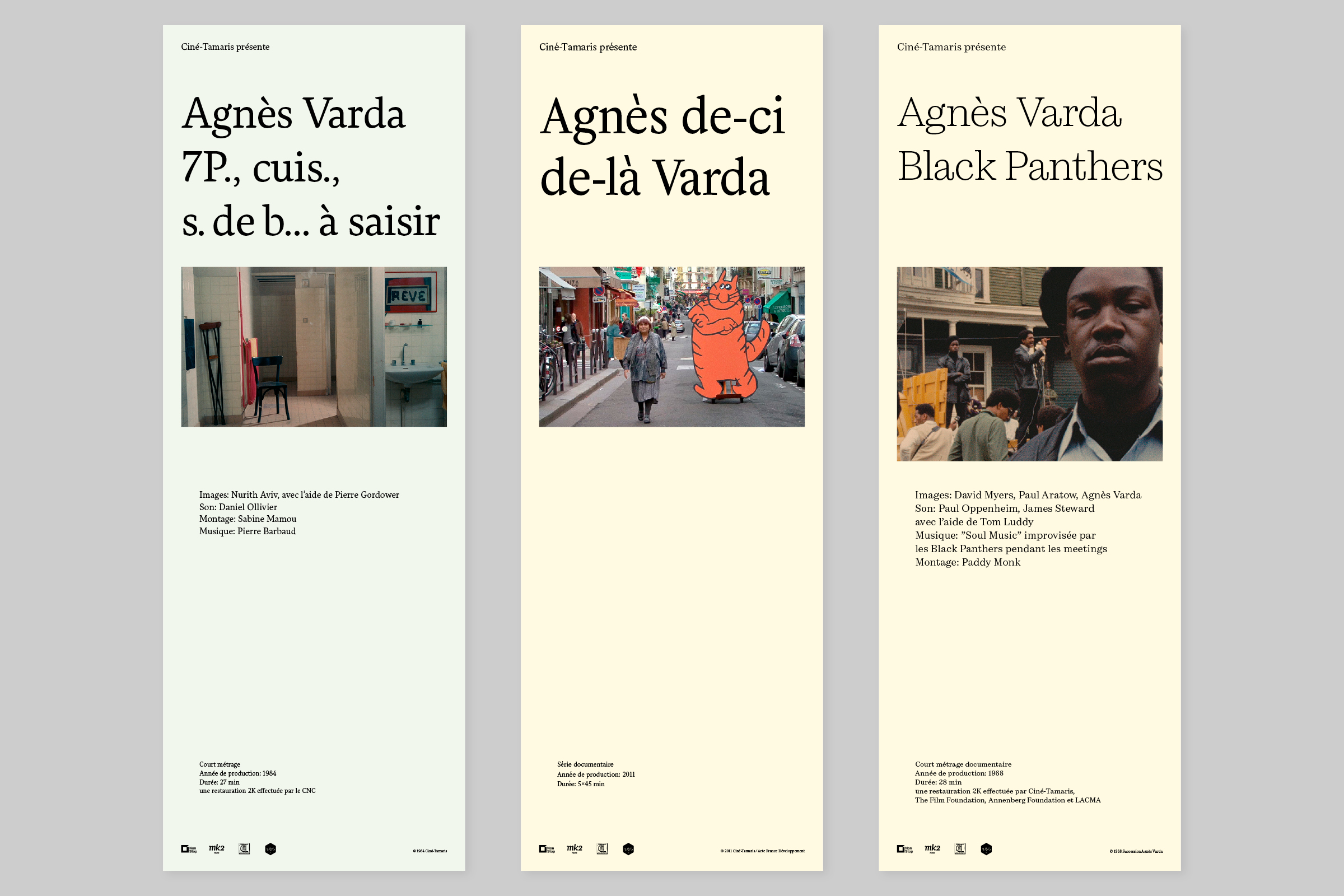
Andersen Regular; Helvetius Regular; Cardone Light
Agnès Varda (1928–2019) was a completely unique director, blending genres, styles and techniques across different themes. Swedish quality film distributor NonStop Entertainment recently acquired the entire Varda catalogue for the Nordic countries.
Malmsten Hellberg were commissioned to design posters for each of the 39 films for screenings and programmes. The image of each poster is a carefully selected still that retains the ratio from the original film and the smallish (25×70cm) posters are colour coded after genre. Each film title has its own typeface from 205TF (as in Type Foundry / Typographie Française, of course). All text, including copyright info etc on each poster is set in the same typeface.
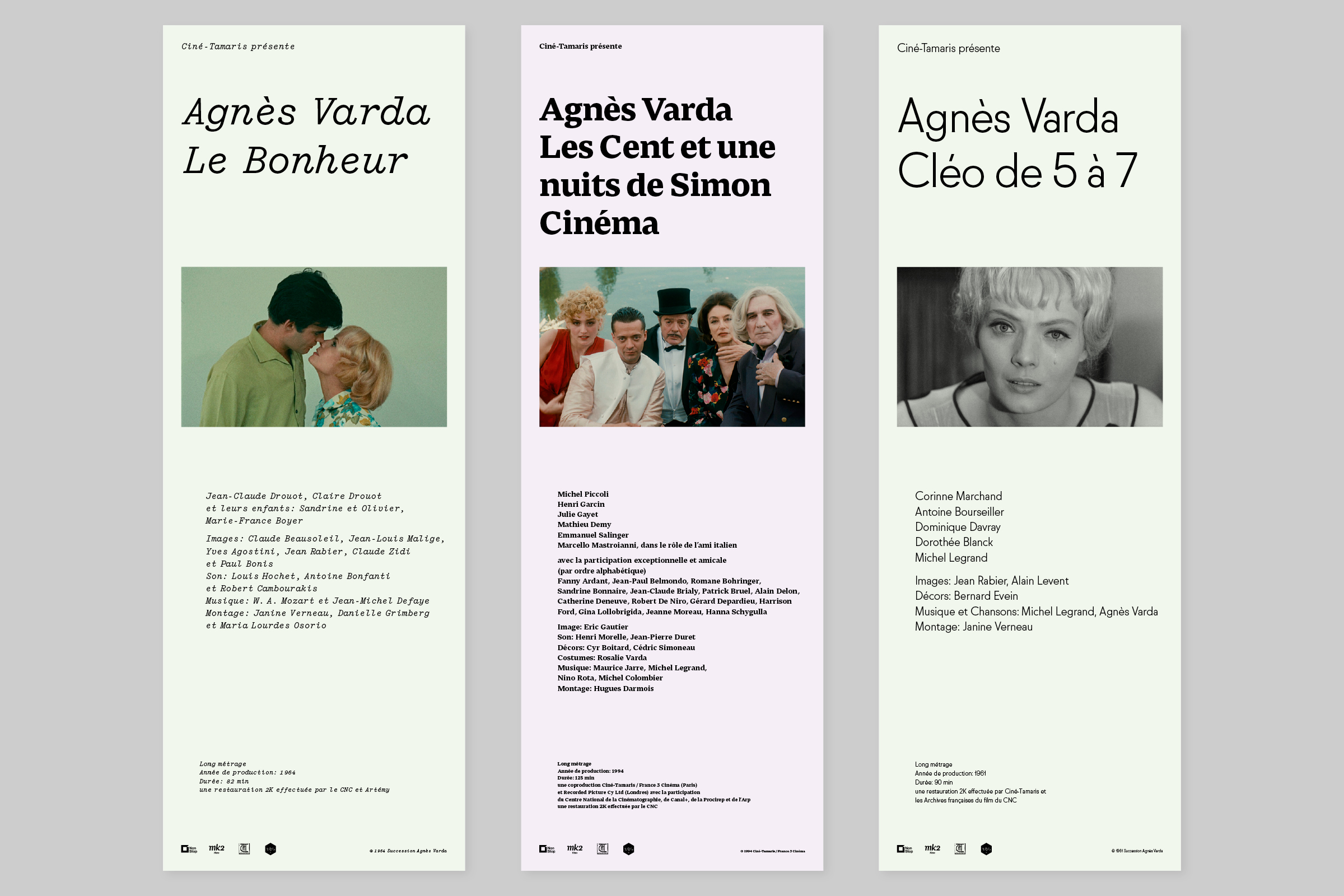
Yorick Italic; Thelo Text Bold; Molitor Light
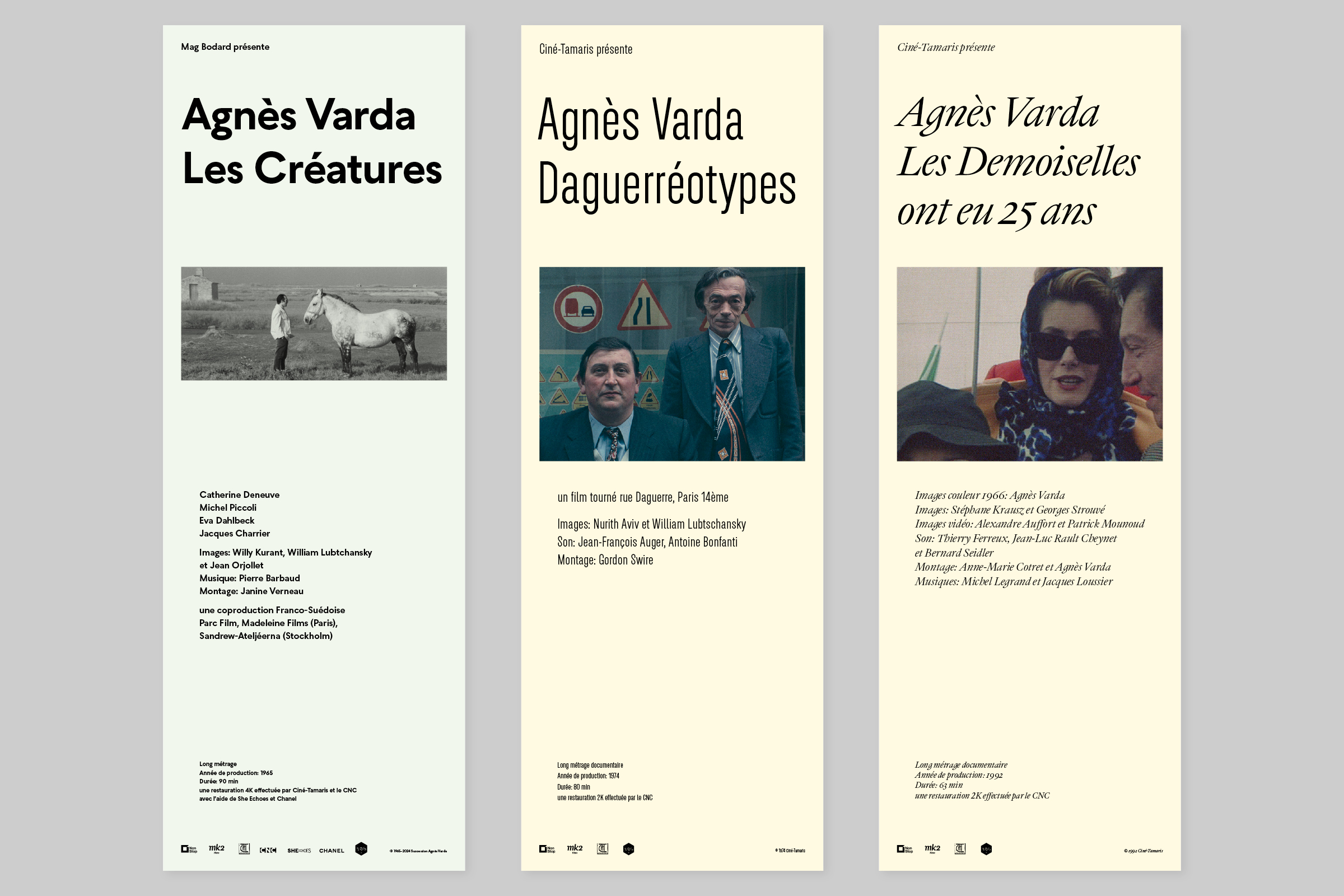
Seabirds Bold; Plaax 4 24-Light; Immortel Colera Italic
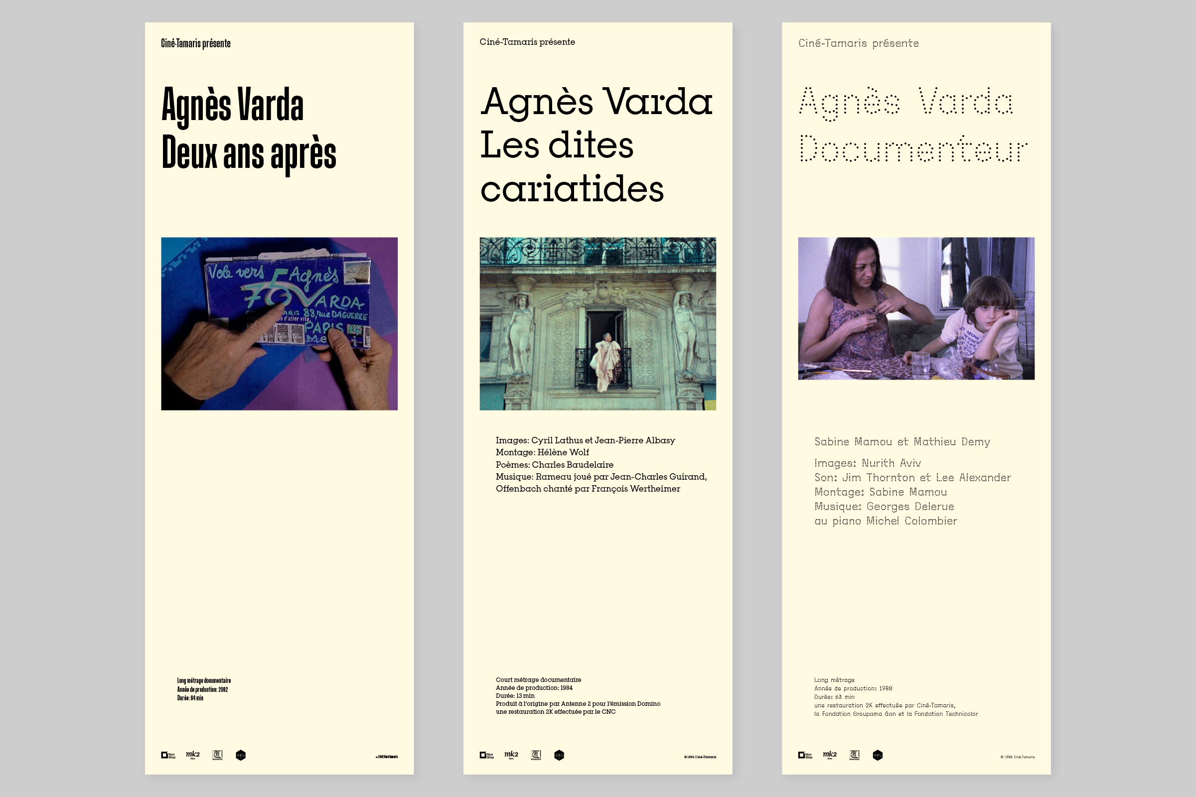
Muoto Ultra Condensed Regular; Pinokio Moyen Regular; Beretta Sans Regular
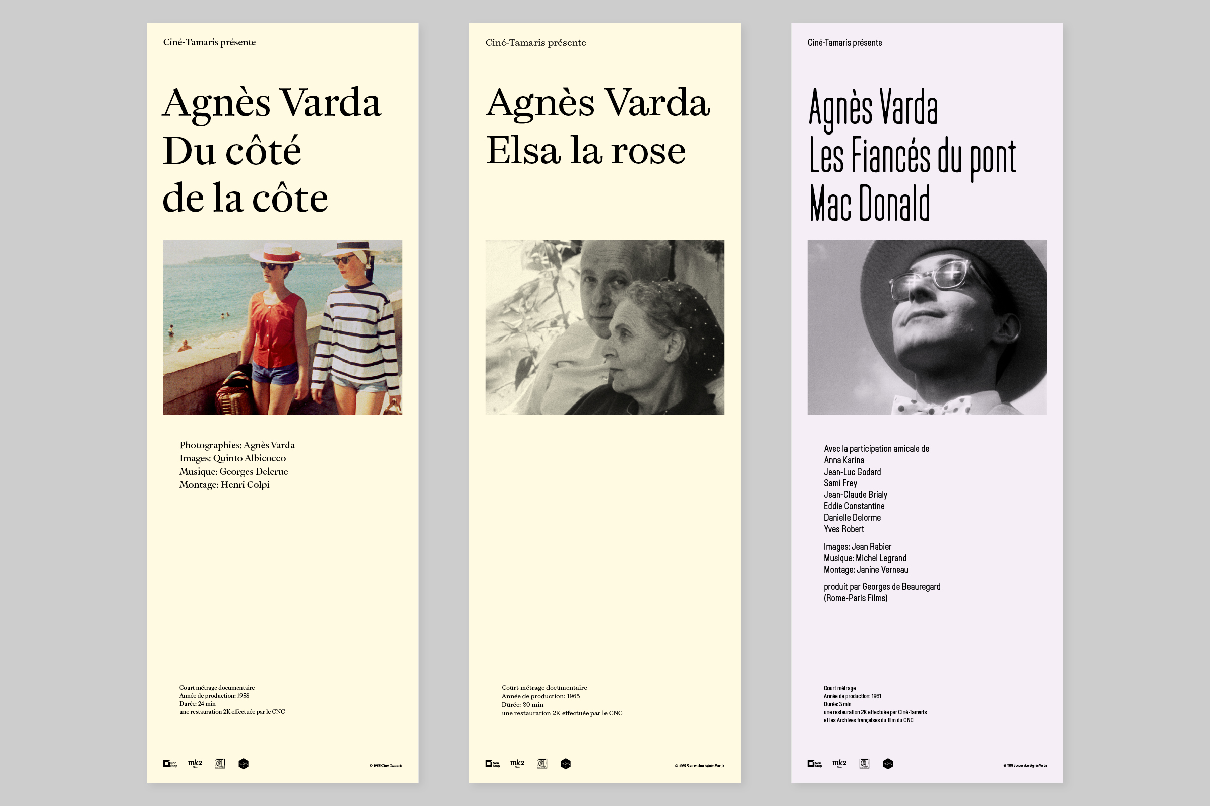
Immortel Vena G2 Regular; Cardone Regular; Lost Extra Condensed
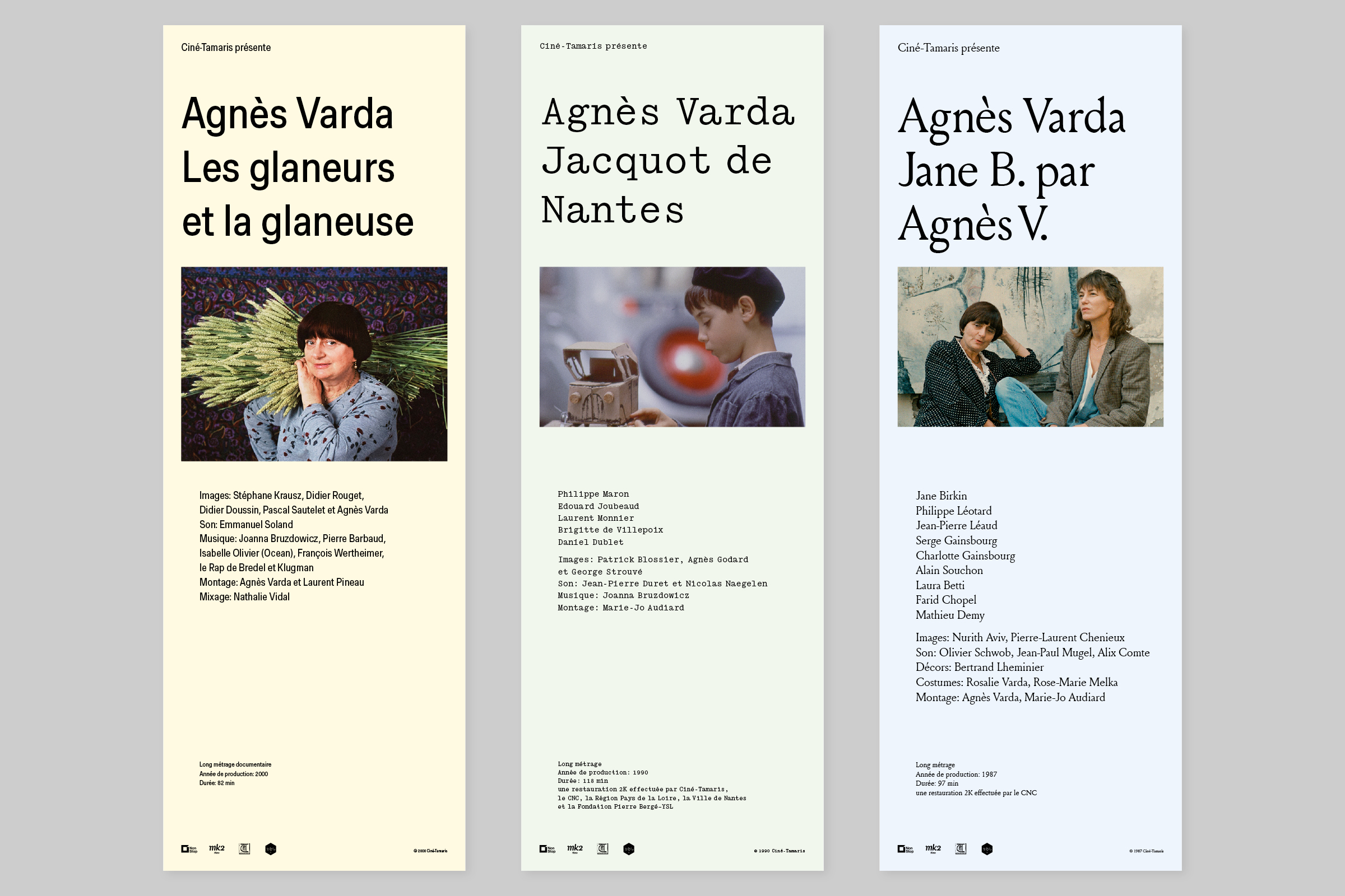
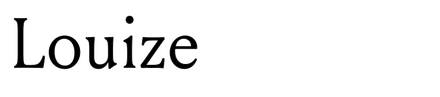
Muoto Condensed Regular; Yorick Regular; Louize Regular
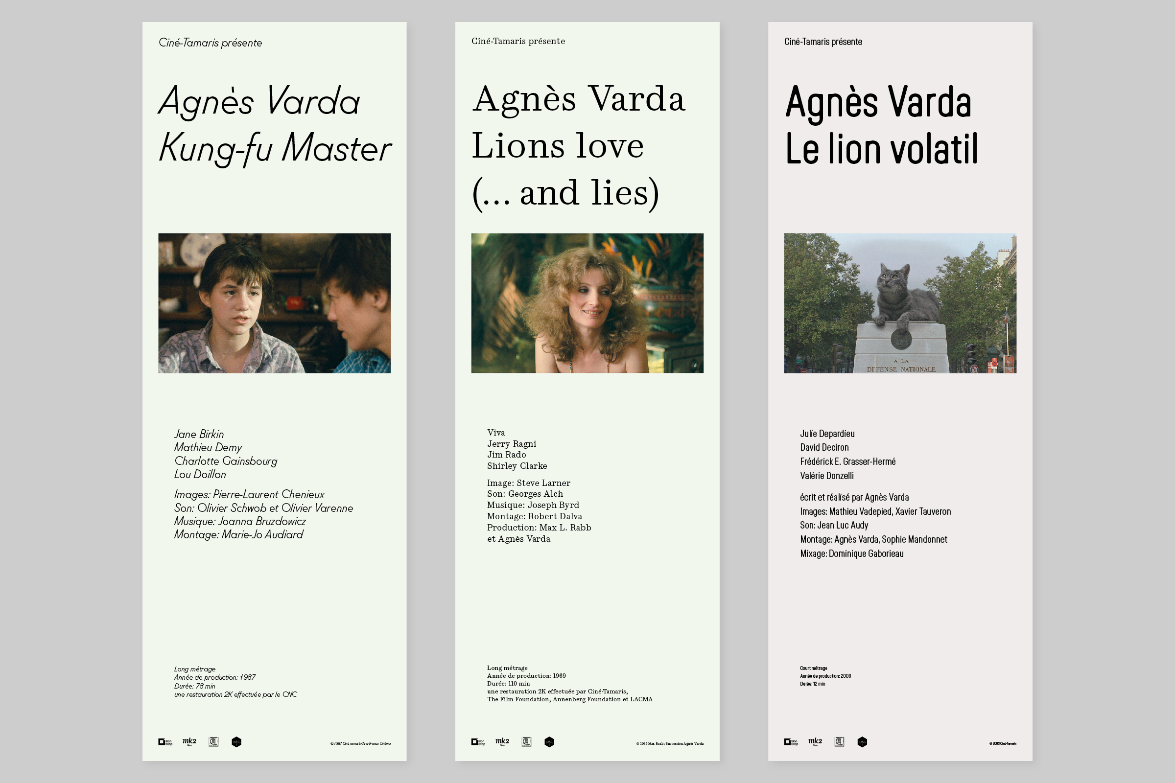
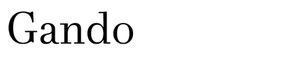
Molitor Text Light Italic; Gando Caption Regular; Lost Semi Condensed
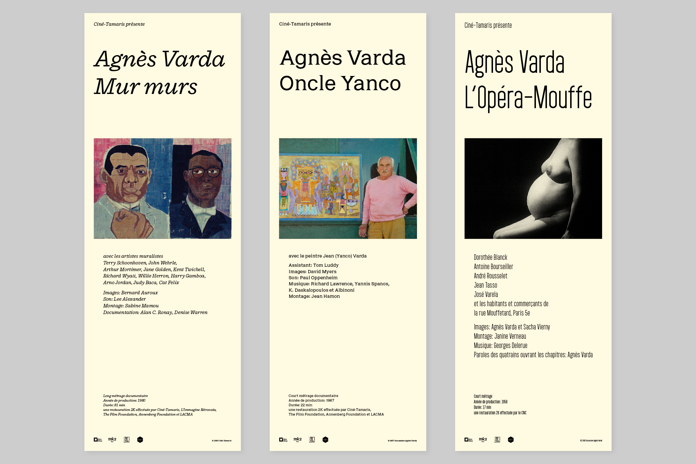
Cardone Micro; Dédale Regular; Garaje 0903 Medium
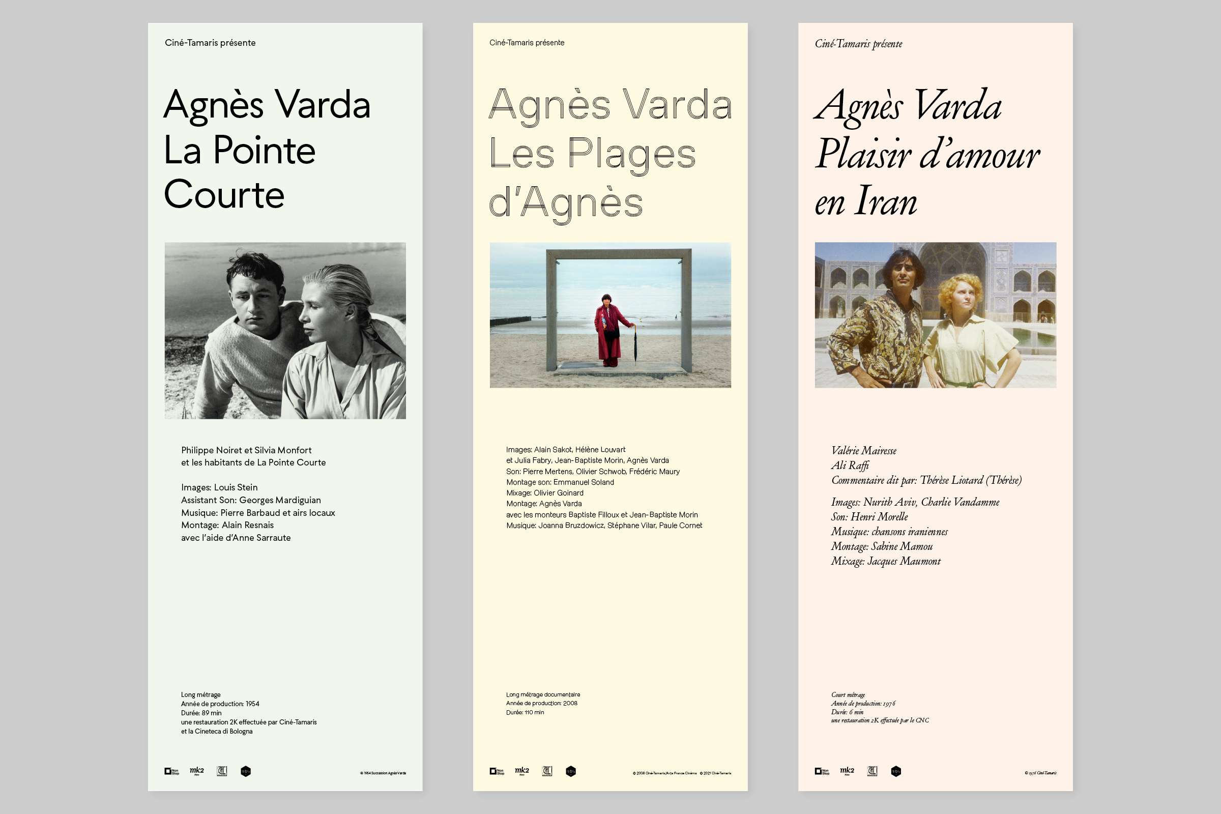
Seabirds Light; Milling Triplex; Henry Italic
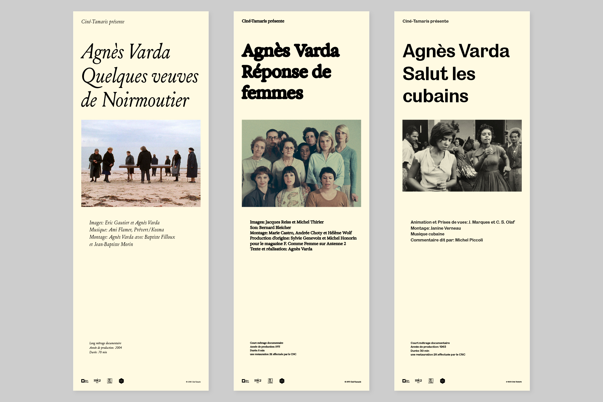
Louize Italic; Exposure -70; Salmanazar Medium
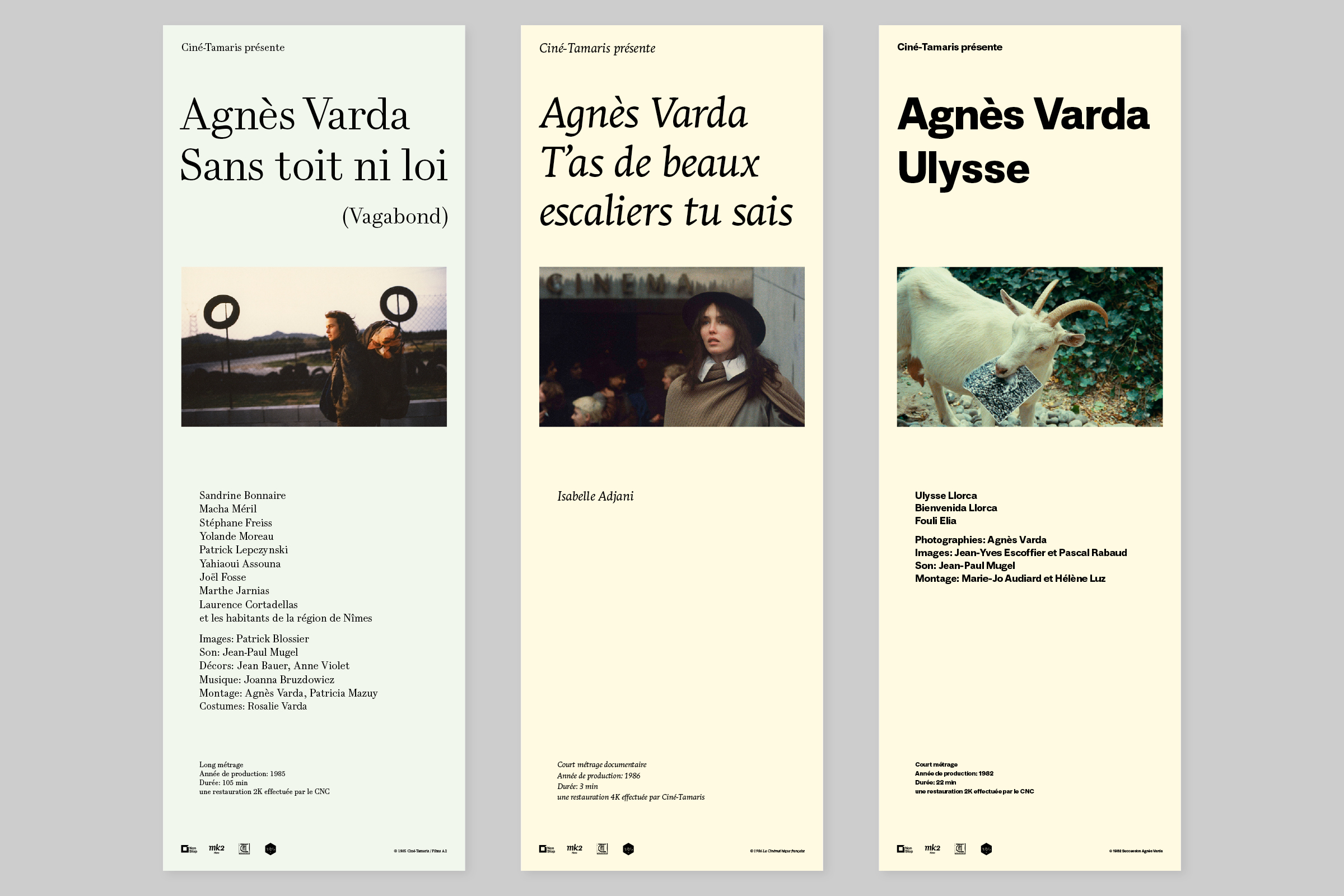
Gando Text Regular; Stuart Titling Italic; Album Sans Bold
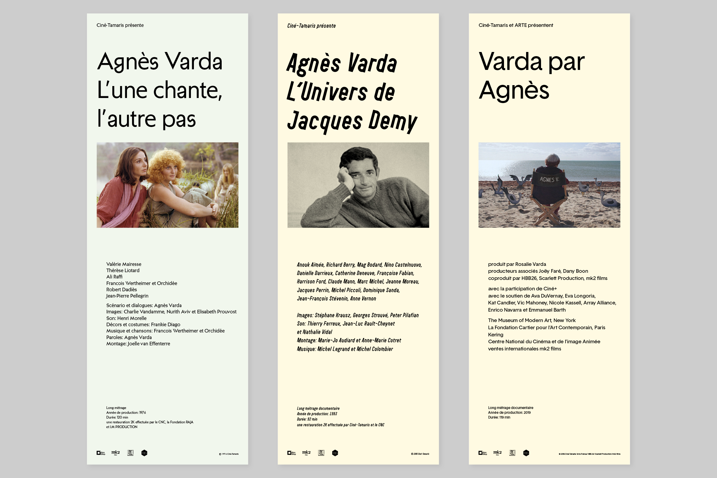
Anacharsis Regular; Garaje 0703-3503; Basetica Regular
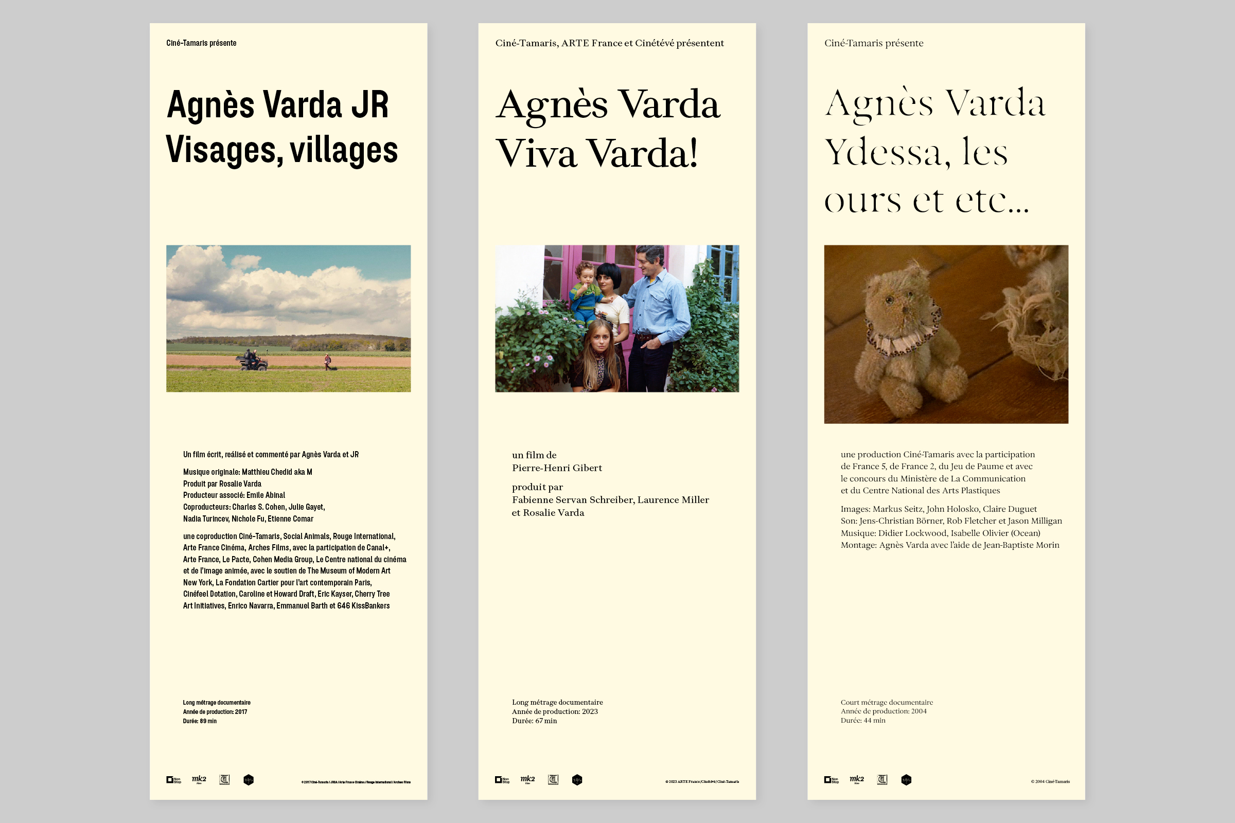
Plaax 44-Bold; Kelvin Avec Clair; Exposure +70












































2 Comments on “Agnès Varda posters”
That’s a lot of fonts…
It’s still fewer typefaces (28) than posters (39) … ;-)
For those who fancy seeing lots of fonts used for a single project, check out the typographic eclecticism tag and also the “More is more” set compiled by Matthijs. At the moment, the Enter the Void title sequence holds the record with 70 identified typefaces. You can find it alongside other questionable all-time highs in the “FIU Extreme” set.