
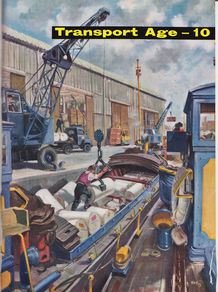
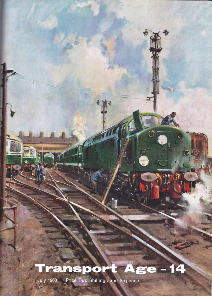
Transport Age magazine covers
Contributed by Stephen Coles on Dec 1st, 2014. Artwork published in
circa 1957
.
Published 1957–62, Transport Age was the publicity publication of the British Transport Commission. The logo appears to be based on Stephenson Blake’s Grotesque No. 66, though Hans Reichardt says that wasn’t released until 1960. It is further in appearance from Monotype Grotesque Bold Extended, though the regular style of that family is used for the date and price.


![<cite>Brasilia</cite> #3—“Warten [Waiting]”](https://assets.fontsinuse.com/use-media/98548/thumb/5db7014c/@2x/jpeg/12409c40223647-577bec55d57d7.webp "<cite>Brasilia</cite> #3—“Warten [Waiting]”")


")


")


")
3 Comments on “Transport Age magazine covers”
Beautiful stuff – incredible that a nationalised industry could once afford painted covers for its staff magazine. Nice font choice, too – very much of the period.
For anyone who wonders, as I did, about the origins of these images, you’ll be glad to hear the Flickr set has full details.
A thought, prompted by some reading following seeing Dan Rhatigan’s comments on Twitter about another MT Grotesque redesign: according to a Paul Shaw article, Monotype attempted a redraw about this time (1956, called New Grotesque) but gave up on the idea, though they got as far as releasing some alternate characters in 1961. It’s possible this had something to do with that.
Of course British Railways rebranded out of Gill Sans and into Rail Alphabet a decade later, clambering on board the swiss-style bandwagon (and probably trying to get letters that looked a bit better in lowercase than Gill Sans’s tend to: if you look at ’50s rail signs they’re mostly UC only).
The magazine that these pictures were the covers for, was not a staff magazine but a promotional product aimed squarely at the customers of the British Transport Commission. We have digitised all of them and made them available for sale to everyone. The content is lavishly illustrated with photographs which reflect the attitute of the 1950s and 1960s.