
Schuyler Quentel ESV Bible

“Many typefaces were considered for this design and a lot of standard workhorse typefaces were discarded in favour of the luxurious beauty of Milo Serif from American type designer Michael Abbink. Milo Serif has the added advantage of combining well with the Milo sans serif companion typeface, that we are using for non scripture materials. We are very happy with the performance of this type family in these editions.” — 2K/Denmark
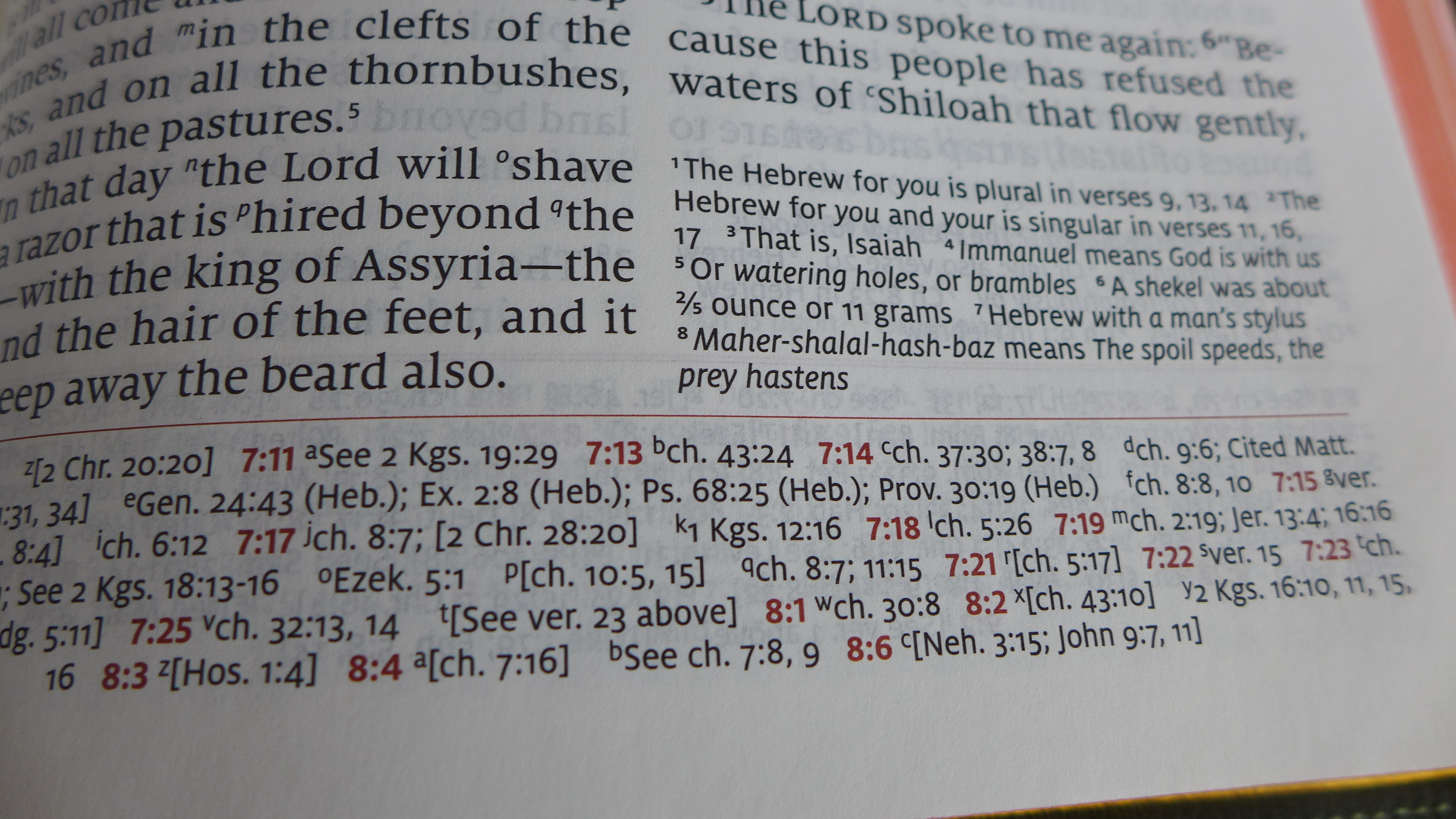
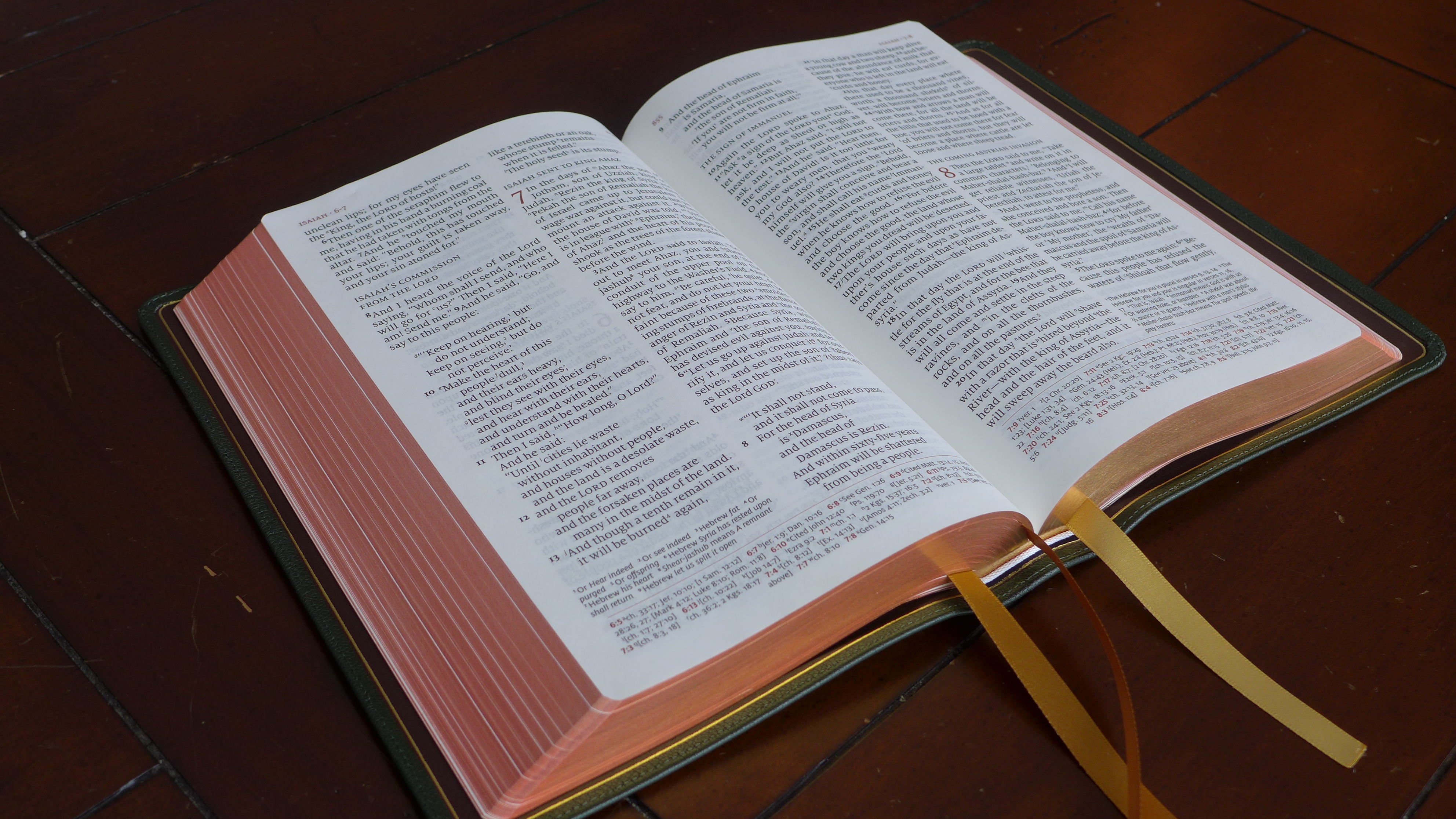
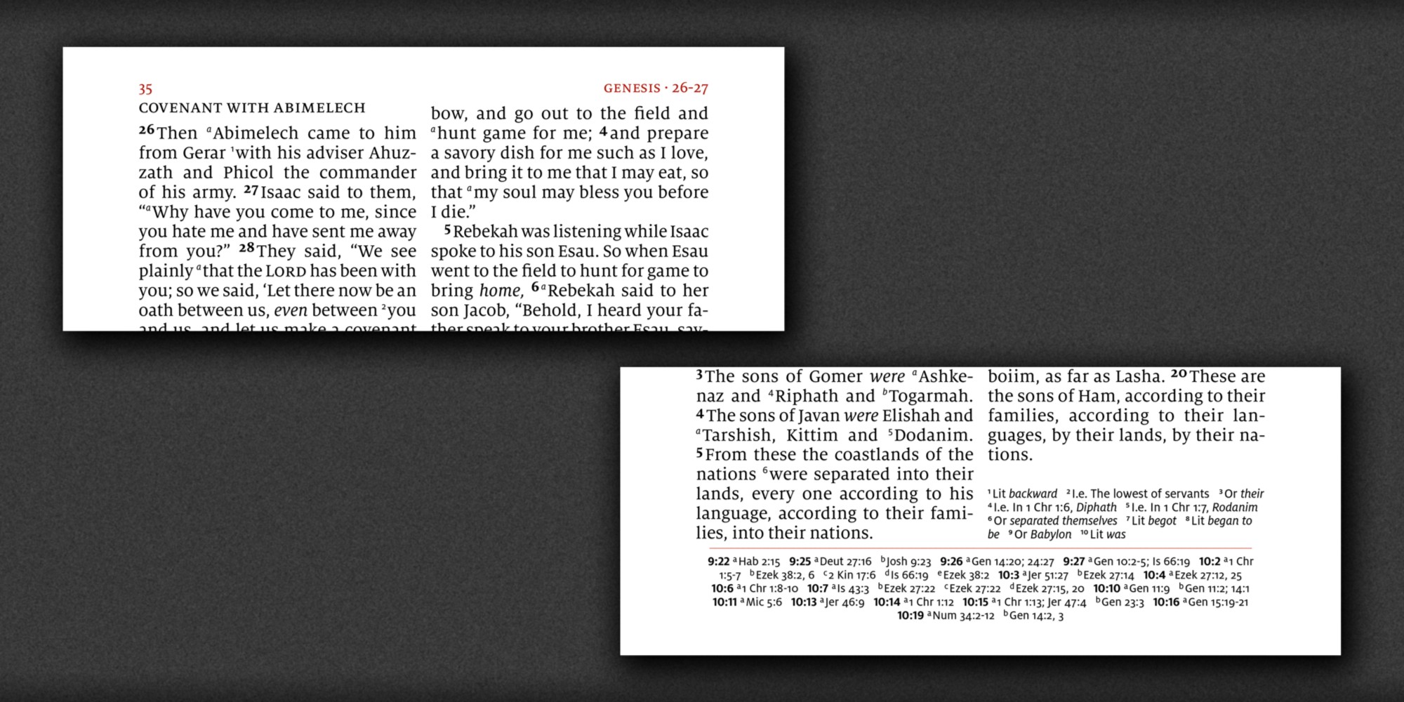
“If you are old, or read from a pulpit, or otherwise appreciate large print, you have to check this Bible out. I am not old, nor do I often read from a pulpit. I mostly read in an armchair, but even so I have yet to find a font that is easier on the eyes than this Milo 11pt. It is a simple and crisply printed typeface, resulting in an eminently readable Bible.
With the ESVQ, the design gets out of the way and lets you see the text more clearly than any other Bible I’ve yet seen, which is just what a design should do. How does it accomplish this? Line matching, large and readable font, opaque and thick paper, understated use of red color, and smart layout.” — Jeffrey Quinn, Holy Writ and Sacred Witness
“The interior typography is elegant but not boring. The capitalized headings and the use of red to set off the page headers, chapter numbers, and marginal references results in an easy flow that looks much simpler than the work it must have taken to achieve.
At the risk of sounding heretical, I’d also like to point out one downside to 11 pt. text in a double-column layout. Because these columns are right justified, and the larger type means fewer words per line, there are occasionally gaps between words in the paragraphed sections that are just too large not to call attention to themselves.” — J. Mark Bertrand, Bible Design Blog


")


")

 and Holland tourism logo (1969)")


 station sign of Kyiv Metro")

4 Comments on “Schuyler Quentel ESV Bible”
very nice! I like the cambridge clarion, uses lexicon : ).
If they ever produce a 14pt ESV Schuyler Quentel or RL Allan, I’m buying them. No one is making a quality giant print ESV, and with so many people that need the larger print bibles, one has to believe Schuyler and RL Allan are missing a large market opportunity.
Are you aware of a Bible that is completely printed in a sans serif font (not just the footnotes)? Thanks.
I believe most versions of the NIV published by Zondervan use a sans serif font.