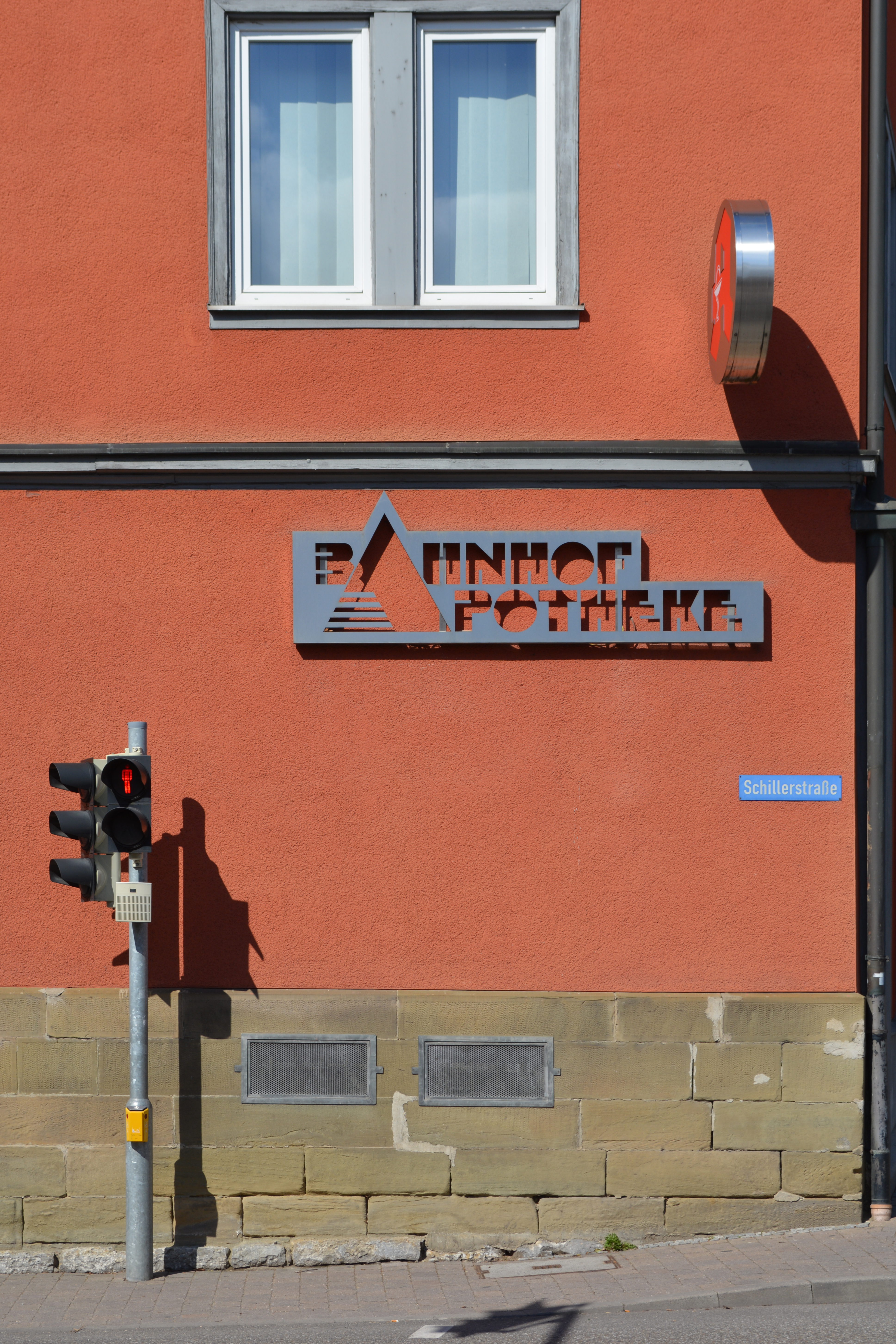
Bahnhof-Apotheke Öhringen Photo(s) by Florian Hardwig. Imported from Flickr on May 26, 2015. Source: www.flickr.com Uploaded to Flickr by Florian Hardwig and tagged with “babyteeth” and “sinaloa”. License: CC BY-NC-SA. Two lines of Baby Teeth with a shared A from Sinaloa, cut from the surface for the sign of the Bahnhof-Apotheke, a pharmacy close to the railstation of Öhringen, Germany. Typefaces More about Baby TeethGet Baby TeethMore about SinaloaGet Sinaloa Formats Signs(2312) Topics Retail/Shopping(1197) Health/Fitness(955) Designers/Agencies unknown(4616) Tagged withpharmacies(19)stencil(492)signs(730)initials(278)lettering derived from typeface(776)type cut from surface(83) Artwork location Germany(4115) Öhringen(3) In SetsRADIOGIAPPANESE (Leonardo de la Fuente)(2878) 2 Comments on “Bahnhof-Apotheke Öhringen” Robert King says: Jan 24th, 2019 12:19 am Wow, this is stunning! And what a great photo, Florian… this looks like a beautiful album cover from the 1970s. Florian Hardwig says: Jan 24th, 2019 3:13 pm Haha! As far as the type choices go, there’s definitely a severe 70s vibe at play. The setting is a bit more … pedestrian than, say, Tomita or Pink Floyd, though. Post a comment Name Email – will not be published Website Your response Submit Comment More Baby Teeth in use Sorcerer by Miles Davis1967unknownContributed by Stephen Coles Let The Fire Fall by Kate Wilhelm (Doubleday, Lancer)1969Milton GlaserContributed by Mathieu Triay Staff Pick Record dividers at Groove Merchant San Francisco2018Patrick DaviesContributed by Patrick Davies Sponsor More in Health/Fitness Whitehill Pool1970Contributed by Kevin Hobbs Sugar River Eye Carec. 2024Studio RogerContributed by Rachel Rogerson Digitron 800 scale brochurec. 1980Contributed by Jason Timmons CETAL packagingc. 2022unknownContributed by Eyad Al-Samman More in Signs Rathaus Charlottenburg RatskellerunknownContributed by Stephen Coles Romantik & Mittelalter, Alte Nationalgalerie2012FernkopieContributed by Florian Hardwig Staff Pick Óptica Futura OpticiansContributed by Ian Lanius Omaka Brewery brandingc. 2021Stockholm Design LabContributed by VP Type More Fonts In Use Lean In: UC Women’s Leadership Conference2019Isabel BinaContributed by Isabel Bina Staff Pick Volksbühne Berlin flyers and leaflets2013LSDLeonard NeumannContributed by Florian Hardwig Staff Pick Satellites of Fashion ExhibitionCartlidge LeveneContributed by Indra Kupferschmid Staff Pick Fukt magazine 19, “The Storylines Issue”, Dec 2020c. 2020Ariane Spanier DesignContributed by Nikolas Wrobel Staff Pick

2 Comments on “Bahnhof-Apotheke Öhringen”
Wow, this is stunning! And what a great photo, Florian… this looks like a beautiful album cover from the 1970s.
Haha! As far as the type choices go, there’s definitely a severe 70s vibe at play. The setting is a bit more … pedestrian than, say, Tomita or Pink Floyd, though.