
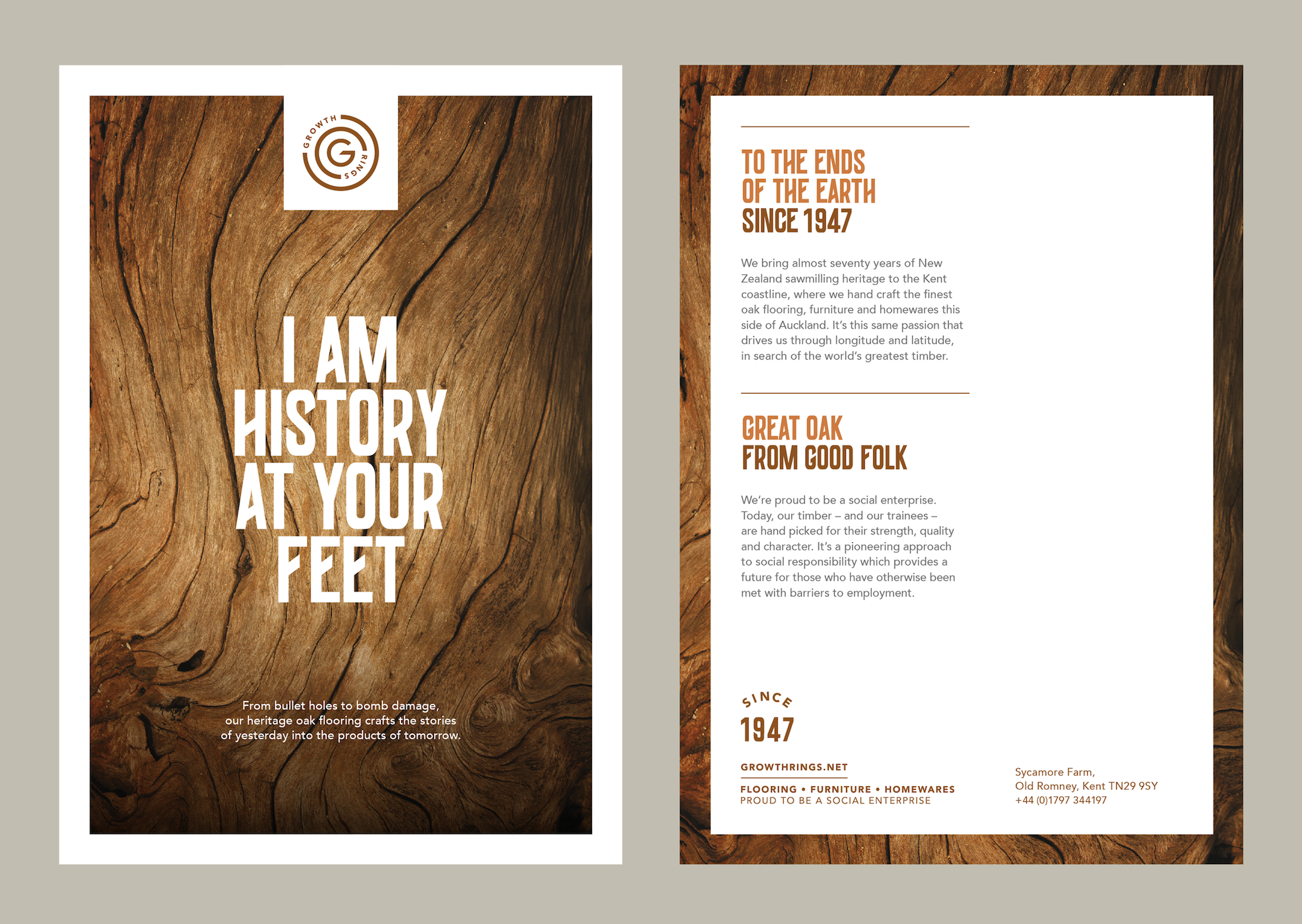
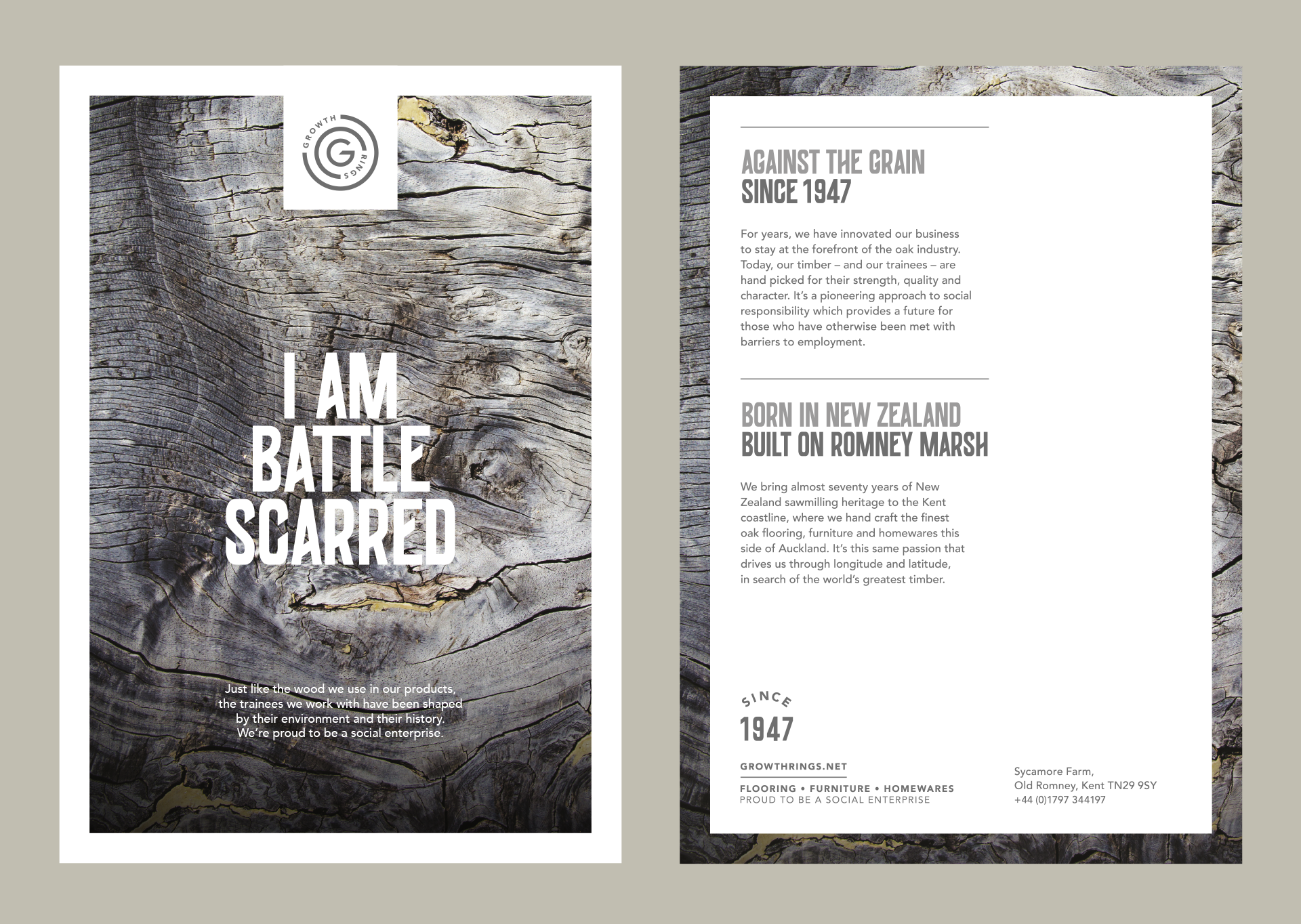
Growth Rings

Designed by Lantern, Growth Rings brings almost seventy years of New Zealand sawmilling heritage to the Kent coastline, where they handcraft the finest oak flooring, furniture, and homewares this side of Auckland. As a social enterprise, they also provide education and training for those who have otherwise been met with barriers to employment.
Lantern celebrated the imperfections of the company’s oak, and its folk, through a suite of powerful creative headlines and textural photography, designed to personify the character and personality of their people and products. They told these stories using BIG — a raw, condensed display font developed by João Miranda and Bruno Rodrigues. Coming from a series of handprinted wood type specimens, the letterforms not only reflect the era of timber typesetting, but the angular forms also compliment the quarter-sawn styling of the logo.


")

")


