
The Kinks – Kinksize Session EP album art
Contributed by Nick Sherman on Jan 6th, 2020. Artwork published in
.
Source: www.rootsvinylguide.com License: All Rights Reserved.
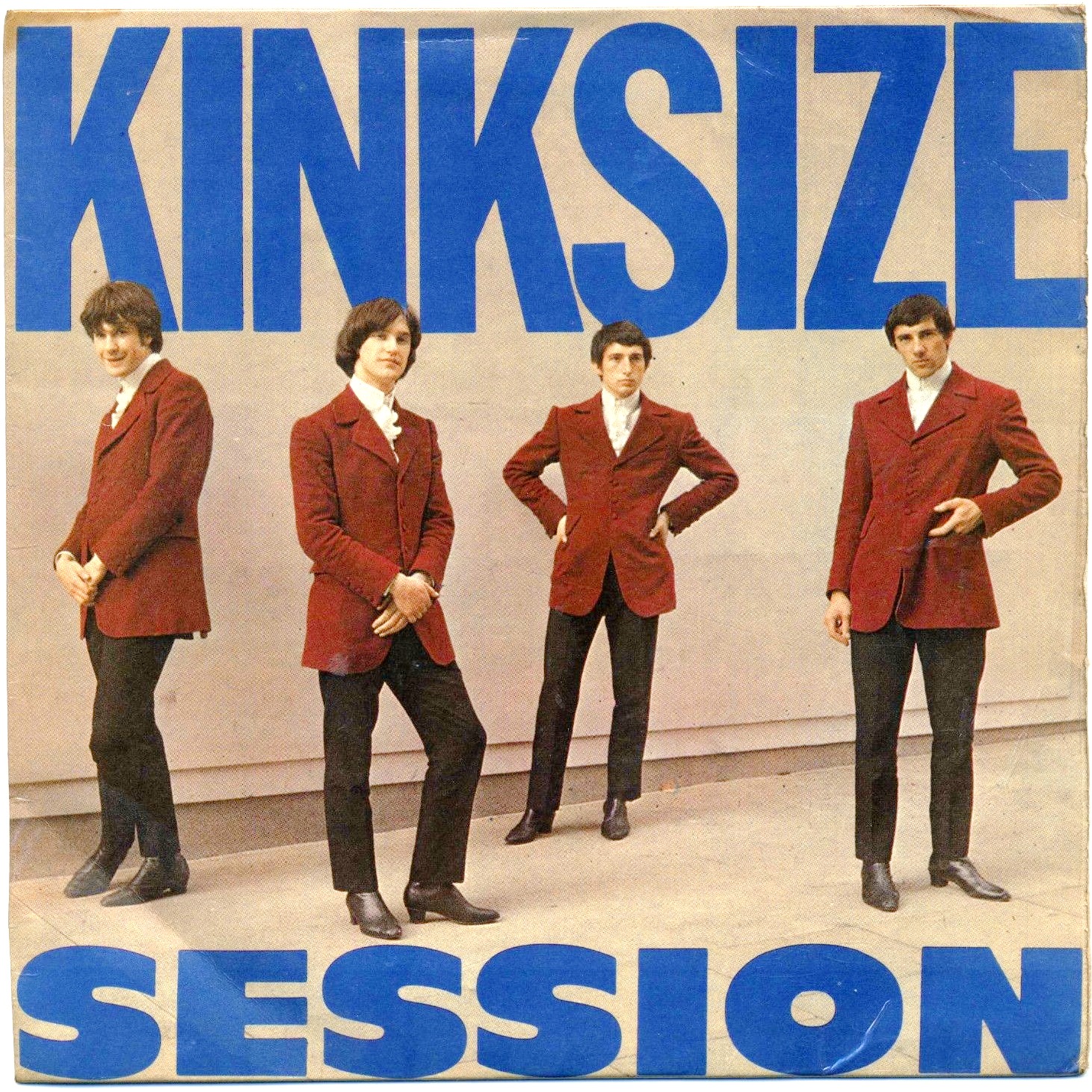
Kinksize Session is the first EP from British rock group The Kinks, released in the UK in 1964 shortly after their first LP.
The cover features extra-large, all-caps settings of Franklin Gothic and Antique Olive Nord incorporated with a photo of the band to further accentuate the Kinksized sense of scale. The back cover is less confidently styled, using a hodgepodge of British sans-serifs in a somewhat awkward composition.

Source: www.rootsvinylguide.com License: All Rights Reserved.


")


 by Anthony Burgess (Aleph, 2019)")


6 Comments on “The Kinks – Kinksize Session EP album art”
That’s a pretty early use for Compacta!
The fat wide sans looks indeed a lot like Antique Olive Nord (1959), but it’s Filmotype Ford (1953). Filmotype faces were available in the UK via Photoscript, probably among others. In Nord (bottom), curves are flatter and tops heavier. I’ve adjusted the typeface credits.
Thanks for the correction, Florian. I didn’t know about Filmotype Ford before. Considering the release dates and similarity in both the name and design, I wonder if Nord was directly inspired by Ford?
By the way, the Ypsilon book on Excoffon dates Nord as 1958, not ’59. (And now I’ll probably read all the parts about Nord in that book again :)
I learned about Ford when it came up here for the first time. That film poster predated Nord, so it had to be something else.
Good question! Some of Excoffon’s faces were – allegedly or evidentially – made in response to existing ones, see Chambord vs. Peignot, Banco vs. Jacno, or Choc vs. Bolide. I don’t know if this is the case here, too. The mentioned releases were all about addressing domestic competition, i.e. giving Fonderie Olive something that meets the same demand as a product by Deberny & Peignot, the other major French foundry. I’d doubt that Filmotype as an American maker of phototype was on their radar. They were in a different market.
Also, Ford and Nord are not that similar as soon as one starts looking at the lowercase. There, the former rather resembles a stretched Futura Extra Bold (1952). Some parallels between Ford and Nord are simply due to the similar width and weight. As with Choc and Banco, it’s beyond question that Excoffon’s take is by far the more interesting design. Does the Ypsilon book mention the reasoning behind the name? I wonder if it has to do with the top-heaviness of the letterforms, with most of the weight up in the “north”.
For the year: Could this be a matter of design date vs. release date? Letterform Archive has a specimen from before there was “Antique Olive”. Stephen dates the release to 1959–60. The specimen is undated, but a calendar shown in one of the samples is September 1961. Our earliest documented in-use example so far is from 1961, too.
This cover is making me so happy!
Hey Nick. Where did you get the publish date for this particular sleeve? Could it possibly have been released later?
I got the date from Discogs.