
The Leeshore by Robert Reed (Donald I. Fine)

The Cut-In typeface comes with a number of alternate glyphs. For Loretta Trezzo, the stylistic range wasn’t large enough, though. The NYC-based book jacket designer made an ingenious discovery: ITC Benguiat Gothic is another monolinear typeface with rounded terminals, and its weight and proportion match those of Cut-In.
For The Leeshore, Trezzo mixed letterforms from both typefaces. “THE” is in ITC Benguiat Gothic (1979), Ed Benguiat’s contrastless sans-serif adaptation of his famous ITC Benguiat (1978). In “LEESHORE”, most glyphs stem from Cut-In (c. 1973), the futuristic geometric sans designed by Maurice Schlesinger. The high-waisted R with the curved leg, however, is taken from Benguiat Gothic, readily identifiable by its Art Nouveau roots. (The H is customized, O appears to be a repurposed zero.)
The author’s name is composed in a similar fashion: It’s in Cut-In, with interspersed E’s from Benguiat Gothic. The mixing is continued even for the small text in red. Both typefaces were available from Letraset at the time. Trezzo effectively uses the the two rub-down typefaces as complementing stylistic sets.
The Leeshore is the debut novel of Robert Reed. It was published by Donald I. Fine in 1987.
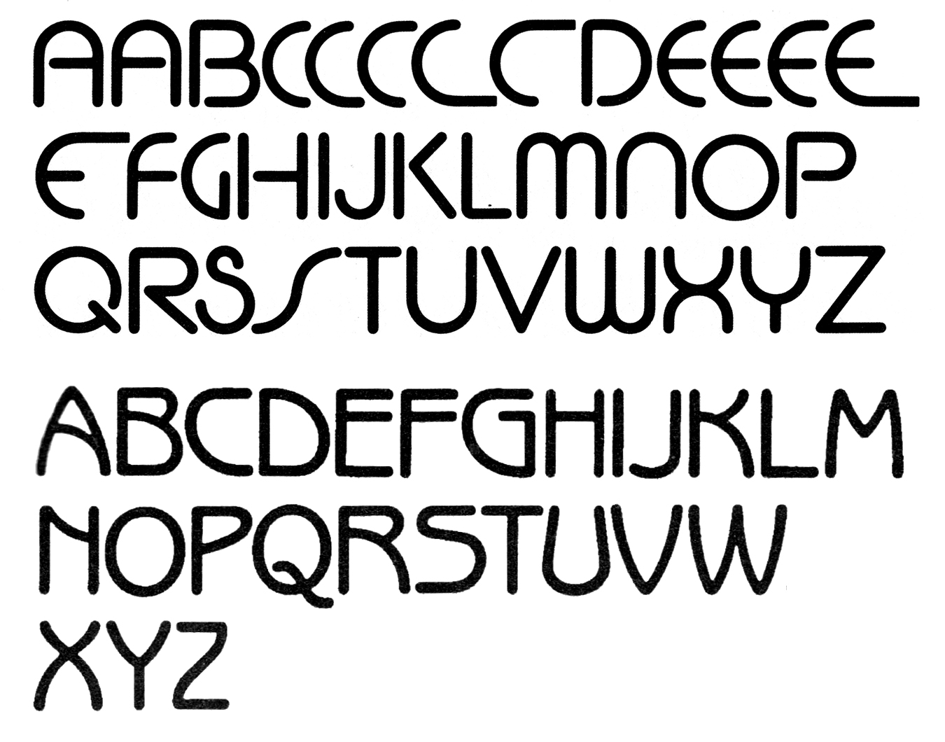
The uppercase glyphs of Cut-In Medium (top) and ITC Benguiat Gothic, as shown in Letraset catalogs.

The title page used a typeface that is influenced by Herbert Bayer’s Universal-Alfabet (like Cut-In) and was designed by Ed Benguiat (like Benguiat Gothic): ITC Bauhaus.

The interior pages are set in Electra by William Addison Dwiggins. Roman numerals mark the beginnings of each chapter. No designer is credited for the book interior.


")


")


")

")


")


")


")


