
New Energy Coalition logo
New Energy Coalition aims to accelerate the energy transition by partnering research, education, innovation and business.
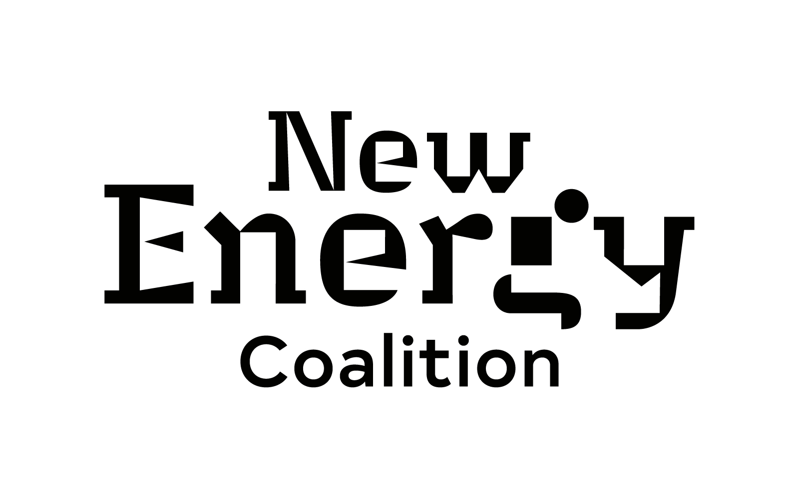
The logo uses Thomas Huot-Marchand’s Minuscule (205TF), “a typeface for extremely small sizes”. The chosen style is the most extreme one: Minuscule 2 was designed to remain legible at 2 pt. For its design, Huot-Marchand looked into the theories of 19th-century ophthalmologist Émile Javal who found out that at sizes this small, “we pay more particular attention to the difference between the letters”. The particularities of each glyph hence are exaggerated, and secondary details eliminated. As with most typefaces optimized for small sizes, Minuscule 2 can also be repurposed as eye-catching typeface for display and branding purposes, as it has been done here, too. Now its weird shapes don’t help so much with legibility, but rather symbolize the radical changes that are necessary for the transition to green, renewable energy. “Coalition” is added in Typold (The Northern Block), which is also used for other aspects of the brand.

The logo as used on the cover of an annual report, with display typography in all-caps Typold.


")


")


