Marvin Gaye – What’s Going On album art
What’s Going On is Marvin Gaye’s eleventh studio album, released in May 1971 on Tamla Motown.
Gaye’s introspective lyrics discuss themes of drug abuse, poverty, and the Vietnam War. He has also been credited with promoting awareness of global warming before the public outcry against it had become prominent. […] Worldwide surveys of critics, musicians, and the general public have shown that What’s Going On is regarded as one of the landmark recordings in pop music history, and one of the greatest albums of the 20th century.
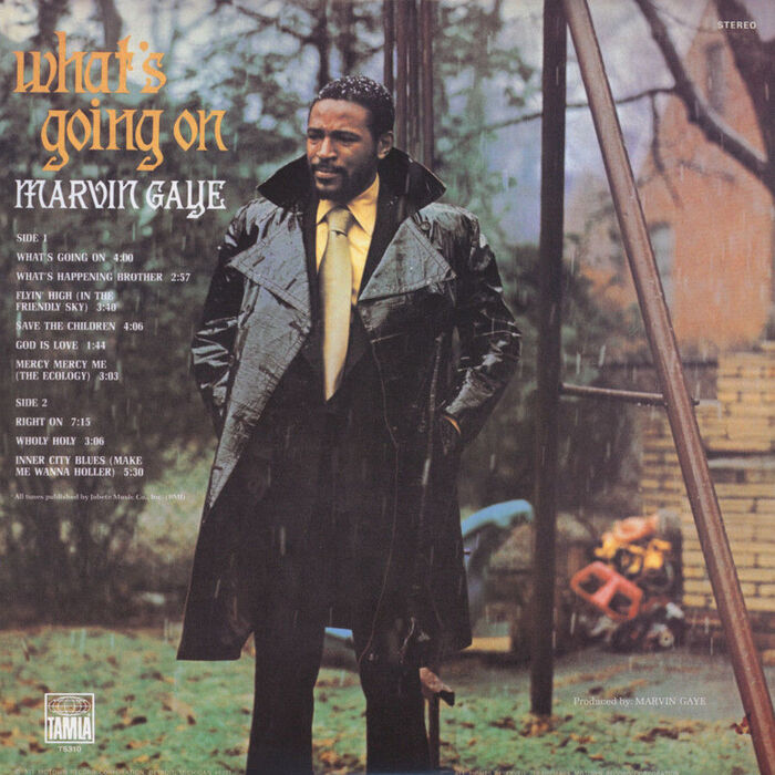
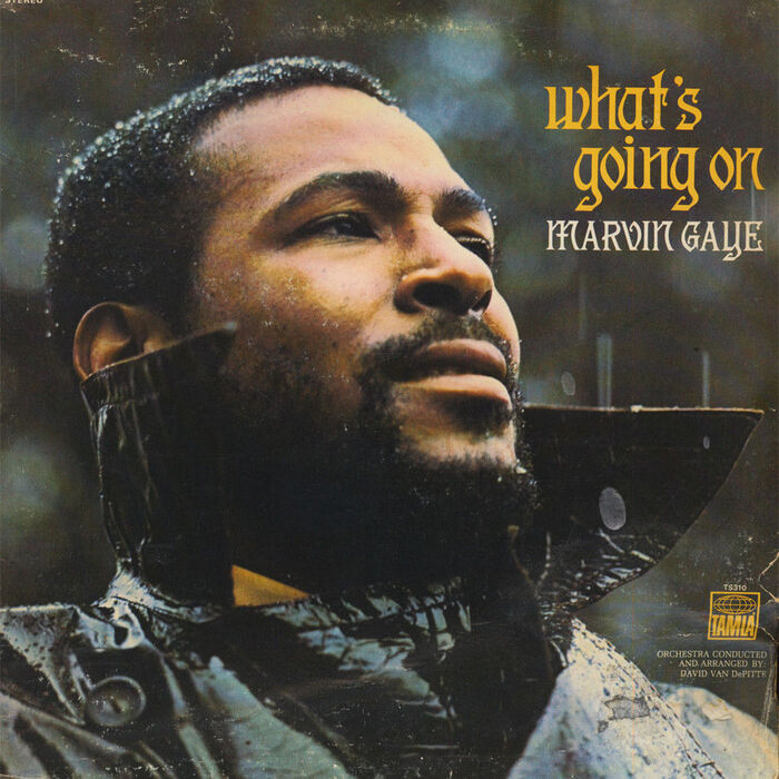
The cover design is by Curtis McNair, with photography by Jim Hendin. Tom Schlesinger is credited for “graphic supervision”. [More info on Discogs]
McNair designed more than a hundred album covers in his role as Motown’s art director. In an interview for The Charlotte Observer, McNair was asked to choose the cover of which he is most proud, and immediately named What’s Going On:
“I could see how emotional [Gaye] was, in terms of the essence of the album, and I wanted to match that. Marvin’s brother was in the military and had come back from Vietnam with stories of the carnage over there. Marvin was perplexed and he was trying to express that.”
“We had 100 slides of photos and I picked this one photo that was taken in Marvin’s backyard, when it was sleeting,” recalls McNair. “I liked that the sleet made his hair turn white, and on top of that you have the moisture on his coat and that wonderful expression on his face. I thought all of that added to the drama.”
“Well, the guy over my department saw it, and he did not like the photo and got upset. … Marvin happened to be in the building, doing some work, so I said, ‘Let’s go ask him and see which one he likes.’ We gave him both slides, and he looked at the one I selected and said, ‘That’s it.’
Curtis McNair passed away in 2017 at the age of 85. The obituary mentions some of his career experiences besides the work at Motown:
He was one of the first African American to work as a Graphic Designer for Chrysler Corporation. He was a Fashion Illustrator for Federals Department Store, a Graphic Designer for Fred Yaffe Advertising Agency and Art Director for the City of Detroit.

The track list on the back cover is set in caps from some version of Melior schmalfett.
The cover typography presents the title in yellow lowercase letters and the artist’s name in a line of white caps in a smaller size. The typeface is Tedesca (Italian for “the German”), originally issued by the AG für Schriftgießerei und Maschinenbau in Offenbach, probably shortly before 1900 (it’s depicted in Petzendorfer’s Schriftenatlas from c.1905, but doesn’t appear on the “list of all typefaces cut by German foundries since 1900” included in Klimsch’s annual from 1907).
Tedesca was adopted in the phototype era by Photo-Lettering and is shown as Xenotype 3793 in their Alphabet Thesaurus Vol. 2 (1965) and under the original name in the One Line catalog (1971). It also can be found in the 1968 catalog by competitor Lettergraphics, as Edesca. In the latter version (and maybe also in PLINC’s), Tedesca’s w with blackletter construction was given a more common form which can be seen on the cover, too. The left-leaning V in “MARVIN” isn’t authentic either. The n with the curved leg as seen in “on” is actually a scaled-down uppercase N. The i dot was lowered.
There are at least two digitizations of Tedesca. Descant (Scriptorium, 1993) is pretty faithful to the metal original (incl. the w), but unfortunately it’s poorly drawn and has a very small character set. The GPL/OFL-licensed Germanica (Peter Wiegel, 2014) has more characters including Cyrillics, but the draughtsmanship likewise leaves a lot to be desired.

Resetting using Descant, a digitization of Tedesca, with adjusted spacing and a superscript comma for the missing apostrophe. The second n is the N scaled to 67%. Note the differences in w and V.
Formats
- Album Art (3439)
Topics
- Music (5197)
Designers/Agencies
- Curtis McNair (2)
- Tom Schlesinger (2)
Tagged with
- Marvin Gaye (8)
- Motown (39)
- album records (2182)
- 1970s (1355)
- soul music (190)
- typeface profile (82)
- modified typeface (1470)
- repurposed glyphs (193)
- high profile (583)
- 1970s albums (285)
- back covers (1671)
- track listings (943)
- vinyl records (2754)
- Tamla (17)
Artwork location
- United States (8319)
- Detroit (48)
- Michigan (41)


7 Comments on “Marvin Gaye – What’s Going On album art”
I definitely associate the iconic photo with this cover, but I never would have remembered this typeface! It feels so disconnected from the music and the image, but it works. I wonder what McNair had in mind, or if it was just one of the fashionable types of the time.
I wondered about that, too. Of the many Art Nouveau faces that had a revival in the 1960s and 1970s, Tedesca is a particularly outré and consequently rare one. Unfortunately McNair didn’t comment on the type.
He was pretty eclectic in his type use, without a clear preference for one typeface or genre. It looks like McNair almost always picked another typeface, probably based on what he felt was fresh, or appropriate for the job at hand. He worked with other turn-of-the-century German oddities like Apollo (Green Grow The Lilacs), Tip-Top (Stop The World – We Wanna Get On), Kalligraphia (I Am My Brother’s Keeper) or the inevitable Arnold Böcklin (Magic). At the same time, he also indulged in other trends including contemporary faces, like ultrageometric Prismania & Prink (Rainbow Funk), swashy Bookman (The Prime of Shorty Long), bottom-heavy Jeanette & Brandywine (New Ways but Love Stays), extra dark Neil Bold (Goin’ Back To Chuck Jackson), or no-nonsense Permanent Headline (Why I Oppose The War In Vietnam), to name but a few examples. I might add more album covers by McNair to our Collection. Let me know if you have any favorites.
Thanks for the very thorough research, Florian!
Looks like for the 50th anniversary of the album it was re-released with a new face redrawn for the relating merchandise: https://jamesadame.com/whats-going-on-50
The article points to the new face, Pentz (drawn by Mattox Shuler and Brian Brubaker): https://fort.onrender.com/fonts/pentz
Ooh, thanks for the pointer! I haven’t visited Fort’s website in a while. Will add Pentz and their other new releases to the database shortly.
Besides PLINC, the Headliners also seem to have offered Tedesca as a photofont, as displayed on page 46 of their More Morgan catalogue (1968 – nicely designed by John Alcorn), see below. There’s no name attributed to the design though.
Thank you, Fernando! To my knowledge, all faces from the Morgan Press Collection went by numbers. So, MP 398 is the “name” of this adaptation.
The MP 399 shown below is Berthold’s Secession. The enlarged letter is its alternate H with the blackletter, minuscule-like construction.