
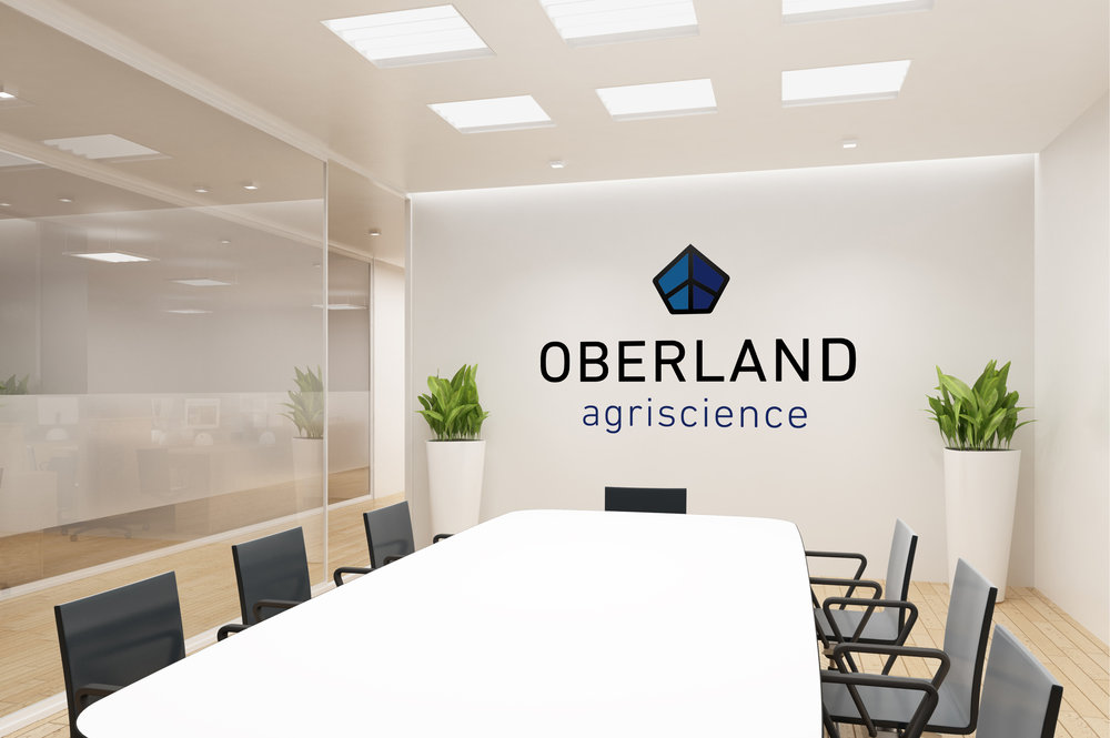
Oberland Agriscience logo
Oberland uses advanced, patented microbial processes to reclaim organic waste and repurpose it to fuel industrial farming of animal feed.
Their Challenge
This team was positioned to take on the world’s looming protein shortage with advanced agritech – but they needed a brand to rally around as they took on closing of the carbon loop.
Our Solution
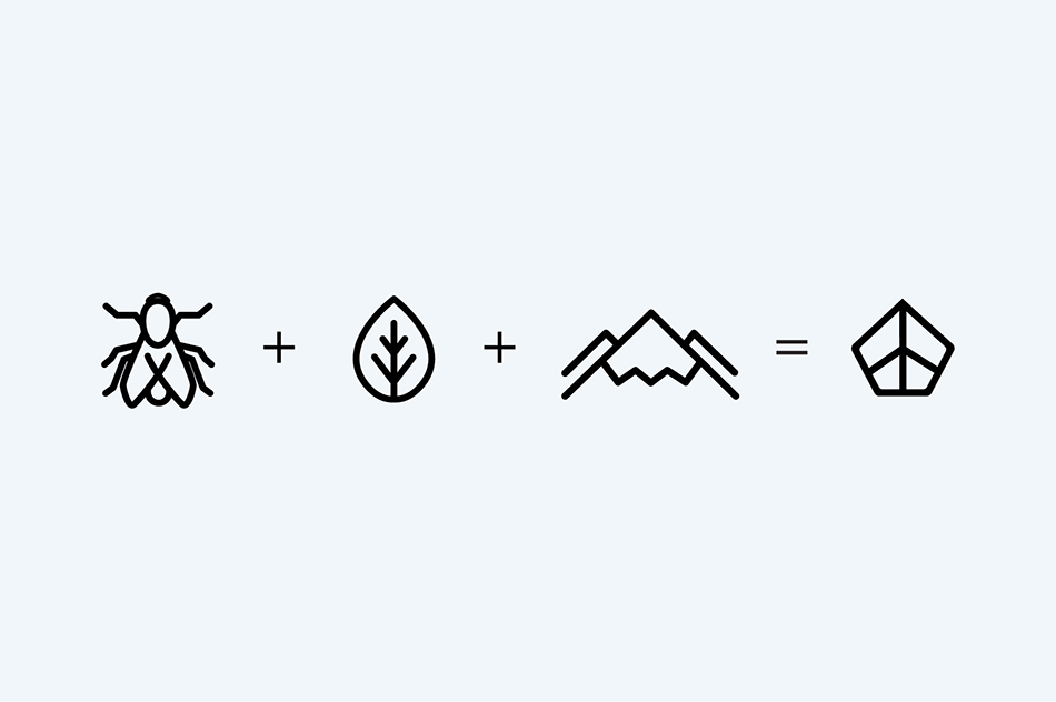
This project presented the perfect opportunity to create a cohesive brand from the ground up. We built a knowledge base and presented a naming strategy to the team. Oberland loosely translates to ‘upper land’, which for us, means an aspirational green place worth getting to. The name lent itself beautifully to a visual brand strategy; Oberland’s optimistic mark gives a nod to the longstanding towers of Oberland in Liechtenstein where the company’s CEO/Founder has family roots – but with modern sensibility and detail. This strong mark signals Oberland’s forward-thinking and underpins its agriscience focus.
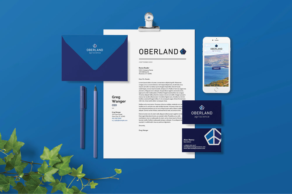
The logo uses two weights from FF DIN.


")


")


