
Wienerschnitzel logo (1978, 2009)

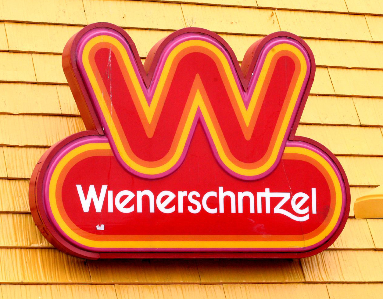
Founded in 1961, Wienerschnitzel is an American fast food chain that specializes in hot dogs (despite the fact that an actual wiener schnitzel has nothing to do with sausages). Saul Bass designed a logo for the company in 1978 and it has mostly survived on all franchise signage ever since. The rounded ‘W’ is most likely custom lettering, but (appropriately) closely resembles Frankfurter. For “Wienerschnitzel”, Bass used ITC Avant Garde Gothic with alternate ‘e’s and ‘c’ as well as a custom swash ‘z’.
Around 2009 the type in the official logo changed to a modification of ITC Kabel with a custom ‘W’, ‘t’. Like in Bass’s treatment, the font’s diamond ‘i’ dots are omitted, which is good because they would be too distracting.
1978 logo, currently used on most signs.
Updated logo, circa 2009.


")

")


7 Comments on “Wienerschnitzel logo (1978, 2009)”
Your comments are spot on for the current logo, which has been in use at least since 2009. The original version that is still used on most (all?) physical signs is ITC Avant Garde Gothic, not ITC Kabel. I’ve added a few more pics.
Apart from the omitted tittles and the swash z, the logo uses Avant Garde Gothic pretty much out of the box, with its alternates for e and c. These are included in ITC’s digital version, too. The image below shows ITC Avant Garde Gothic Demi (top) and ITC Kabel Demi (bottom). It’s shocking to see how poor the former is spaced.
ITC Avant Garde Gothic is one of my all-time favorite typefaces! I loved the use of alternates in the logo’s type. The new logo is a downgrade; the curves in the W icon and swash z of old version are just much more cleaner than the new ITC Kabel version.
Oh, duh! Good catch, Florian. I fixed my description. I wonder why they switched the type. Like Quan says, I can’t see a good reason for it, except perhaps that the Avant Garde ‘s’ sticks out a bit more.
The hotdog W is even more hotdoggy when extruded, like this sign in Redondo Beach, California:
My pessimistic guess: The switch was unintentional. Sometime in the 1990s or 2000s, Wienerschnitzel needed a vector version of their logo and couldn’t find the right font. (ITC’s digitization was released in 2005. IIRC, Elsner+Flake had a version with these alternates earlier.) The angled ‘e’ led them to ITC Kabel, and the other key glyphs (W, t, z) were beaten to shape.
That sounds plausible. A lot of folks – even large, national corps – don’t realize that lettering is a skilled labor they can seek out, rather than pulling a font off the shelf.
Hi I have one of those sigh on your pic of the original big o sigh of weinersnitzel wondering if interested in purchasing the sigh