
Fairway Market logos
The legendary New York grocer is rumored to close its stores after 87 years. Here’s how their typographic identity evolved over the last decade.

Dom Bold and Agenda.
Fairway Market is a chain of grocery stores in the New York metropolitan area. From Wikipedia:
Founded in 1933, it expanded in the New York area in the 21st century, with 15 grocery stores plus 4 liquor stores in the tri-state area as of August 2018. The flagship store remains at Broadway and West 74th Street, on the Upper West Side of Manhattan.
Their visual identity is not exactly consistent, and has seen several changes over the past few years.
Perhaps referencing the long history of the sign painter’s brush script in U.S. grocery signs, the logo used on the store shown above is in yellow caps from Dom Bold, horizontally stretched and with added drop shadow, against a green background. The casual unconnected brush script easily withstands some amount of stretching, in this case a little more than 120%.
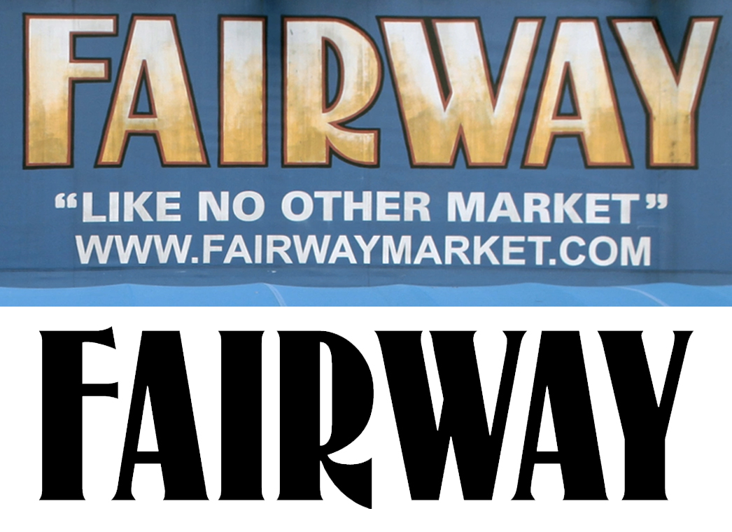
The slogan “Like No Other Market” sometimes is rendered in a mechanically extended brush script, too. In the photo below, the font in use possibly is the lighter Dom Casual. Here, with less chunky letters and in title case, the distortion is more problematic – at least the e looks somewhat pained. Other signs use the similar Impress. The setting with lowercase letters is also more revealing of the typefaces’ age. (Dom Casual goes back to the early 1950s when ATF adopted a film face originally drawn by Peter Dom for Photo-Lettering, Inc.; Impress is a digital version of Filmotype Prima which was first offered in 1955.) This may have been the motivation to replace the slogan typography with something more contemporary. The photo above shows “Like No Other Market” in Greg Thompson’s Agenda (1993), in all caps and without quote marks. The tapering red underline was maintained.
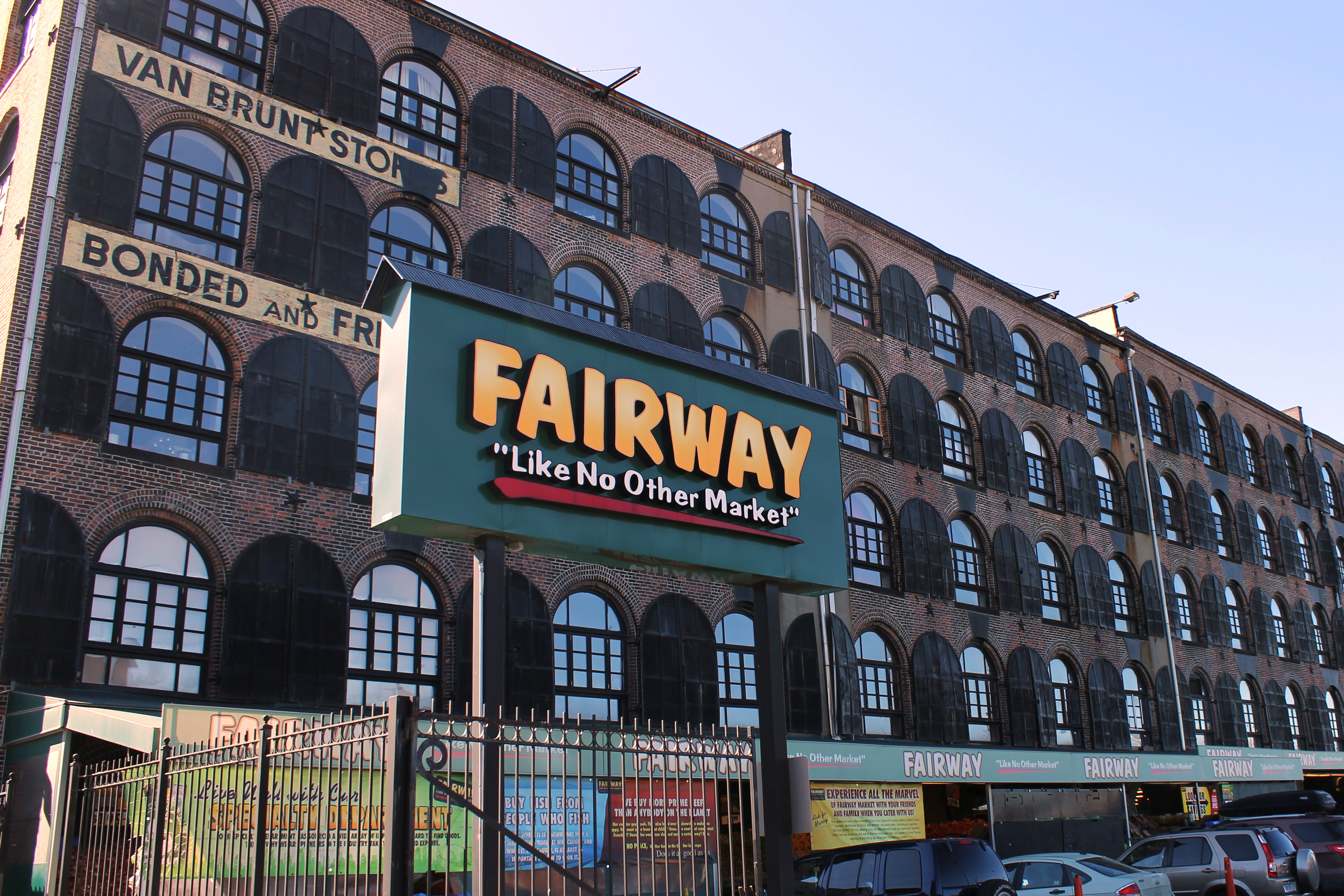
Dom Bold and Dom Casual (?), stretched. Red Hook, Brooklyn, 2012.

Top: The Fairway logo with slogan. Bottom: Recreation with stretched and respaced glyphs, featuring ① Dom Bold, ② Dom Casual, and ③ Impress (all by Bitstream).
Apparently this update still didn’t look modern enough. The Fairway website shows the latest logo version, in white on black. It’s not a drastic redesign, but a cautious revision. Dom Bold had to make way for a more recent typeface from the same genre, Ahkio.

Ahkio Bold (modified) and Neutraface.

Ahkio Bold (top) compared to the current Fairway logo (bottom)
Designed by Mika Melvas, it was released in 2014 in five weights. Ahkio is slightly inclined, adding a welcome sense of movement to the wordmark. The Bold weight already had the right weight and width. Some changes were deemed necessary, though: the bar in F was raised and shortened – maybe to mitigate the near crash with the protruding A bar – and crosses the stem; and the leg of R curves forward. While the apex of A was cleaned up, the opposite approach was chosen for W, with offset strokes that emphasize the handmade look. The slogan underneath now is set in caps from another sans serif, Neutraface by Christian Schwartz. Both typefaces are used for the Fairway website, too. The newest logo has the most professional appeal, but also borders on the slick.

The original Fairway store at Broadway and West 74th Street (see Google Street View) in 2008. Zoom in to spot two more typefaces from the same genre as Dom & Co.: Benguiat Frisky and Balloon are used for “Fresh cut flowers”.

The same store in 2012, shortly before the redesign was implemented. The banners at the top already show Dom Bold in stacked caps.
Until around 2012, Fairway used yet another logo version, in yellow caps on a blue background. It’s not clear to me if these letterforms are typographic or custom made. The closest typeface I’m aware of is McCullagh, which has a similar boldness and tall proportions, and shares three of its key characteristics: the high-waisted F, the asymmetrical W, and, most notably, the low-waisted R with a flat and vertically cut leg. The old Fairway logo looks like a sans-serif adaptation of McCullagh, but I can’t rule out that the similarities are just coincidental. This variant scores high in terms of uniqueness. On the other hand, it’s maybe too obviously rooted in the past. The red and black outlines and the gradient fill add to the nostalgic, sign-painterly charm.
While the slogan here is set in caps from Univers Bold, the web address below doesn’t follow suit: It’s the system font Arial, which makes this line look like a belated and thoughtless addition.
The Fairway logo on the original store (top) compared to McCollough, a digital version of McCullagh (bottom).

A large painted version of the old logo with outline, spotted underneath the Riverside Drive Viaduct, Harlem, in 2017. The awning at the left shows the version in Dom Bold, with the slogan in yet another bold grotesk, here in title case with straight quotes.


")


 trailer, Rolling Thunder Pictures (1999)")


")


2 Comments on “Fairway Market logos”
After ambitiously spreading itself too thin, Fairway declared bankruptcy in 2016 and then received financing from the private equity group Blackstone. The store has continued to struggle. Last week, New Yorkers were saddened to learn that Fairway recently filed for Chapter 11 bankruptcy protection and appears to be preparing to liquidate its assets. Though it could successfully emerge from voluntary bankruptcy, particularly if it scales back and focuses on just two or three properties, its future remains uncertain and it faces intense competition from Amazon, Whole Foods, and Fresh Direct.
Thank you for adding this context, Caren! It was a report about the recent news that brought my attention to Fairway.
I didn’t touch upon this subject in the post, but of course the underlying motivation for these redesigns usually isn’t about formal considerations. They rather reflect changes in ownership, management, or corporate strategy. It’s no coincidence that the old logo was retired around the same time when the chain was spun off in an IPO in April 2013, or that the latest logo change took place shortly after Fairway emerged from bankruptcy in 2016 with new owners.
Here’s a variant of the old logo, spotted by Japanese blogger cpiblog01502 in Harlem in 2009. With the unbalanced spacing, the filled counters, and the raised straight quotes, it certainly isn’t fine typography. At the same time, it’s authentic. This amateur design perfectly captures the allure of a neighborhood market without any excessive expansion plans.