
Where the Wild Things Are by Maurice Sendak (Harper & Row first edition)

Front panel of jacket
From Wikipedia:
Where the Wild Things Are is a 1963 children’s picture book written and illustrated by American writer and illustrator Maurice Sendak, originally published in hardcover by Harper & Row. The book has been adapted into other media several times, including an animated short film in 1973 (with an updated version in 1988); a 1980 opera; and a live-action 2009 feature-film adaptation. The book had sold over 19 million copies worldwide as of 2009, with 10 million of those being in the United States.
Jacket and cover, featuring illustrations by Sendak, with type set in Safari. Spine of the jacket is set in Helvetica and text on flaps looks to be set in Trade Gothic with the $3.50 price set in Futura. Text from interior title page and story set in Cheltenham.

Full view of jacket

Front flap and illustrated pastedown

Front panel of hardcover

Interior title page
")


")


")


")


 </cite>poster series")


3 Comments on “Where the Wild Things Are by Maurice Sendak (Harper & Row first edition)”
Thank you very much for contributing a post about this iconic book, Patrick! You submitted this a long while ago and tagged it with Casual Interlock – sorry for the wait (we are getting more submissions than we can handle).
In the meantime, Josh Korwin found out the original name of this design: it’s Safari, issued by Headliners. Casual Interlock is a copy made by Techni-Process. I have adjusted the typeface credit.
On his blog, Josh shows a mailer from November 1960 that announces the release of Safari. Furthermore, he kindly shares scans from his three-ring specimen binder from The Headliners, which has seven full pages devoted toa ll of Safari’s variations, including its three distinct weights.
Josh noted that Safari Medium Semi-Condensed looked familiar. He soon realized why: it’s the typeface he knew from Where the Wild Things Are! Josh also put together a submission for Fonts In Use, but since you already did so before, we sadly couldn’t feature it.
Everyone, make sure to head over to Three Steps Ahead where you can see Safari in full glory, plus some specimens of PLINC’s interlocking faces, and read Josh’s insightful notes about these lettering styles and how phototype made it possible to turn them into fonts.
Perfect! Many thanks to Josh for tracing the origins and the additional samples. I do have a few other in-use examples for Safari which I hope to submit soon but Where the Wild Things Are will likely be the best known. As soon as I looked at the specimen of Casual Interlock the G, R and S lept off the page and reminded me of the book cover. I guess that’s the magic of letterforms.
To my knowledge, there is no direct digitization of Safari – and Josh isn’t aware of one either.
In 2012, however, PintassilgoPrints based their Sundowners on the cover typography of a 1963 album by Roy Clark … which happens to use Safari, and in all three weights, no less.
I just added a post about this album cover:
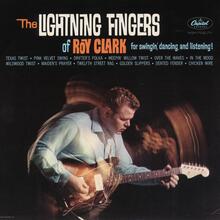
Most of the title is set in Safari’s Medium weight, but with more condensed proportions than for Where the Wild Things Are.
In terms of proportions, Sundowners is closer to Safari Semi-Condensed than the Condensed (I assume these “widths” offered by Headliners weren’t specifically drawn, but produced by photographic means). Also regarding other aspects, Sundowners is not a literal digitization of the letterforms found on the cover, and more of a free interpretation.
Sundowners comes with a range of interlocking pairs and triples, as well as swash alternates and ornaments, see the glyph palette on MyFonts.