
Der Mensch und seine Zeichen by Adrian Frutiger
In memoriam Adrian Frutiger, 1928–2015.
“Man and his signs” is a series of books written and illustrated by Adrian Frutiger. The content is based on the teaching materials as used in his classes at École Estienne (1952–1960) and ESAD (1954–1966)¹ and comprise his thoughts on signs and symbols. Volume 1 is generally about recognizing and designing signs, while volume 2 more specifically deals with the characters that are used to record language. The third volume is concerned with pictograms, non-alphabetic symbols, and signets.
The books were produced by D. Stempel AG as annual giveaways in 1978, 1979 and 1981, and are typeset in Iridium, Frutiger’s first typeface design for Stempel. It was made in 1972 for phototypesetting technology, following the request to “design the most beautiful typeface you’re capable of.”² Iridium later was replaced by Linotype Centennial when the original three volumes were merged into one book.³
Text editing: Horst Heiderhoff (art director at Stempel)
Final artwork vol. 1: Helena Novak
Typesetting and printing: Hausdruckerei der D. Stempel AG
1–3: Osterer & Stamm (ed.): Adrian Frutiger – Typefaces: The Complete Works

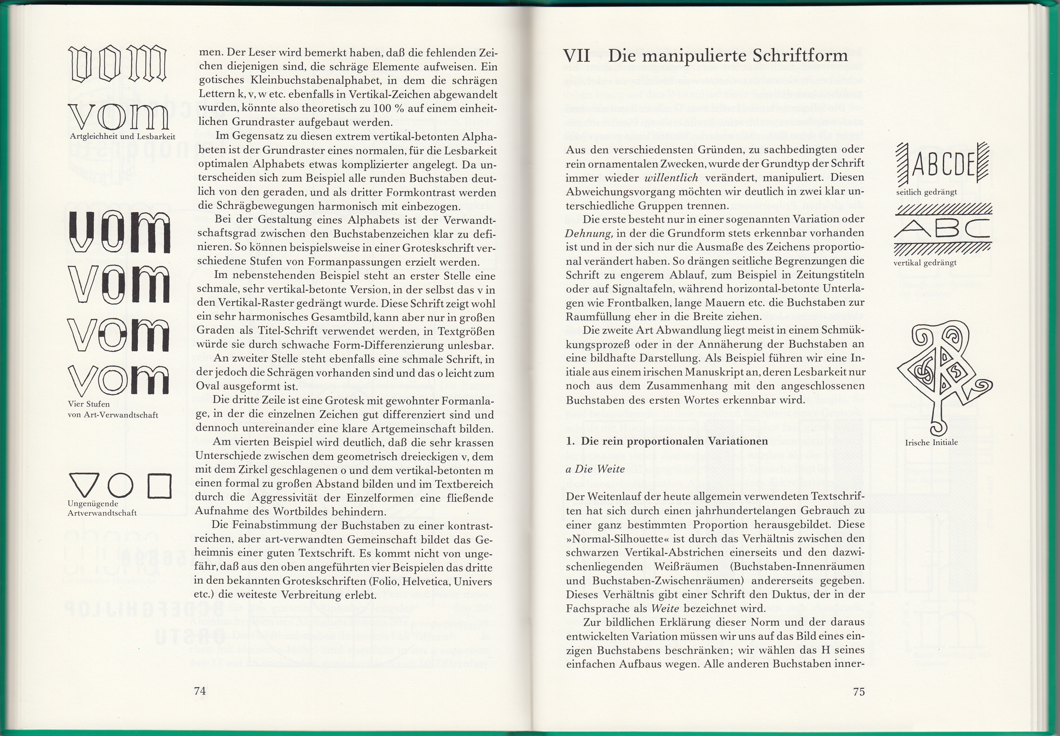
Sample spread from the interior (vol. 2, chapter VII “The manipulated letterform”)


</span>")

")


