
Tomy Blip / World Tennis / Blip-o-mat
This odd little Pong wannabe was a microcosm of video game typography, using all three MICR-style fonts popular in the ’70s.
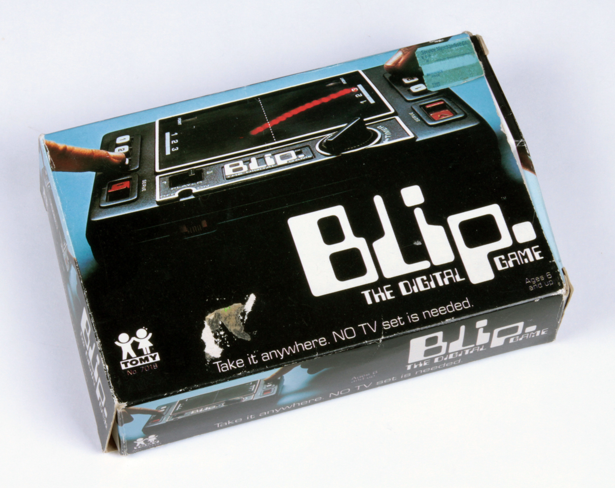
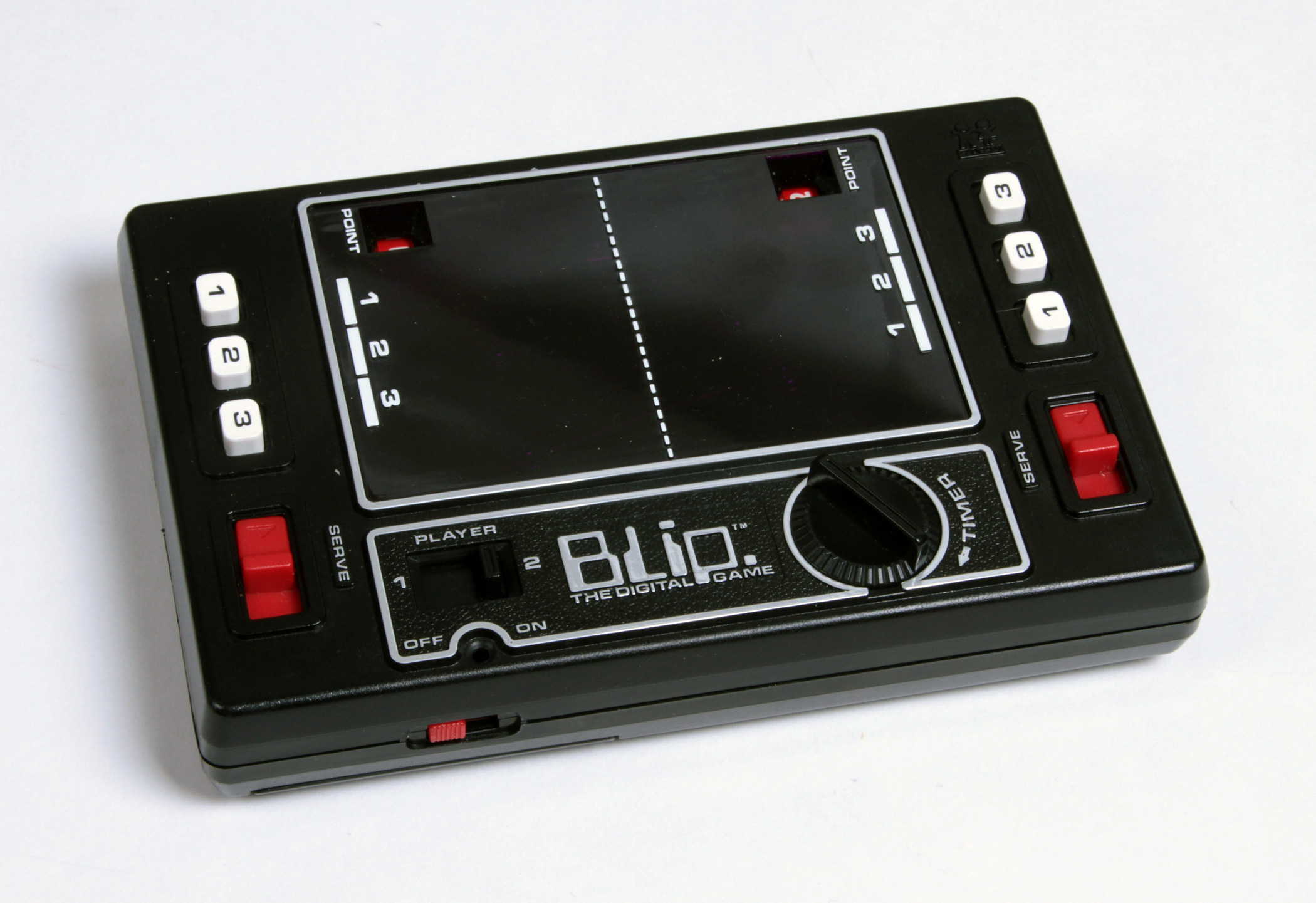
Blip was a portable Pong-style game made in 1977, the year handheld video games were just catching on. Although it was branded “The Digital Game”, the action was purely mechanical, powered by a wind-up timer. According to the Handheld Games Museum, “The batteries are only there to light up the single red LED light that represents the ball. (You can actually play the game with no batteries in a bright enough setting).”
But that didn’t hold Tomy back from playing up the “digital” aspect. The late 1970s were all about video games, so the company did their best to hide Blip’s true analog nature, branding the product so it looked and felt high-tech and electronic. The name itself is an obvious reference to the sound a computer might make, and they pounded that into the heads of consumers in this television spot.


Besides the name, type played a major part in Tomy’s futuristic aims: what could be more computerized than Computer? The typeface was used for “The Digital Game” on the box, and the Blip logo was likely derived from Computer as well, but it needed some creative modification as the font had no lowercase. A cap ‘L’ works fine for the lowercase ‘l’, and a squashed cap ‘P’ can fake a minuscule if it descends below the baseline. Meanwhile, the logo on the unit itself appears to be set in Orbit-B, a design similar to Computer, but lighter and more square, with larger counters.

Japanese and German editions of Blip, courtesy sellers swow and Los Reyes Magos.
The Japanese version (left) was labeled “World Tennis”, set in Data 70, another simplified take on the MICR aesthetic. The same font was also used on the packaging for the German “Blip-o-mat” (right).
If you add it all up, this odd little game managed to utilize all three of the MICR-style fonts that were frequently found in futuristic films, entertainment, and other products throughout the 1970s and ’80s. Read more about the relationship between this type genre and video gaming in an extensive article by Zach Whalen.


")


")


")


