
Turm zur Katz cultural center

Mut zur Wut exhibition poster, spring 2019.
Turm zur Katz is a cultural center that opened in 2019 and is dedicated to the exhibition of design, posters, and other productions related to applied arts. Located in the city center of Konstanz, the building is one of the town’s oldest towers, dating back to 1200. Named after one of the wealthiest families of Konstanz, the Turm zur Katz now bridges the medieval legacy, whose early conscience of the importance of architecture is visible in the structure of the building, and our contemporary culture of design, visible in any aspect of everyday life. Besides of being an exhibition center, the Turm zur Katz is also a place for events, lectures and workshops.
For their identity, Bureau Progressiv played on the contemporary aspect of the center, while keeping the importance of architecture for the custom drawn logotype (with letterforms not too different from PVC Banner). The website is in itself an illustration of the mobility of design and its power of adaptation to any situation: the automatic slide show of the homepage changes the whole background color depending on the image in question. We find this logic again in the “Exhibition” category of the website, where each exhibition has its own color set. Besides, the different reading directions of text, vertically in two columns, and images, horizontally, gives a prismatic aspect to the interface moving in multiple directions.
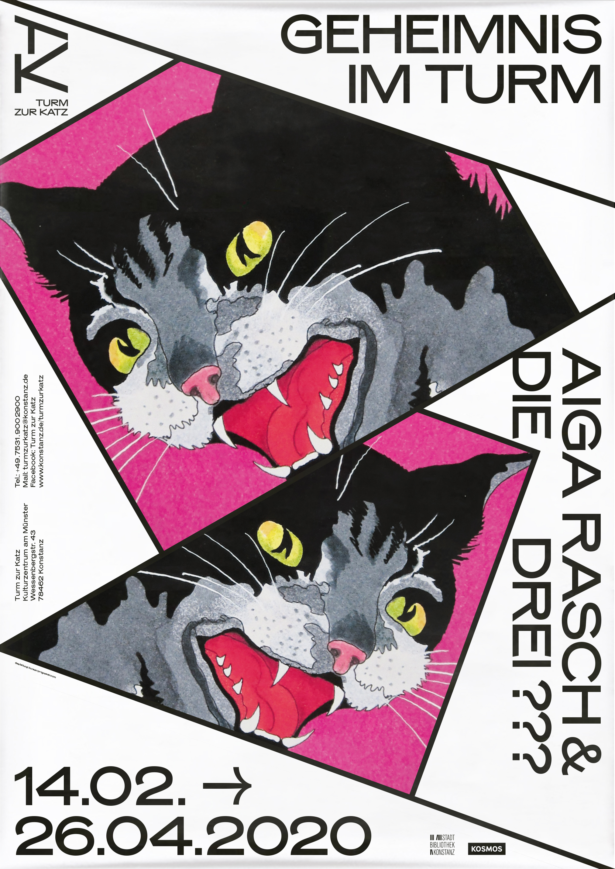
The identity typeface used for exhibition posters and the website is Mars Extended from Production Type. Inspired by vernacular signs from North America, the Mars family is strong of a historical legacy not yet considered as design, while anchored in the contemporary viewpoint of the French designer Alaric Garnier. The punchiness of display typefaces is still visible in Mars, which is nevertheless an appropriate choice for setting the descriptions of the exhibitions that take place at the Turm zur Katz. This double aspect builds up a strong identity while keeping its ergonomy.

Tom Hegen → Habitat exhibition poster, summer/fall 2020.

Vinyl Ikonen 60er → Heute exhibition poster, fall/winter 2020/2021.
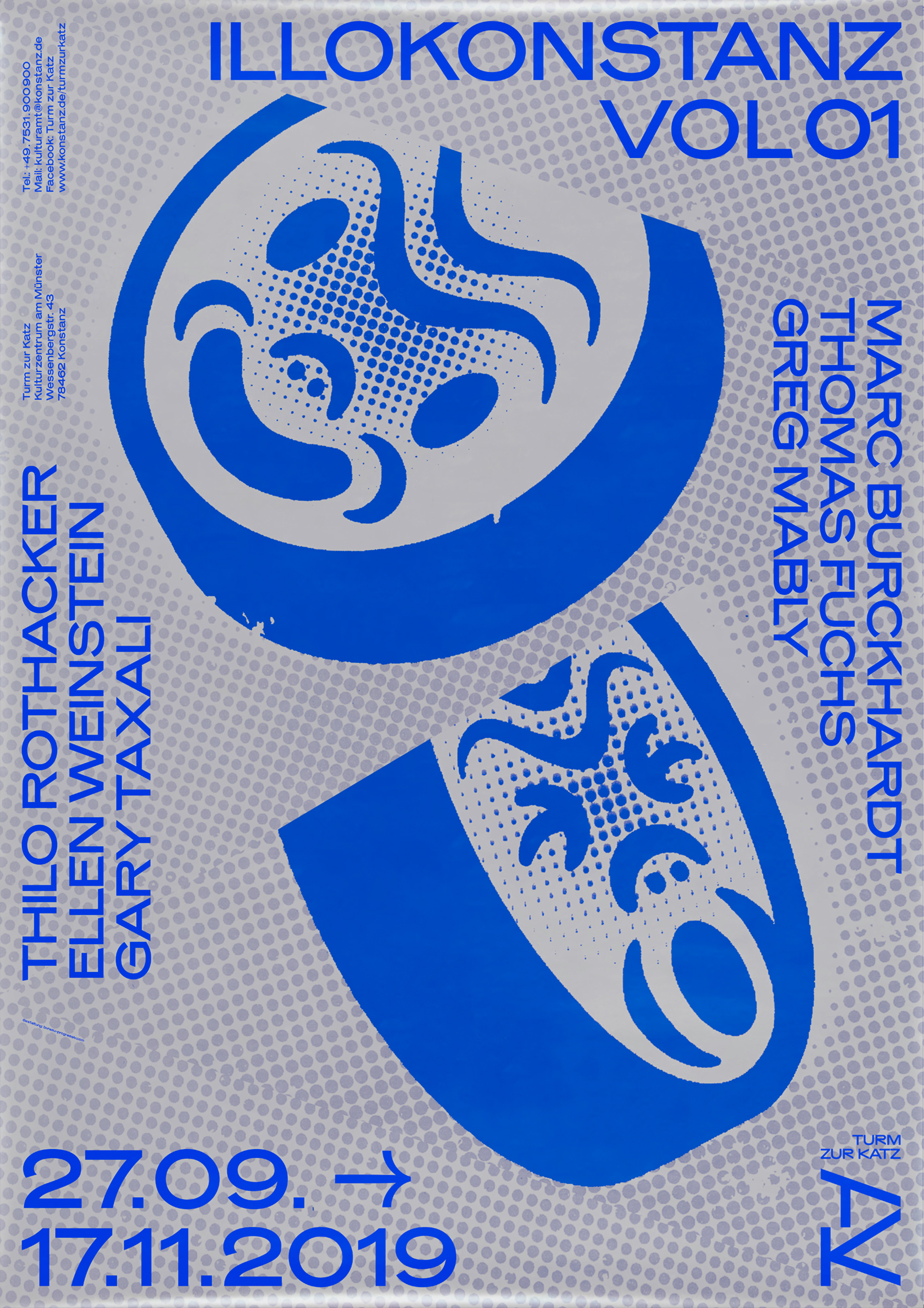
ILLOKonstanz Vol 01 exhibition poster, fall 2019.

Homepage with TZK monogram and wordmark.


Mobile view of the website.


")


